Ready to turn clicks into customers? This guide to high-converting landing page design blends smart conversion optimization with scroll-stopping ux ui and web design best practices. Explore proven layouts, copy cues, and above-the-fold tactics, plus free checklists. We’ll show you how to prototype fast with Figma templates, test variants, and polish visuals that build trust. Whether you prefer a plug‑and‑play landing page template, a customizable Figma template and UI kit, or sketching ideas in a wireframe sketchbook inspired by your favorite UX design book, you’ll find practical tips to launch faster—and win more signups.
Conversion Optimization Checklist for Above-the-Fold Content
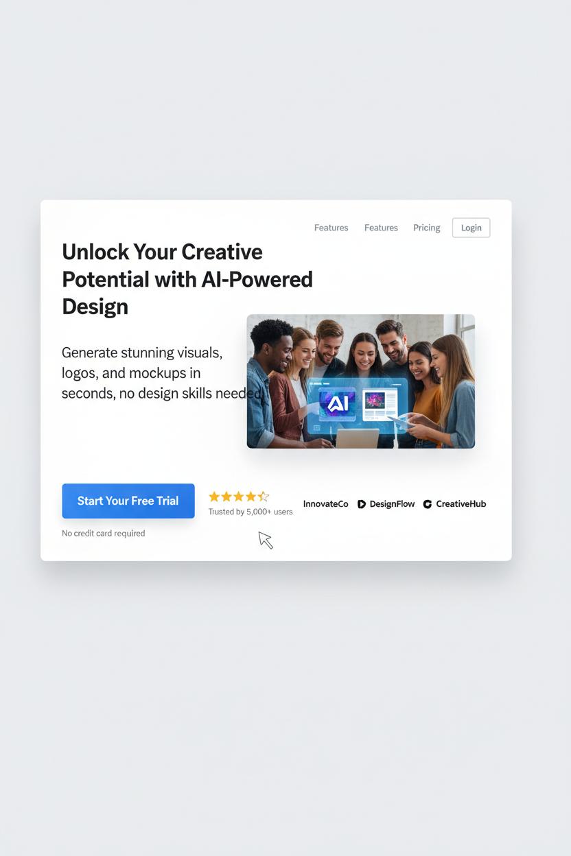
Before anyone scrolls, your above-the-fold section should feel like a beautifully styled entryway—inviting, clear, and irresistibly focused. Start with a headline that says exactly what you do and who it’s for, then a subhead that lands the value in plain language. Keep your attention ratio tight: one primary call-to-action, high-contrast, action-oriented, and visible on both desktop and mobile. Anchor it with tiny trust builders—review stars, recognizable logos, a quick “Trusted by 5,000+” stat—and add a low-friction reassurance like “Free trial—no card needed” right by the button. Visual hierarchy is everything; think Z-pattern scanning, big legible type, generous whitespace, and a hero image that shows the outcome, not just the interface. If there’s a form, keep it to the essentials (three fields max), use inline validation, and pair it with a small privacy note. For accessibility and ux ui best practices, aim for at least 4.5:1 contrast, meaningful alt text on the hero, visible focus states, and tap-friendly buttons. Speed is conversion optimization too: compress hero images, serve WebP, preload your main font, and skip carousels and heavy autoplay video. Mobile-first web design wins—consider a sticky footer CTA, avoid cluttered nav, and make sure your headline doesn’t wrap into oblivion.
Message match your traffic source to your headline promise so visitors instantly feel “Yes, I’m in the right place.” Keep navigation minimal or remove it completely to prevent escape hatches. Spice in micro social proof—press badges, customer count, or a quick testimonial—and consider risk reversal like a money-back guarantee. Use subtle directional cues (gaze lines, arrows) to guide eyes to the CTA, and keep the above-the-fold height lean so the button is visible without pinching and zooming. Test what matters: headline clarity, CTA copy, and hero imagery; heatmaps and scroll maps will show you the drop-off line. If you’re building in Figma, start with figma templates or a polished Figma template and UI kit to lock in consistent spacing, type scales, and components. Sketch the layout in a wireframe sketchbook first, sanity-check ideas with a favorite UX design book, then implement with a flexible landing page template. Great landing page design is less about being flashy and more about being fast, focused, and unmistakably helpful.
UX UI Essentials: Clarity, Hierarchy, and Microcopy
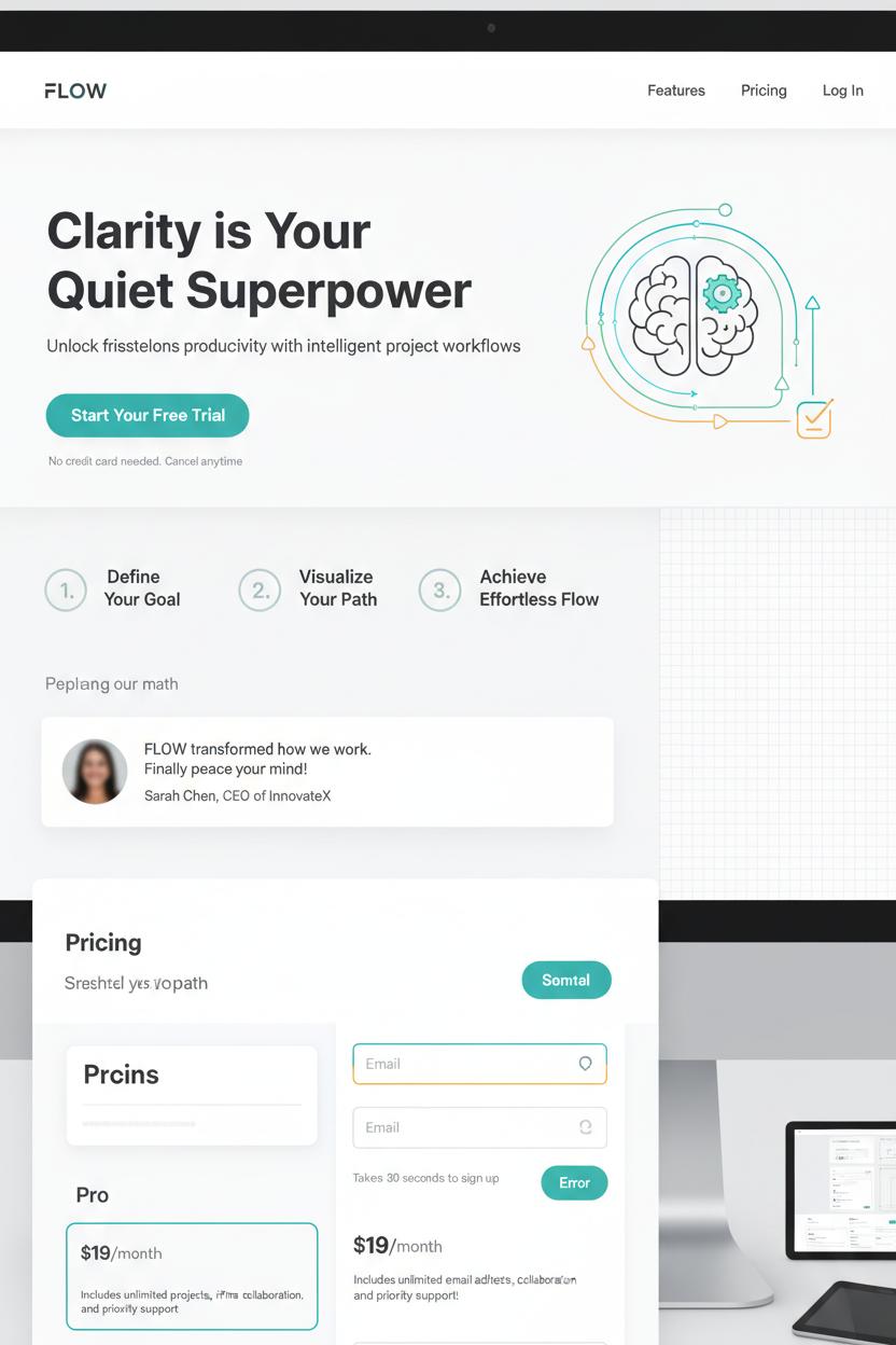
Clarity is the quiet superpower of landing page design. When someone lands on your page, they should instantly understand what you offer, who it’s for, and what happens next—no scavenger hunt required. Think crisp headline, supportive subhead, and a single, unmistakable call-to-action. Keep the visual language simple and friendly: generous white space, clean imagery that reflects your promise, and copy that speaks like a human. In ux ui terms, this is cognitive ease—reducing friction so decisions feel effortless. If you’re aiming for serious conversion optimization, remove anything that competes with the primary goal. That means limit competing links, tuck secondary details below the fold, and pair your hero section with a tiny reassurance line—like “Free returns” or “No credit card needed”—to soften hesitation.
Hierarchy is how you guide the eye without saying a word. Use a clear type scale, color contrast, and spacing to create a visual path: headline, proof, benefits, CTA. Arrange sections in a comfortable rhythm—problem, solution, social proof, action—so the story unfolds naturally. You can mock this flow quickly using figma templates, testing different layouts before you commit. A consistent UI kit will keep buttons, forms, and alerts uniform, which makes the whole experience feel trustworthy. Consider visual anchors like numbered steps or icons to chunk information. In web design, even tiny choices—like button prominence or a sticky bar—can change how confidently someone moves through your page.
Then, polish with microcopy—the tiny whispers that make people feel safe. Next to a form, add how long it takes. Under a price, note what’s included. Inside an error state, offer a fix, not a scold. Microcopy is where empathy lives, and it’s often the last nudge a visitor needs. If you like sketching first, map your sections in a wireframe sketchbook, then translate them into a Figma template or a landing page template for quick iterations. Keep a favorite UX design book nearby for pattern inspiration and test your variations like a scientist. With clear hierarchy, thoughtful microcopy, and a tidy ux ui foundation, you’ll have a landing page design that looks beautiful, feels intuitive, and quietly does the heavy lifting of conversion optimization.
Web Design Patterns That Build Trust and Reduce Friction
When people land on your page, they’re quietly scanning for two things: “Can I trust this?” and “Is this easy?” The best landing page design answers both with familiar, gentle patterns. Start with a clean hero that states the value in plain language and backs it up with a single, high‑contrast call to action. Keep your layout predictable—strong visual hierarchy, generous white space, and scannable sections with short subheads. A sticky CTA can float as they scroll so they never lose the next step. Reduce choices, tame busy navigation, and keep forms to one column with the fewest fields possible. Inline validation, clear error messages, and helpful microcopy remove anxiety before it starts—tiny ux ui touches that pay off big in conversion optimization.
Trust blooms through proof and transparency. Show testimonials with names, faces, and specific outcomes. Add star ratings, client logos, and review counts where they naturally support the story. If you handle money or data, surface security badges, refund policies, and guarantees near the CTA, not buried in the footer. Be upfront about price, shipping, and timelines; mystery costs are conversion killers. Support the journey with an FAQ accordion that answers objections in the same voice as your headline, and consider a short product or demo video with captions for accessibility. Speed is a trust signal too—lightweight images, tidy code, and lazy loading keep your web design feeling effortless.
If you’re building from scratch, a thoughtful landing page template can nudge you toward these patterns automatically. I love starting in Figma with a polished UI kit or a minimal Figma template so the structure is right before I obsess over color and type; there are plenty of figma templates that bake in smart spacing, mobile‑first grids, and accessible contrast. Sketch ideas in a wireframe sketchbook to separate flow from flair, then refine components digitally. Keep a favorite UX design book nearby to sanity‑check patterns you’re tempted to reinvent. And don’t forget to prototype—hover states, button feedback, and simple microinteractions make the page feel alive and reliable. When your web design quietly guides, reassures, and removes friction, you don’t have to push for the click. It just happens.
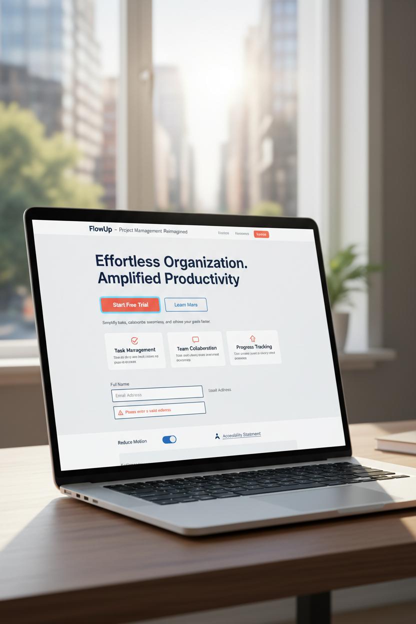
High-Converting Layouts: Hero, Feature Grid, Social Proof, and Pricing
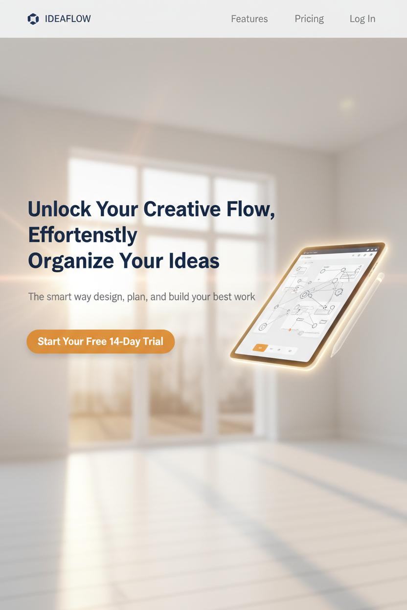
Start with a hero that feels like a sunlit entryway: uncluttered, welcoming, and unmistakably “you.” In landing page design, the hero is your handshake and elevator pitch rolled into one. Keep the headline a single, generous sentence that says what you do and why it matters, follow with a short supporting line, and offer one primary call-to-action that doesn’t compete for attention. Choose a visual that frames the benefit—a crisp product render, a lifestyle scene, or a friendly demo GIF—and give everything plenty of breathing room. In ux ui terms, think hierarchy first: bold headline, calm subhead, confident button. I love sketching three hero variations in a wireframe sketchbook, then translating the winner into a Figma template so it’s easy to tweak typography and spacing with reusable styles and components from figma templates.
Right below, a tidy feature grid works like a gallery wall for your best benefits. Aim for three or four tiles with short, verb-led headlines and one or two lines of cozy, concrete copy. Iconography from a UI kit keeps things consistent and clickable, while measured white space helps each tile feel important without yelling. For conversion optimization, order features by impact, not chronology—lead with the instant win, then the trust-building detail, then the delightful extra. If you can add a mini proof point to each tile (like a stat, badge, or micro testimonial), even better.
Social proof is the warm nod from the crowd. Sprinkle recognizable logos, star ratings, and photo-backed testimonials near your CTAs, not just at the bottom. Pull out a specific outcome in bold—time saved, revenue gained, headaches avoided—and let the rest flow naturally. As any good UX design book will remind you, proximity matters: place reassurance exactly where hesitation happens. This is where web design meets human storytelling.
Finally, treat pricing like a well-labeled shelf. Use clear plan cards, a gentle highlight on the “Most Popular” option, and a simple monthly/annual toggle with honest savings. Add a guarantee or free trial note right under the primary button to lower friction. If you’re starting from a landing page template, keep the comparison details scannable and trim; test copy, not just colors. A clean, confident layout—refined in your UI kit and polished in Figma—turns curiosity into clicks without the hard sell.
Forms That Convert: Field Strategy, Validation, and Privacy Cues
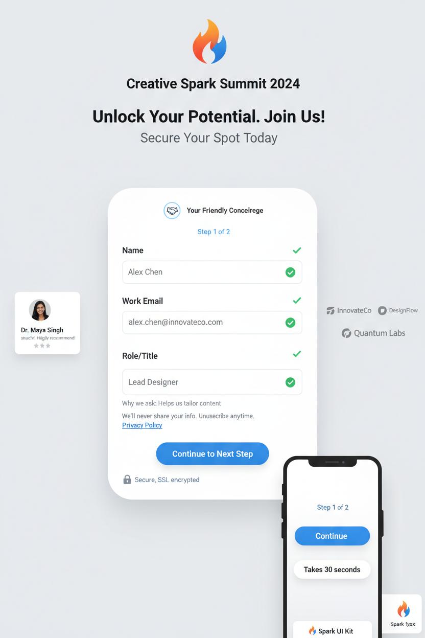
Treat your form like a friendly concierge, not a clipboard. In landing page design, fewer, clearer fields almost always win: name, email, and one focused qualifier are often enough to help with conversion optimization without feeling nosy. Single-column layouts reduce eye zig-zag and make completion feel breezy. If you truly need more, try a gentle, two-step flow with a progress hint (Step 1 of 2) and smart defaults that prefill where possible. Use explicit labels above fields (placeholders can vanish mid-typing), add tiny “Why we ask” microcopy for sensitive questions, and set correct input types so phones surface numeric keypads for phone/ZIP. Let autofill do its magic; it’s a gift. On mobile, make tap targets comfy, keep the CTA sticky, and show a short line about the time required—“Takes 30 seconds.” Sketch the layout in a wireframe sketchbook first, then finesse it with figma templates or a polished Figma template and UI kit so spacing, contrast, and error states are consistent with your broader ux ui. If you like learning by example, a solid UX design book can spark patterns to adapt, and you can test variants quickly by swapping components in a landing page template.
Validation should feel like a kind friend standing nearby. Confirm in real time with soft green checks, and when something’s off, say exactly how to fix it—“Use a work email like name@company.com”—without clearing the whole form. Keep the submit button disabled only until minimum requirements are met, and never punish users by wiping their entries after an error. For privacy cues, anchor trust right where hesitation happens: a lock icon with “Secure, SSL encrypted,” a short “We’ll never share your info. Unsubscribe anytime,” plus a link to the privacy policy. Keep consent checkboxes clear and unbundled; if you’re using a captcha, make it invisible or delightfully lightweight. Surround the form with calm whitespace and tuck a single, believable testimonial or logo row nearby for social proof. Tie everything together with high-contrast buttons, predictable focus states, and a warm, grateful success message. These small, thoughtful details are classic web design craft—and when you prototype them in Figma using reusable figma templates, you’ll iterate faster and measure real gains in conversion optimization.
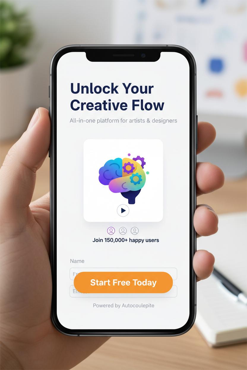
Mobile-First Landing Page Design and Page Speed Wins
If you want that instant “this feels right” moment on a phone screen, start every landing page design with mobile as your muse. Think generous white space, a single-column flow, and thumb-friendly tap targets that don’t make people pinch, zoom, or guess. Keep your headline snackable and your value prop front and center, then let a sticky, high-contrast CTA follow the scroll like a helpful friend. Trim forms to the essentials (name + email can be enough), enable autofill, and stack social proof right under the hero so credibility isn’t hiding in the footer. In ux ui terms, you’re crafting a clear visual hierarchy: bold headline, supportive subhead, one strong image or short loop, then proof and a simple next step. Sketch your flow in a wireframe sketchbook to stay honest about hierarchy before color and flourishes sneak in, and when you’re ready, drop it into a clean Figma template or UI kit so spacing, type scale, and icons stay consistent. If you’re new to this rhythm, a well-loved UX design book can help you sanity-check patterns as you go, and a ready-to-edit landing page template can speed up the build.
Now for the secret sauce of conversion optimization: speed. Mobile visitors will bounce if the page lingers, so aim for a hero under 100 KB and a fully interactive experience in about two seconds. Export images from your figma templates at the right sizes, convert to WebP or AVIF, and lazy-load anything below the fold. Limit JavaScript to what actually earns its keep, inline critical CSS, and prefer system or well-optimized variable fonts over a font party. Swap auto-play videos for a poster image and a tap-to-play if video truly clarifies your offer. Use a CDN, set generous caching, and preconnect to critical domains to shave milliseconds. Test with Lighthouse and PageSpeed Insights, watching especially for Largest Contentful Paint and CLS—because a layout that jumps around will tank trust no matter how pretty the web design is. When the page feels light, focused, and fast, those tiny mobile moments stack up to bigger sign-ups, more clicks, and a landing page design that quietly does the work.
Visual Strategy: Imagery, Color, and Contrast for Conversion Optimization
Start your visual strategy with imagery that tells a quick, irresistible story. On a high-converting landing page design, your hero image should feel like an instant mood board: crisp lighting, a clear focal point, and plenty of breathing room for your headline and call-to-action. Faces with eye-lines pointing toward your button act like subtle arrows; lifestyle photos show the promise, while close-up product details build trust. Keep an eye on consistency—matching tones, similar crops, and cohesive textures make the whole page feel intentional. If your photos vary, unify them with a soft duotone overlay so text pops without fighting busy backgrounds. Think of each image as a chapter in the same narrative, guiding the scroll with curiosity instead of clutter.
Color is your conversion compass. Choose a calm base palette, then pick one high-contrast accent that’s reserved for CTAs and critical actions. That signature hue becomes the “click me” color, and repetition trains attention. Test contrast on mobile in bright light—if your button disappears on a sunny sidewalk, it’s not working. Use warm neutrals and generous whitespace to frame bold accents, and add micro-contrast with shadows, borders, or subtle gradients to separate cards, inputs, and testimonials without visual noise. Gradients can be directional, too: a gentle fade can guide the eye from headline to button. Remember that contrast isn’t just about dark vs. light; it’s scale, texture, and motion as well—larger type, sharper edges, and a touch of animation can quietly lift priority elements.
Turn this into a repeatable workflow. Sketch the layout in a wireframe sketchbook to map hierarchy, then translate it into a Figma template or UI kit so your ux ui decisions are consistent. Try two or three figma templates for quick A/Bs: one photo-forward, one illustration-led, and one minimal with a bold color field. Save variants of your landing page template with alternate CTA colors, swap a lifestyle hero for a product-in-hand shot, and preview across breakpoints. If you want deeper rationale, a practical UX design book is gold for color psychology and accessibility, and it pairs neatly with your day-to-day web design experiments. The sweet spot is when visuals feel beautiful, intentional, and unmistakably clickable—that’s where conversion optimization starts to look effortless.
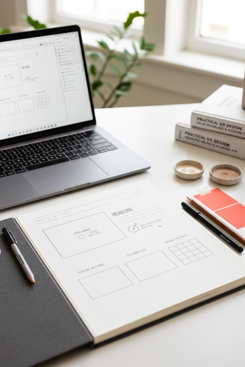
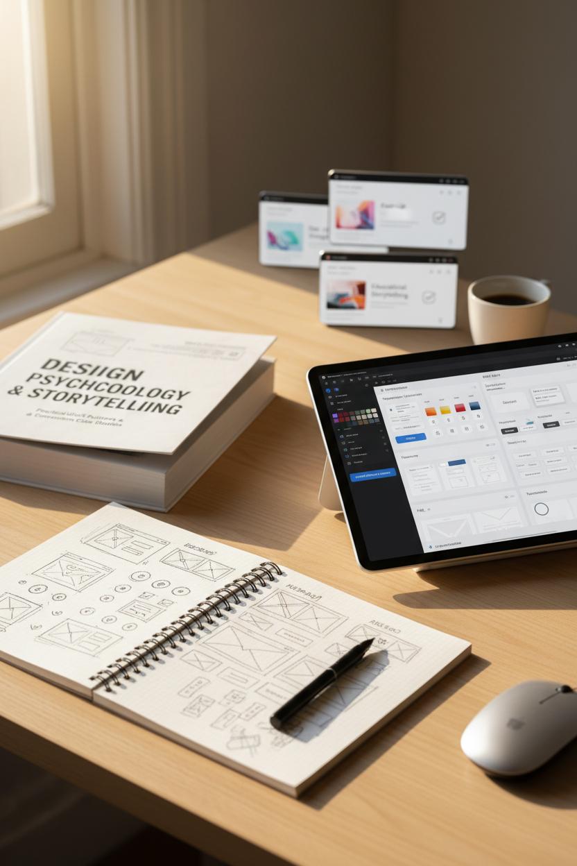
From Wireframe to Hi‑Fi: Using a Wireframe Sketchbook and a UI Kit

Before I open a file, I start analog. A wireframe sketchbook on my desk, a pen in hand, and a rough list of goals—this is the low-pressure space where landing page design gets its shape. I block out a simple zigzag hierarchy: hero, proof, benefits, objection-busters, CTA. I scribble notes in the margins about what needs to be visible above the fold, which elements should feel “quiet,” and which moments should pop for conversion optimization. If you’re new to this ritual, a quick flip through a favorite UX design book can spark layout ideas and remind you of those tiny ux ui details that build trust: ample white space, scannable subheads, sensible image ratios. I’ll sketch mobile first, then let the desktop grow from there, so the story reads beautifully on any screen.
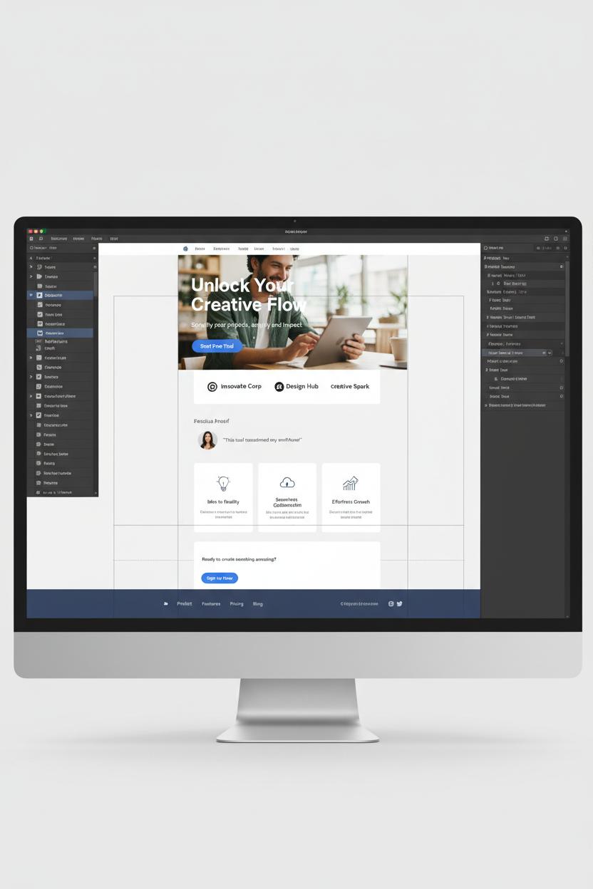
Then I translate the bones into pixels. I open a Figma template or a lightweight UI kit and drop in components to speed things up: buttons with states, input fields with labels, card patterns that already understand spacing. This is where consistency becomes your superpower. Using figma templates with predefined styles—type ramps, color tokens, grid systems—keeps the whole web design clean and cohesive, and that visual order is catnip for conversions. I’ll map my sketch 1:1 into frames, swapping placeholders with real-ish copy, then test variations like a longer hero lead vs. punchy headline, or social proof near vs. far from the CTA. If you need a fast start, a landing page template can save hours while still letting you customize the vibe.
When it’s feeling solid, I move to hi‑fi: refined photography, brand textures, microinteractions, and a crisp contrast pass. I check tap targets, hover affordances, and load order to keep the experience fast. The last polish is a mini QA tour—keyboard nav, color contrast, and a quick scroll test on my phone. Save your wireframe sketchbook pages beside the Figma file so future you can see the thinking trail, and keep a few UI kit components handy for rapid A/B tests. That mix—paper-first clarity plus systemized components—turns good ideas into clear, confident landing pages that convert.
Step-by-Step: Build a Landing Page Template from a Figma Template
Start by choosing a Figma template that already feels close to your brand’s vibe—clean, generous white space, purposeful typography—and drop it into a fresh file. If you’re in idea-sorting mode, do a quick thumbnail pass in a wireframe sketchbook to map the journey: hero, value prop, proof, features, call to action, and a gentle footer. Define a single core goal (email signup, demo, purchase), then gather your palette, logo, and 3–5 hero images that communicate the transformation you’re promising. If you’re brushing up on the fundamentals of landing page design, a favorite UX design book can help you anchor decisions in ux ui best practices before you start styling.
In Figma, set up a tidy page with grids and text styles to keep everything consistent, then import components from a UI kit or swap elements inside the landing page template you picked. Use Auto Layout to make blocks stretch and snap elegantly as you edit copy. Start with the hero: a crisp headline that states the outcome, a supportive subhead, one primary CTA, and a visual that shows the product in context. Flow into social proof—logos, a testimonial with a face, or quick stats—then a scannable feature stack that connects benefits to real-life use. Keep your web design decisions light and breathable: generous spacing, short lines, and buttons that look obvious without shouting. If you need fresh patterns, explore figma templates for pricing tables, FAQ accordions, and footers so your structure stays cohesive without reinventing the wheel.
Before you call it done, do a conversion optimization sweep. Check hierarchy (biggest message first), contrast (CTA stands out), and friction (form fields trimmed to essentials). Ensure the “above the fold” story earns the scroll, then make mobile sing—stacked modules, thumb-friendly buttons, and images optimized for speed. Add subtle microinteractions to guide attention, and run a quick prototype test with two or three real users to catch sticking points. When everything feels smooth, package components for reuse so this becomes your go-to landing page template. Hand off neatly with annotations, or publish a shared library if your team collaborates. Keep notes on what you’ll A/B next: headline, hero graphic, or social proof placement. Iteration is where great ux ui and web design quietly outperform over time.
A/B Testing and Analytics: Find Wins and Avoid False Positives
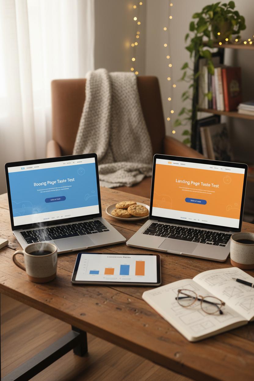
Think of A/B testing like a cozy taste test for your landing page design: two beautiful versions, same goal, and a clear plan to crown a winner. Before you launch, write a one-sentence hypothesis and pick a single primary metric—sign-ups, purchases, or booked calls—so you don’t get distracted by shiny but irrelevant upticks. Decide the smallest improvement that actually matters for your business and let your test run long enough to see it. A good rule is to cover at least one full business cycle (week to week, payday to payday), and resist peeking early. Quick spikes can feel thrilling, but true conversion optimization is calm, patient, and grounded in clean data.
Avoiding false positives is all about consistency and focus. Keep your variants tight—change one meaningful element at a time, like headline, hero image, or CTA color—and send evenly split traffic. Watch your sources; a version getting more paid clicks or more mobile users can look “better” for the wrong reason, so segment by device and channel. Set up a tidy analytics plan with named events, funnels, and UTMs, and QA your tracking before you go live. Heatmaps and scroll-depth reports help you see where attention pools, while session replays reveal friction that raw numbers miss. Use guardrail metrics like bounce rate and average order value to catch risky “wins,” and give each test enough visitors to breathe. If you’re testing multiple ideas, queue them rather than stacking too many variants at once—p-hunting is real, and it’s the fastest path to misleading results in web design.
Make your workflow feel effortless and pretty. Start with a quick sketch in a wireframe sketchbook, then translate the best direction into polished screens using figma templates. A streamlined Figma template or UI kit keeps your ux ui consistent while you spin up crisp variations in minutes. If you need a head start, try a landing page template, swap in your brand, and publish. Document everything in a simple test log with dates, audiences, screenshots, and outcomes so your future self can build on real wins. Keep an inspiration stash, read a thoughtful UX design book now and then, and archive your proven patterns in Figma so each new test begins from something strong. Data guides the decision; delightful design seals the deal.
Accessibility and UX UI Compliance That Improve Conversions
When your landing page design feels effortless—like strolling through a well-lit boutique where everything is labeled, reachable, and inviting—conversions naturally rise. Accessibility and ux ui compliance aren’t just checkboxes; they’re friction-fighters. Start with clarity: strong color contrast that meets WCAG guidelines, readable type sizes, and generous line spacing so copy feels airy, not cramped. Don’t rely on color alone for meaning; pair hues with icons, patterns, or microcopy. Make every interactive element obvious and reachable with visible focus states and keyboard navigation that glides from hero to form without traps. Forms deserve extra love: real labels (not placeholders pretending to be labels), clear error messages near the field, and big, comfortable tap targets. Add descriptive alt text to images, captions to video, and give users the gift of choice with motion settings that respect prefers-reduced-motion.
Accessibility is conversion optimization in disguise, because it trims cognitive load and builds trust. The fastest way to bake it in is at the sketch stage: map hierarchy and flow in a wireframe sketchbook so the most important action is always the easiest to take. Translate that into figma templates or a polished Figma template and lean on an accessible UI kit with ready-made states for hover, focus, and disabled. Many figma templates have plugins for color contrast and focus order—use them like a checklist, and keep your heading structure logical so screen readers can scan as smoothly as your scrollers. If you’re newer to patterns, a well-reviewed UX design book can anchor your decisions, and a proven landing page template can speed setup without sacrificing standards.
Remember that performance is part of accessibility and ux ui excellence. Compress images, avoid heavy carousels, and keep motion meaningful. Test with a keyboard, a screen reader, and on a sunny phone screen to catch real-world snags. Collaborate with your devs on semantic HTML and ARIA where needed, but keep the web design simple and scannable: short paragraphs, descriptive buttons, and friendly microcopy that reduces anxiety. When the experience works for everyone, it feels calmer, cleaner, and more trustworthy—and that’s the quiet power move behind higher conversions.
Recommended Resources: Best UX Design Book, UI Kit Libraries, and Figma Templates
If you’re ready to level up your landing page design, start with a solid foundation: a truly useful UX design book. Pick something that blends psychology, storytelling, and practical ux ui pattern guidance—ideally with case studies that show how small tweaks in hierarchy, contrast, and microcopy move the needle on conversion optimization. Keep it open on your desk while you work; having a dog-eared reference helps you make faster decisions about spacing, button states, and information density. I also love keeping a wireframe sketchbook within reach. Quick pen-and-paper sprints help you solve flow problems before you touch pixels, and they’re perfect for exploring hero variations, social proof placements, and calls-to-action without getting lost in color or icon rabbit holes.
Once your structure feels right, borrow brilliance from well-built UI kit libraries. A thoughtful UI kit can give you pre-tested typography scales, grid systems, and component styles, so your web design keeps a consistent rhythm from headline to footer. Look for libraries that include landing page template sections—hero, features, pricing, FAQs, testimonials—so you can mix and match blocks with minimal friction. If you’re designing in Figma, choose figma templates that already use Auto Layout, constraints, and component variants; that way your buttons, cards, and forms respond gracefully to content changes. A polished Figma template can save hours while still leaving room for brand personality, and it’s a great way to pressure-test your copy and imagery in a real layout.
Finally, keep a small stack of templates just for testing. Spin up two or three lightweight figma templates focused on different goal paths—one for fast sign-ups, one for educational storytelling, and one for direct sales—and pair them with a simple conversion optimization checklist. Map each section to an intent moment, then confirm that your headlines, CTAs, and proof points ladder up to a single, irresistible action. Whether you’re sourcing a new UI kit, refining a landing page template, or flipping through a favorite UX design book for inspiration, curate tools that nudge you toward clarity and momentum. The right mix transforms web design from guesswork into a warm, repeatable craft—so every launch feels calm, cohesive, and conversion-ready.
Conclusion
Wrap up: Your landing page design doesn’t need to be complicated—just clear, fast, and focused. Lead with a promise, proof, and one primary CTA. Use tight hierarchy, generous whitespace, and mobile-first ux ui. Test headlines, visuals, and forms for conversion optimization, and keep load times lean. Borrow our layouts, remix in figma templates, and let your web design shine with on-brand copy and trust signals. Pour a coffee, tweak one section at a time, and watch conversions climb. Pin this for later—you’ve got this.