Ready to turn clicks into clients? This guide to services website design shows how to transform any service business website into a conversion-focused web design machine. Perfect for small business web design, we’ll share practical UX UI tips, high-impact layouts, and messaging that builds trust fast. Plus, quick wins using website templates, UI kit elements, wireframe templates, and WordPress themes—so you can launch faster without breaking your branding book. Get swipe-worthy sections, CTAs that convert, and a simple checklist to optimize today and scale tomorrow.
Conversion-Focused Web Design Strategy for a Service Business Website
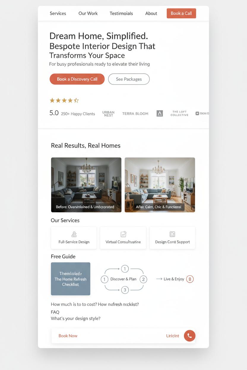
Think of your home page as the most welcoming front porch—airy whitespace, a clear headline that promises a specific outcome, and one unmistakable path to take next. In conversion-focused web design for a service business website, clarity is everything: lead with a tight value statement, name who you serve, and place a single primary call-to-action like “Book a discovery call,” with a softer secondary like “See packages.” Keep navigation light and skimmable, then layer trust right away—starred testimonials, recognizable client logos, certifications, and a few before-and-after mini case studies. Add a compact overview of your services, a simple three-step process graphic, and a short FAQ that removes friction. Sprinkle in a tasteful lead magnet (a checklist or mini guide) so visitors who aren’t ready to buy can still say yes, and make your contact or booking option sticky so it follows them as they scroll.
Design with generous, Pinterest-pretty polish, but prioritize speed and usability. A few practical UX UI tips: use a consistent color system where your primary button shade is unmistakable; keep typography large and legible with ample line height; give form fields labels on the outside and clear error messages; and keep forms short—name, email, one goal. Mobile is your default canvas, so test the thumb reach for CTAs, add click-to-call, and embed a calendar for instant scheduling. Performance is part of conversions too: compress images, lazy-load galleries, and avoid heavy scripts. For local services website design, include a map, hours, and consistent NAP details, and mark up services, reviews, and FAQs with schema for extra SERP sparkle.
If you’re building from scratch, start with wireframe templates to map the journey, then layer a cohesive UI kit so buttons, cards, and forms feel like a family. Speed your build with website templates or WordPress themes that support block editing and lightweight performance, and keep brand decisions tidy with a simple branding book covering palette, type, and voice. This approach is especially helpful in small business web design, where you want momentum without sacrificing polish. Iterate like a stylist: A/B test headlines, swap hero images, refine microcopy, and watch where visitors drop off. With each tiny upgrade, your service business website becomes a calm, confident guide that quietly converts.
UX UI Tips to Reduce Friction and Boost Leads
Think of your homepage as a tidy hallway that guides guests straight to the room they came to see. In services website design, the fastest way to reduce friction is radical clarity. Lead with a headline that says exactly what you do, for whom, and the transformation you deliver—no fluff. Pair it with a single, confident call-to-action (“Book a Consult” or “Get a Quote”) and keep the navigation peaceful: no more than five items, with Services, About, Portfolio/Results, and Contact front and center. Use generous whitespace, soft contrast, and scannable sections so busy visitors can skim. A quick grid of your top three offers with plain-English descriptions and friendly icons helps people self-select instantly, which is the heartbeat of conversion-focused web design.
Trust is your secret conversion engine on a service business website. Sprinkle social proof early and often—client logos, a short testimonial carousel with headshots, and one meaty before-and-after case snippet. Show your process as a simple three-step timeline (Inquiry → Proposal → Kickoff), and remove guesswork with “starting at” pricing or at least transparent ranges. Your form should be short and sweet—name, email, project type, and timeline—and always visible via a sticky button. Microcopy matters: reassurance like “No spam, ever” and “Replies within 1 business day” calms nerves and nudges action. Use color intentionally so the primary button is unmistakable yet on-brand. Little touches like micro-interactions (a soft hover, a subtle checkmark on form completion) give that “buttery-smooth” feel that keeps momentum going.
Don’t let tech trip you up. Speed and mobile are make-or-break for small business web design: compress images, lazy-load galleries, and test thumb-friendly tap targets. Keep headings descriptive for accessibility, and ensure every image has alt text. If you’re building from scratch, start with wireframe templates to map flow, then layer a cohesive UI kit and a branding book to keep fonts, colors, and tone consistent. Ready-to-go website templates or polished WordPress themes can fast-track a professional result without reinventing the wheel. These UX UI tips are simple, but together they create a friction-free path that turns curiosity into clicks—and clicks into clients.
Homepage Essentials for Services Website Design: Value Prop, Proof, CTA
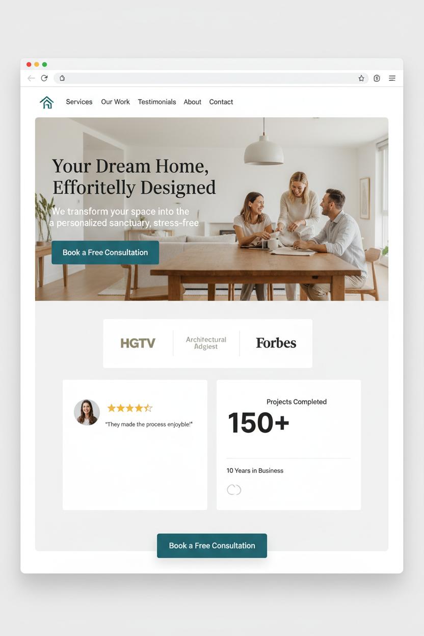
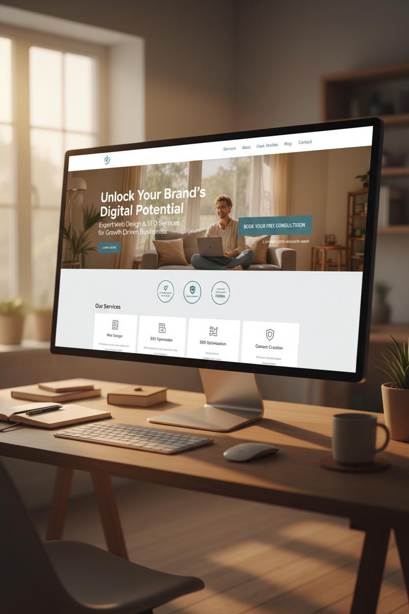
Your homepage is your handshake, your storefront window, and your best elevator pitch all in one—so start with a value proposition that makes visitors feel instantly understood. In services website design, the hero section should say who you help, what transformation you deliver, and how to get it, without jargon. Pair a clear one-liner with a warm subheading, a real-life photo or simple motion that shows the outcome, and a single, high-contrast button. Think of small business web design like styling a cozy entryway: tidy navigation, a standout headline, and a button that invites them in. If you’re DIY-ing, begin with website templates or WordPress themes to nail the layout, then refine with a UI kit and wireframe templates so your spacing, typography, and components stay consistent with your branding book.
Next comes proof—the cozy throw blanket that says “stay a while.” Stack quick signals of trust above the fold and throughout the page: logos, testimonial snapshots, star ratings, and bite-sized metrics like years in business or projects completed. Sprinkle in before-and-after visuals or a mini case study that shows process and results. For a service business website, credibility doubles as clarity; let clients speak in their own words and use captions that highlight measurable outcomes. A few gentle UX UI tips to weave in: use scannable headings with verbs, keep generous breathing room, make buttons larger on mobile, and maintain accessible color contrast. Place contact details in the header, add trust badges near forms, and don’t forget alt text for images that carry meaning.
Finally, guide the click with a confident CTA. One primary action—Book a Consult, Get a Quote, or Start a Project—should be visible in the hero and echoed as a sticky button as they scroll. Offer a softer secondary step like View Pricing, Download the Services Guide, or See Case Studies for browsers who aren’t ready yet. In conversion-focused web design, each section should resolve a doubt and point to the next step; keep forms short, confirm submissions with a friendly message, and follow with an onboarding email. Build it once with thoughtful structure, and your homepage quietly becomes a gracious host—welcoming, reassuring, and always ready to convert.
Service Pages That Sell: Offers, Pricing, FAQs, and CTAs
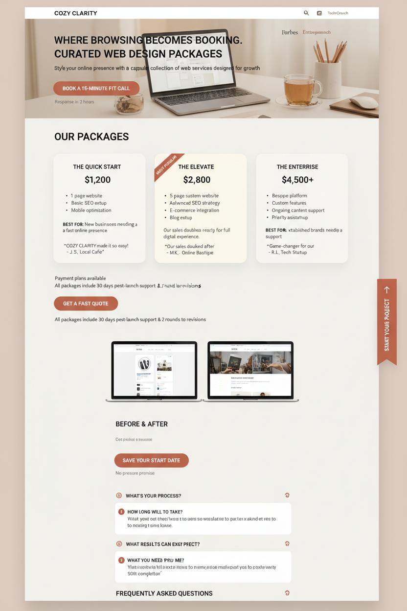
Your service page is where browsing becomes booking—the boutique shelf where you style your offers like a capsule collection. In services website design, lead with outcomes: name each package clearly, list deliverables with simple bullets or short lines, and add a one‑sentence “best for” note that helps visitors self‑select without overthinking. In conversion-focused web design, clarity sells, so don’t hide the numbers; use clean, comparable pricing cards with one “Most Popular” highlight, optional payment plans, and a quick note on what’s included after the project ends (support, revisions, handoff). Thread CTAs like little signposts—one above the fold, one after pricing, one after FAQs—with friendly microcopy: “Book a 15‑minute fit call,” “Get a fast quote,” “Save your start date.” Add a tiny reassurance beside them—response time, no-pressure promise, or a money‑back milestone—to lower the last inch of friction.
FAQs are your quiet closers. Think of every hesitation your client whispers to themselves—timeline, process, what you need from them, results, refunds—and answer in warm, candid language. Use a compact accordion so the page still feels airy and Pinterest-pretty, and sprinkle proof right where it matters: a short testimonial under each package, logos near the fold, and a before/after snapshot by the CTA. Quick UX UI tips: keep buttons consistent in color and copy, make one action primary, use roomy spacing around prices, and add a sticky “Start” ribbon on mobile so thumbs never hunt. If you’re DIY‑ing a small business web design refresh, sketch the layout with wireframe templates, then layer in a UI kit for buttons and badges; polish with website templates or WordPress themes that support pricing tables and accordions; and keep your voice on-brand with a simple branding book so your offers, visuals, and tone stay cohesive. Whether you’re launching a brand‑new service business website or refining one that’s almost there, the goal is cozy clarity: packages that feel curated, prices that feel honest, FAQs that feel seen, and CTAs that feel like an easy yes.
Plan Faster with Wireframe Templates and Content Priority
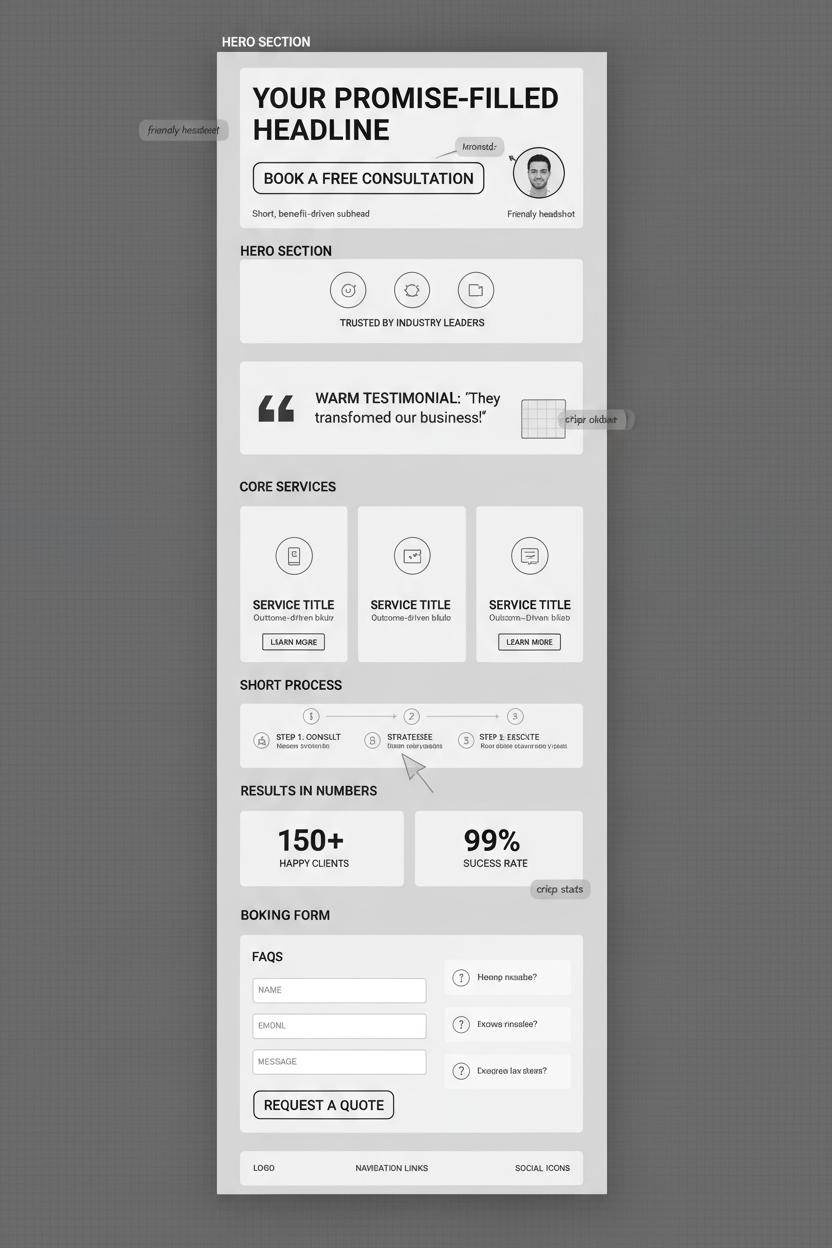
Before you pick colors or obsess over fonts, give yourself the gift of a quick sketch. Wireframe templates are like tracing paper for your ideas—they let you map content priority before anything gets precious. Start by choosing the single action you want a new visitor to take: book a call, request a quote, or purchase a package. Then let everything else support that decision. In services website design, hierarchy is everything. Lead with a promise-filled headline, place a clear primary button in the hero, and follow with proof that eases hesitation—logos, a testimonial, a short process, or a peek at results. This is the heartbeat of conversion-focused web design: remove guesswork, reduce friction, and make choosing you feel effortless. If you crave quick wins and smart UX UI tips, wireframes help you design flow instead of decoration.
Once the priorities are set, drag familiar building blocks into place using your favorite UI kit or website templates. Stack your frames like a story: promise, proof, offer, invitation. For a service business website, place your core services near the top with outcome-driven blurbs, tuck FAQs close to your booking form, and sprinkle trust marks where someone might hesitate. If you’re working in WordPress themes, start with a layout close to your plan so you spend time refining, not wrestling. Many small business web design projects move faster when the visual layer is just a skin over a strong content skeleton. Keep your branding book nearby to stay consistent with tone, color, and photography style; even in grayscale wireframes, label each block with the vibe it will carry later—warm testimonial, crisp stats, friendly headshot—so the final build feels cohesive.
Before you “go pretty,” test the wireframe in three ways: print it and do the squint test (is the CTA obvious?), open it on your phone (does the headline earn the scroll?), and read only the buttons (do they tell a story?). Trim anything that doesn’t help someone say yes. With clear content priority and simple wireframe templates guiding you, the jump from plan to polished becomes a smooth glide—and your service website begins working like a quiet, confident closer.
Local SEO, Reviews, and Trust Signals for a Service Business Website
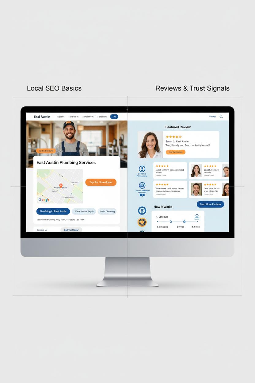
Local SEO is the cozy backbone of a service business website, quietly guiding nearby clients to your door while your visuals do the charming. Start with the basics: make your Name, Address, and Phone consistent everywhere and mirror them in your footer, contact page, and Google Business Profile. Embed a clean map near your primary call to action so people can see “you’re right here” and tap to get directions. Create simple, well-structured service-area pages—think “Plumbing in East Austin” or “Family Photography in Hoboken”—and weave in a few lifestyle photos, a short case study, and a local testimonial to keep it human. Use LocalBusiness schema to help search engines understand you, and link to those pages from your homepage with warm, descriptive microcopy. If you’re using WordPress themes or customizable website templates, look for built-in schema support and fast loading; sketch your layout with wireframe templates so your above-the-fold section, map, and reviews land exactly where attention peaks. In small business web design, every pixel should reduce friction.
Reviews and trust signals are your social proof bouquet—arrange them beautifully and make them impossible to miss. Curate a “featured review” with a face, location, and service type, then follow with a grid of stars, short quotes, and a button to read more. Layer in trust badges (certifications, associations, guarantees), friendly headshots, and a quick “how it works” timeline to melt hesitation. Bonus UX UI tips: use a soft background, generous white space, and a sticky “Call/Text” bar for mobile. Add Review schema for rich snippets, and let visitors filter testimonials by service or neighborhood. A tasteful UI kit helps keep testimonial cards, icons, and buttons consistent, while a branding book keeps your tone and color story aligned across forms, emails, and follow-ups. Many conversion-focused web design choices are pre-baked into modern WordPress themes; just refine them with your copy and imagery. For faster build-outs in services website design, start with a minimal website template, map your content with wireframe templates, then sprinkle in personality. The result is a service business website that feels local, looks trustworthy, and gently nudges visitors to book.
Brand Consistency: Create a Simple Branding Book for Your Site
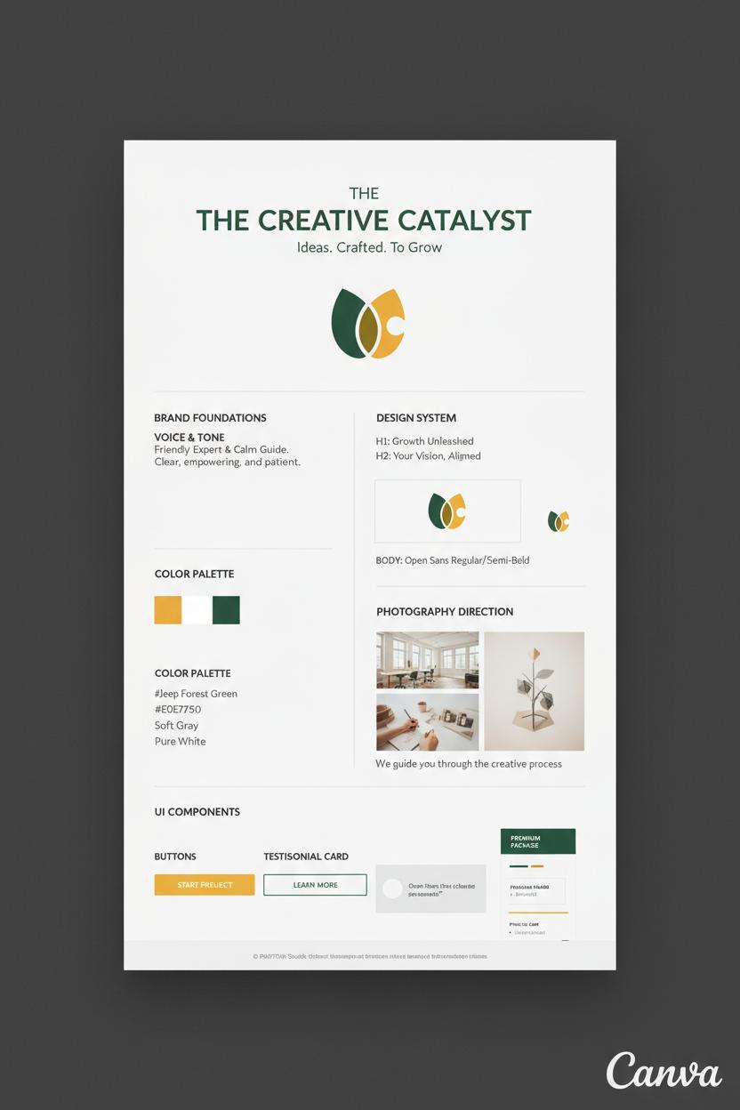
Think of brand consistency like the cozy signature of your studio—when someone lands on your pages, they should instantly feel they’re in your world. A simple branding book is your cheat sheet for that feeling, and it doesn’t have to be fancy or long. Capture your primary and secondary color palette (with HEX codes), two go-to fonts with sizes and weights, logo usage and spacing, photography direction (light, airy, bold, moody), and your voice notes—are you friendly expert or calm guide? Add button styles, hover states, icon sets, and how you treat testimonials and pricing. In services website design, this little guide keeps every decision aligned so your visuals, copy, and calls-to-action look and sound like you, every time.
Start with structure, then layer on style. Map pages with wireframe templates to plan flow, then pull a clean UI kit to define components and spacing so everything snaps together. If you’re using website templates or WordPress themes, choose ones with global styles so changes happen once and ripple sitewide. For conversion-focused web design, commit to one hero layout, two button styles (primary and ghost), and one CTA color that contrasts beautifully. Keep to two typefaces, a 4–6 step type scale, and 2–3 brand colors plus a subtle neutral. A few quick UX UI tips: check contrast ratios, keep line lengths readable, give buttons generous padding, and make form fields friendly on mobile.
Package it all in a one-pager: your branding book can live in Canva or a shared doc with swatches, fonts, sample headlines, CTA copy, image examples, and do/don’t notes. Drop in a mini component library—cards, badges, FAQs—so your service business website can be built fast and on-brand, whether you’re using a designer or DIY-ing small business web design. If you like mood boards, add a row of “approved” textures and backgrounds to keep that Pinterest-polished vibe. Using website templates? Paste your styles before you touch layouts. Working from a UI kit? Rename components to your brand terms. The result is a site that feels cohesive, intentional, and trustworthy—because every pixel is doing its job. That’s the quiet power of a clear brand guide built to convert.
Launch Checklist and Ongoing Optimization for Services Website Design
Before you hit publish, walk through your services website design like a guest in a beautifully styled home: is the path clear, the lighting warm, and the invitation obvious? Start with messaging—your headline should promise a result, your subhead should reassure, and every service page needs a single, obvious CTA with a thank-you page tied to conversions. Test forms, calendars, and chat on mobile first, add UTM tags to primary buttons, and connect Google Analytics and Search Console. Do a quick SEO and accessibility sweep: unique title tags and meta descriptions, H1/H2 structure, descriptive alt text, good color contrast, and focus states for keyboard navigation. Check speed with compressed images and lean scripts, add favicon and Open Graph images for pretty shares, and map 301 redirects from any old URLs. Don’t forget local schema for your service business website, testimonials and case studies for social proof, and legal pages (privacy, terms, cookies) tucked neatly into your footer.
The first 30 days after launch are for gentle, data-led polishing—the heart of conversion-focused web design. Set weekly checkpoints to review heatmaps and session recordings, spot friction on key funnels, and A/B test one element at a time: hero headline, primary CTA color, service package names, or pricing anchors. Add FAQs to reduce hesitation, place trust badges near forms, and sprinkle microcopy where users pause. Watch your top exit pages, improve internal links, and create a seasonal content plan so your small business web design stays fresh—think new blog posts, location pages, or a simple lead magnet that captures emails before a user bounces. Keep an eye on Core Web Vitals, run regular backups and updates, and invite recent clients to drop reviews you can feature on-page.
If you love a toolkit, start with wireframe templates to sketch flows, then layer a cohesive UI kit to keep buttons, forms, and icons consistent. Pair clean WordPress themes or flexible website templates with your branding book so typography, color, and tone stay on-brand across every service page. These UX UI tips make iteration easy: swap imagery based on performance, refine microinteractions for delight, and document learnings as you go. Your site isn’t a one-and-done; it’s a living portfolio that grows more persuasive each month.
Conclusion
Wrap up: With thoughtful services website design, your service business website can feel welcoming and work hard behind the scenes. Blend conversion-focused web design with clear copy, trust signals, and simple paths to book. Use small business web design best practices and UX UI tips: consistent branding, readable fonts, fast pages, and mobile-first layouts to guide visitors gently to yes. Start small: refresh a hero, tighten your offer, polish your CTA. Brew a coffee, make one improvement today, and watch clients find and choose you.