Ready to turn scrolls into sales? In this guide to creative digital ads that convert, you’ll get ad design tips that boost conversion marketing across social media advertising and beyond. Whether you’re new to digital marketing or leveling up, discover swipe-stopping layouts, magnetic copy, and thumb-stopping visuals using Canva templates. Pair these strategies with your favorite digital marketing book, a practical Facebook ads guide, a focused marketing planner, and even a crisp ring light for DIY shoots. Let’s craft creative ads that attract, engage, and convert—beautifully and predictably.
Creative Digital Ads That Convert: Why Design Matters in Digital Marketing
Design is the quiet salesperson in your digital marketing—often invisible when it’s working, painfully obvious when it isn’t. In a feed that moves faster than fresh latte art, creative ads have to earn a pause with a single, crystal-clear idea: What’s in it for me? Strong visuals spark emotion, but clarity drives action; the magic happens when color, typography, imagery, and microcopy all point to the same promise. Think of your ad like styling a vignette on a shelf: fewer pieces, better light, and a confident focal point. That’s the heart of conversion marketing—removing friction so people can say “yes” without thinking too hard.
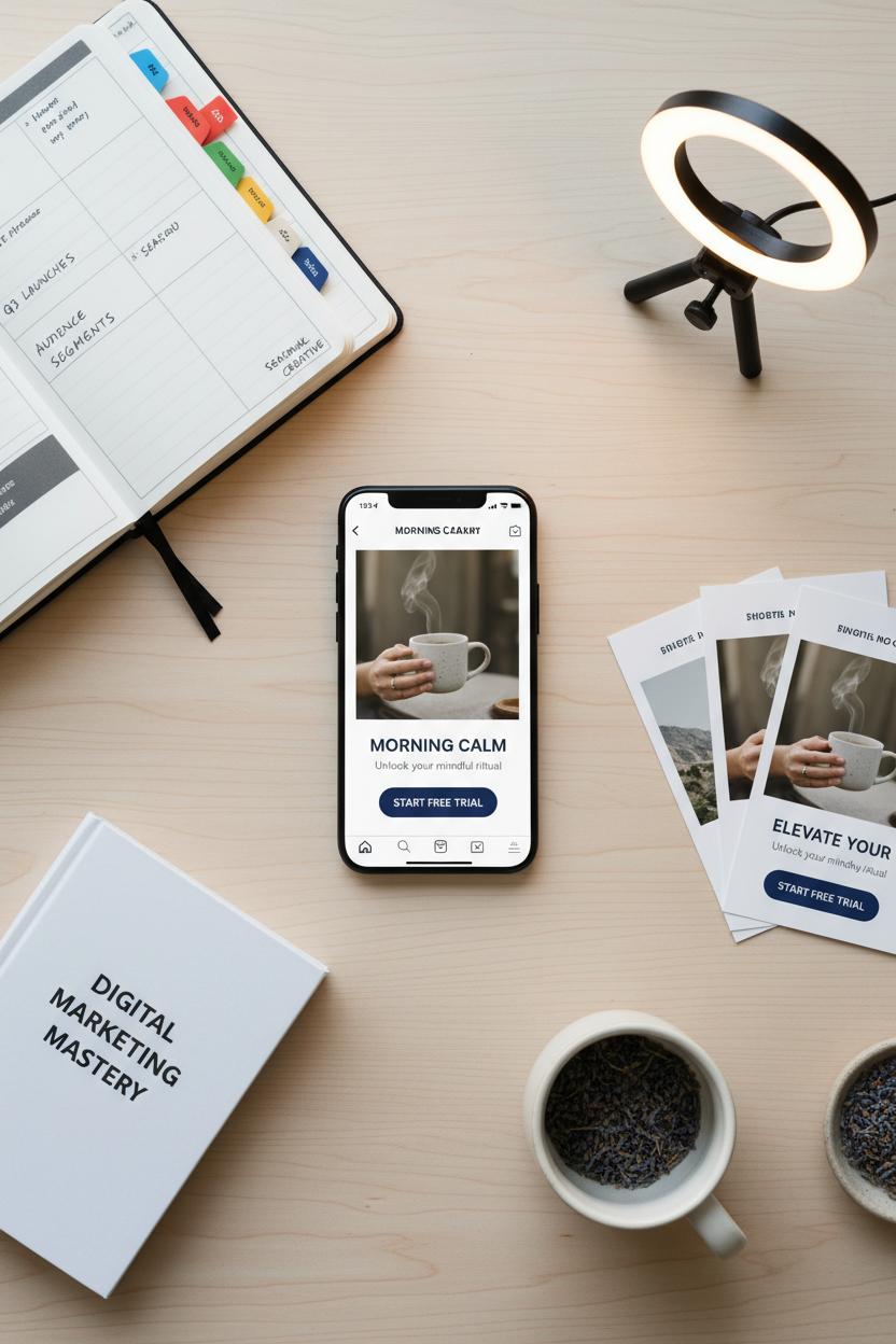
Here are the ad design tips I come back to again and again. Lead with one focal image (a face, a hand using the product, or a bold shape), then build hierarchy with scale and contrast so the eye naturally travels headline → benefit → call-to-action. Use generous white space; it creates calm and makes buttons pop. Choose a color from your brand palette with enough contrast for legibility, then add motion thoughtfully—subtle movement or a three-frame GIF can be more thumb-stopping than busy edits. Remember that most social media advertising is sound-off, so layer captions and short, benefit-first overlays. Design mobile-first, checking crops for Reels, Stories, and Pins; what’s centered in a square may vanish in 9:16. Batch variations and test—same headline, three images; or same image, three headlines. Canva templates are lifesavers for quick, on-brand iterations, and a simple ring light can elevate your UGC-style videos from dim to delightful in minutes.
Behind the scenes, stay organized. A marketing planner helps you map launches, audiences, and seasonal creative so your ads feel timely, not random. Keep a swipe file and study what you save—notice palettes, type pairings, negative space, and how they frame the offer. If you want to go deeper, a solid digital marketing book or a focused Facebook ads guide can demystify placements, objectives, and optimization so your design choices align with platform behavior. In the end, great creative ads are just good empathy made visible: you’re showing the right person the right solution in a way that feels effortless. When your design does that, clicks become customers—and that’s the whole point.
The Fundamentals of Conversion Marketing: Ad Design Tips That Drive Clicks
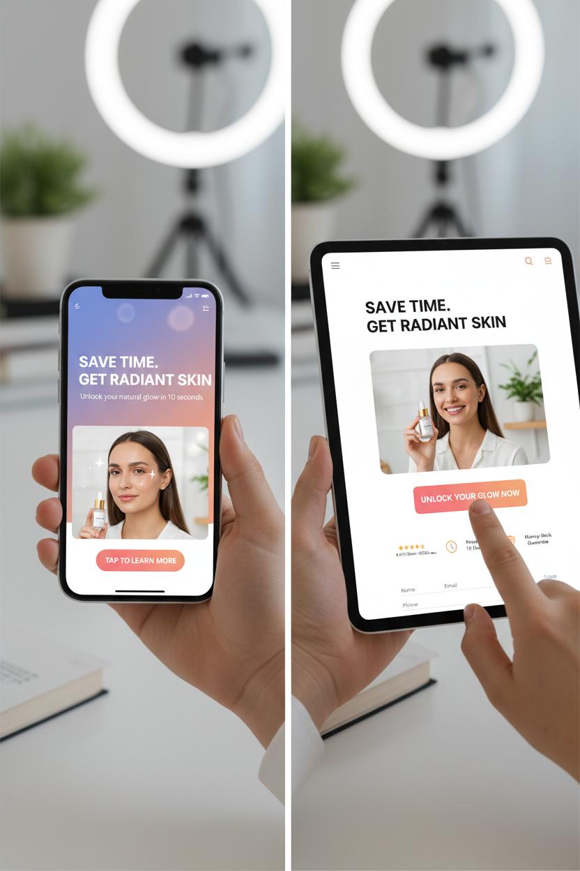
Think of conversion marketing as the art of guiding a busy, scrolling thumb toward a single, irresistible action. Start with clarity: one promise, one image, one button. Your headline should deliver the benefit in a heartbeat—save time, feel confident, look amazing—while the visual makes that promise feel tangible. Use crisp hierarchy so the eye knows exactly where to land: bold headline, supportive subhead, then a clean call-to-action. Give everything breathing room; whitespace is not wasted space, it’s focus. Color and contrast matter, too—let your brand palette shine, but make sure the CTA pops like a friendly nudge. For video, hook within the first second, design for sound-off with captions, and keep scenes tight and bright; a simple ring light can turn a dim demo into a thumb-stopping moment.
On social media advertising, craft creative ads that feel native to the feed. Crop close, highlight faces and hands-in-action, and favor snackable loops that show a quick before-and-after or a tiny transformation. Carousels are perfect for mini-stories: problem, promise, proof, and a tap-forward CTA. Keep copy short and scannable, but don’t be afraid of personality—warm, descriptive language builds craving. Then, keep the path friction-free. Match the ad’s headline, imagery, and color to the landing page so the click feels like a continuation, not a detour. Load fast, simplify forms, and surface social proof early—reviews, star ratings, or a quick stat that whispers “you’re in good hands.” That’s the essence of smart digital marketing: every pixel doing a polite, purposeful job.
Finally, build a steady rhythm for testing and iteration. Use ad design tips like “one change at a time” to A/B test your hook, image, or CTA, and track CTR, CPC, and CPA so you know what actually moves the needle. Canva templates make quick variations effortless, while a marketing planner keeps your creative calendar tidy. If you’re leveling up, a trusted digital marketing book or Facebook ads guide can sharpen your strategy between campaigns. The goal isn’t just clicks; it’s confidence—knowing your visuals, words, and structure are working together to turn curiosity into action, again and again, with conversion marketing baked into every frame.
Copy Meets Design: Headlines, CTAs, and Ad Design Tips for Clarity

When copy and visuals hold hands, your message gets crystal clear. Start with a headline that earns the scroll: short, specific, and benefit-first so people instantly know what’s in it for them. Think of it as your ad’s thesis statement—answer the “why now?” in seven words or less, and let the subhead add a juicy detail or proof point. In social media advertising, your first line has to do heavy lifting on tiny screens, so trim fluff, ditch jargon, and echo the language your audience actually uses. If you’re stuck, flip through a favorite digital marketing book or Facebook ads guide for formulas that turn blah into bite-sized clarity.
Your CTA should be a door, not a maze. Choose one action per ad—Shop Now, Download, Book a Call—and pair it with a tiny value hint so it feels like a reward, not a chore. “Get the Checklist” beats “Learn More” because it names the prize. Design-wise, make the button a clear focal point: high-contrast color, generous padding, rounded corners if your brand skews friendly, and enough white space so it breathes. Keep visual hierarchy simple: headline first, product or hero visual second, CTA third. For creator-style shots, a ring light and a clean background make faces bright and clickable, which matters when you’re building trust with conversion marketing.
Clarity is also about layout rhythm. Aim for 80% visual, 20% text in most creative ads, and make sure the headline is legible at arm’s length. Use directional cues—a model’s gaze toward the button, an arrow, or a diagonal product angle—to guide eyes naturally. Save room at the top and bottom for platform UI so nothing essential gets cropped. If design isn’t your superpower, Canva templates can jumpstart consistency across formats while you swap in brand fonts and colors in minutes.
Finally, test like a scientist but iterate like an artist. A/B test one thing at a time—headline, then image, then CTA—and log results in your marketing planner so winners become your new baseline. Tag on microproof (a star rating, a quick testimonial snippet) to nudge confidence. That’s the sweet spot of digital marketing: clear copy, clean design, and ad design tips that turn social media advertising into steady, scalable results.
Brand Consistency at Scale: Building Reusable Creative with Canva Templates
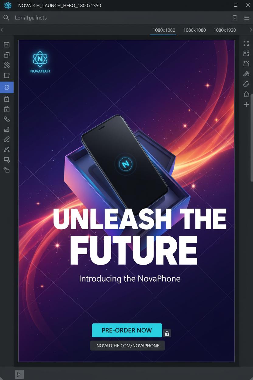
When you’re juggling multiple campaigns, platforms, and product moments, Canva templates become your quiet superpower for keeping everything on-brand without starting from scratch every time. Build a small family of reusable layouts that reflect your brand’s signature: one bold “hero” design for launches, a clean “promo” design for sales, and a lighter “community/UGC” design for everyday storytelling. Set your Brand Kit first—primary and accent colors, headline and body fonts, logo lockups—then bake that DNA into each template with consistent margins, a simple grid, and a repeatable type scale so headlines, subheads, and captions always snap into place. Add locked layers for your logo and CTA bar, define safe zones for vertical placements, and use Magic Resize to spin one concept into 1080×1080, 1080×1350, 1080×1920, and 1200×628 in minutes. It’s one of those ad design tips that feels tiny but changes everything: your creative ads suddenly look related, trustworthy, and scroll-stopping across social media advertising without a pixel out of place.
For the day-to-day, treat your Canva templates like a living system. Keep image frames ready for product close-ups and UGC, placeholder text with character counts for short, punchy hooks, and a mini style note inside the file that reminds you of tone and color rules. Batch your refreshes by season—swap a background texture, rotate an accent color, drop in new photography—and your feed evolves without losing continuity. A simple marketing planner or naming convention keeps versions tidy, while a ring light and the same editing preset protect your visual mood from shot to shot. Then plug the creative into your conversion marketing workflow: duplicate a template to test two hooks or two CTAs, tag the files by audience, and track performance. It’s digital marketing made human—thoughtful, consistent, repeatable. If you like deeper dives, a practical digital marketing book or a focused Facebook ads guide can help you map these layouts to funnel stages and placements. But even with just a few well-built Canva templates, you’ll feel the lift: faster production, clearer branding, and creative ads that quietly do more of the selling for you.
Platform Playbook: A Practical Facebook Ads Guide for Designers and Marketers
Think of Facebook and Instagram ads as your tiny moving mood boards: they still need a big idea, just distilled to a thumb-stopping first second. Start by choosing an objective that matches your end game—if you want sales, pick conversions, not traffic—and make sure your pixel and conversion events are set before you design a single tile. For targeting, keep it simple. Broad audiences work surprisingly well now, and you can layer in lookalikes from purchasers and website visitors to power your conversion marketing. Warm retargeting is your second act: recent site visitors, video viewers, and engaged users get creative that assumes a little familiarity and nudges them over the line.
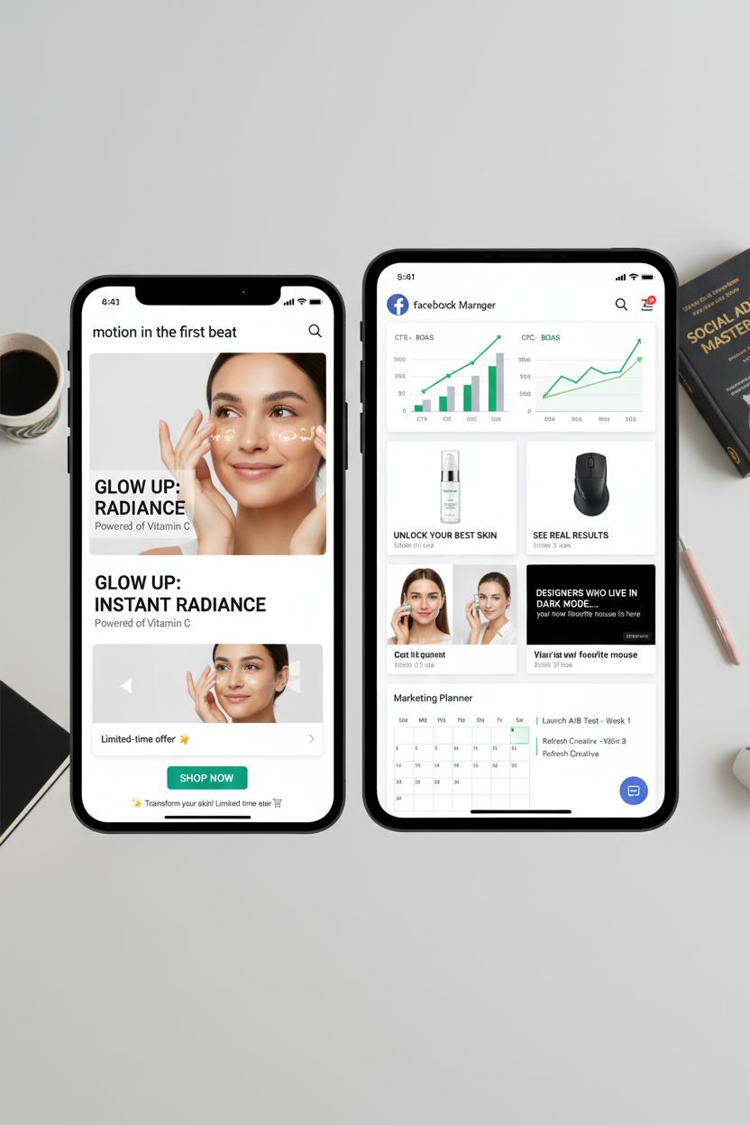
Design for the feed your audience actually sees. Go mobile-first with 1:1 or 4:5 assets, keep key elements in safe zones, and punch up contrast so your brand color sings against the scroll. Motion matters—aim for 6–15 second videos, captions on, with movement in the first beat. Show the product in use, then the payoff; faces, hands, and quick cuts feel native to social media advertising and often outperform studio-perfect scenes. If you’re filming UGC, a ring light helps without killing the lived-in vibe. Stills can still win: crisp product close-ups, a bold benefit line, and a single, clean call-to-action. Canva templates make rapid variant testing easy when you want to trial different backgrounds, crops, or headline treatments without rebuilding your layout from scratch.
Keep copy breezy but purposeful. Lead with the benefit, follow with a proof point, and wrap with one clear CTA. Short primary text plays best on mobile; save the storytelling for a carousel or landing page. Headlines under 40 characters pop; emojis are seasoning, not the dish. Creative ads that call out the audience—“Designers who live in dark mode…”—earn attention, while social proof and a gentle urgency nudge clicks.
Finally, test like a designer and think like digital marketing. Launch 3–5 creative variations, watch CTR, CPC, and CPA/ROAS, and pause anything that drifts while you scale the winners. Refresh every couple of weeks to fight fatigue. A simple marketing planner keeps ideas, dates, and insights tidy, while a solid Facebook ads guide or digital marketing book can sharpen your ad design tips between launches.
Plan Like a Pro: Campaign Calendars, Budgets, and Your Marketing Planner

Before you design the next batch of creative ads, cozy up with your calendar and plan the story your audience will follow. Start by sketching a simple campaign calendar: anchor it to real moments—product drops, holidays, or that seasonal mood your brand owns—and map each week to a funnel stage so your digital marketing doesn’t shout all at once. Think awareness pins and Reels early, testimonials and guides mid-campaign, then irresistible offers when it’s time to seal the deal. I like to batch assets: one afternoon for product shots (a small ring light makes video smoother and colors truer), one for UGC snippets, and one for graphic variations built from Canva templates so everything stays on-brand. Tuck your copy angles into the calendar too—three headlines per concept keeps your ad design tips actionable when you sit down to build. It’s Pinterest-board energy, but with a production schedule.
Now give your budget the same gentle structure. Start with your conversion marketing goal—what a lead or purchase is worth—and reverse-engineer daily caps from there. Allocate a test slice (think 20–30%) to audition formats in social media advertising: Story vs. Feed, static vs. motion, short-form vs. carousel. Flight your spend around key dates, but leave breathing room to boost surprise winners. Name each ad set cleanly, track UTMs, and watch your cost-per-result glide downward as you pause slowpokes and scale top performers. It’s not fussy; it’s freedom—because when you know your numbers, your creative can play.
Finally, make your marketing planner a ritual, not a relic. On Mondays, set micro-goals; midweek, note what’s resonating; Fridays, highlight learnings to roll into next week’s tests. Keep a “swipe file” plus a tiny resource shelf: a digital marketing book for big-picture strategy, a Facebook ads guide for platform quirks, and a folder of ready-to-edit Canva templates so you can spin variations in minutes. When your calendar, budget, and planner hum together, your creative ads feel intentional, your social feeds look cohesive, and your results compound—proof that a little upfront planning turns ad design tips into dependable performance.
Inspiration and Learning: Must-Read Digital Marketing Book Recommendations

When you’re ready to level up your digital marketing brain, a small stack of smart, dog‑ear‑worthy reads can spark big ideas for creative ads that actually sell. Start with Contagious by Jonah Berger for a masterclass in why people share, then flip through Made to Stick by Chip and Dan Heath to learn how to distill ideas into clear, memorable messages that travel beautifully in social media advertising. Pair those with Building a StoryBrand by Donald Miller to tighten your brand’s narrative and guide viewers toward action—a quiet superpower in conversion marketing. For timeless ad design tips that never go out of style, Ogilvy on Advertising is like coffee with a legend, while Scientific Advertising by Claude Hopkins brings a test‑and‑learn mindset that keeps every headline, color choice, and call‑to‑action focused on measurable results. Each digital marketing book here nudges you from “pretty” to “profitable,” helping you translate inspiration into ads that click, cart, and convert.
To turn reading into results, create a cozy little workflow. Keep a marketing planner nearby and jot bite‑sized experiments as you read—one tweak per campaign, one test per week. If you’re running paid social, a straightforward Facebook ads guide can help you apply the principles to targeting, creative rotation, and budgeting without the overwhelm. When you’re ready to mock up concepts, drop your headlines and hooks into Canva templates for quick, on‑brand iterations you can A/B test across platforms. Shooting simple video? A ring light adds that crisp, scroll‑stopping glow, even in late‑night “content sprint” lighting. Treat each chapter like a creative brief: pull a single insight, adapt it to your audience, and ship something small today. Over time, these little habit stacks—good books, clear notes, clean design, steady testing—become your secret engine for ad design tips that feel fresh and intentional. You’ll notice the shift: fewer random guesses, more grounded creative choices, and a feed full of social media advertising that quietly does the heavy lifting for your brand.
Accessibility and Compliance: Inclusive Ad Design Tips That Build Trust

Accessibility isn’t just a checkbox—it’s an invitation. When your creative ads are easy to read, hear, and understand, you’re quietly telling people, “You’re welcome here.” That kind of care builds trust, and trust fuels conversion marketing. In a noisy digital marketing world, inclusive choices are a soft spotlight on your brand’s integrity: clear captions on a quick reel, color contrast that’s kind to tired eyes, and copy that doesn’t make people work to get the point. Think of accessibility as the warm, human layer that turns clever visuals into connections that last.
A few grounding ad design tips: start with contrast and scale. Choose palettes with ample light–dark separation and lean into generous font sizes and line spacing so your message breathes on small screens. Keep text-in-image minimal and crisp, and skip all-caps blocks that blur together. Always caption videos—burned-in subtitles in vertical formats are ideal for social media advertising—and avoid auto-playing audio. Add alt text that describes meaning, not just appearance (“Smiling barista handing over a reusable mug” beats “person with cup”). Make CTAs short and direct with action verbs, and ensure buttons are big, tappable, and surrounded by whitespace. Avoid flashing effects, and be mindful of motion; subtle, steady movement is easier on everyone. Show inclusive imagery and language that reflects a variety of ages, abilities, and cultures—representation signals that you see your audience.
Tools make it easier to bake accessibility into your routine. Start with Canva templates that use high-contrast colorways and accessible type pairings; tweak them to meet platform safe zones. If you film, a simple ring light brightens faces for clearer lip-reading and crisper captions. On Meta platforms, add alt text and captions natively; a quick skim of a Facebook ads guide can reveal hidden settings that help. Keep a tiny compliance checklist in your marketing planner—contrast check, captions on, alt text added, plain-language CTA—so nothing slips when you’re moving fast. If you love deeper dives, a well-reviewed digital marketing book can unpack WCAG basics and ethical data practices that reinforce trust beyond the click. The result? Creative ads that feel considerate, compliant, and conversion-ready—proof that accessibility isn’t extra polish; it’s the path to performance.
Metrics That Matter: Measuring Creative Ads in Digital Marketing

Before you hit publish, give your creative ads a cozy reality check: what will you measure, and what will signal that your story is landing? In digital marketing, metrics aren’t cold numbers; they’re little postcards from your audience telling you what made them pause, click, and buy. Start with attention metrics that reflect your ad design tips in action—the “thumb-stop” moment. Look at 2–3 second video views, hook rate, and scroll-stopping clicks. Then peek at engagement that shows emotional stickiness: saves, shares, comments, and message replies in social media advertising. If people are pinning, saving, or sharing to a friend, your concept is traveling beyond the first impression.
Next, layer in performance signals that guide conversion marketing. CTR shows how tempting your creative is; CPC and CPM tell you how efficiently you’re buying attention; cost per view helps benchmark video. On-site, match the mood of your ad to the landing page and watch bounce rate, time on page, and scroll depth—misalignment here is where beautiful creative quietly leaks results. Mid-funnel metrics like add-to-cart, lead form completion, or quiz finishes reveal whether curiosity becomes intent. And your north stars: conversion rate, CPA, and ROAS, with an eye on average order value and eventually LTV to know if that stunning carousel actually builds a sustainable business.
Treat optimization like a gentle weekly ritual. A/B test one element at a time—hook line, first three seconds of footage, headline, color palette, or call-to-action—and tag everything with UTMs so your insights don’t get lost. Watch frequency and creative fatigue; when costs creep and engagement softens, refresh the first frame or swap in new testimonials. Keep a simple marketing planner to log hypotheses and results, lean on Canva templates for fast iterations, and use a ring light for crisp, flattering video that lifts watch time. If you want a deeper dive, a solid digital marketing book or a practical Facebook ads guide can sharpen your decisions. The secret is a warm blend of art and evidence: let your visuals enchant, let your metrics whisper back, and keep polishing until the story and the numbers glow together.
Conclusion
Pin this for later: great digital marketing starts with empathy, scroll-stopping visuals, and clear calls to action. Mix bold branding with whitespace, mobile-first layouts, and snackable copy, and let social proof shine. Test, tweak, and A/B again—because creative ads become winners through iteration. Use these ad design tips across social media advertising to meet your audience where they already linger, and let conversion marketing be your compass. Brew a coffee, open your design file, and craft the ad that feels like a friendly nudge—and converts like a charm.