Ready to turn scrolls into clicks and clicks into customers? These digital marketing design tips distill what actually converts—from landing page design that guides the eye to brand identity that wins trust. Learn how to craft ad creative that stops the feed and social media graphics that spark saves and shares. We’ll show simple frameworks, power tools like Adobe Creative Cloud, and quick wins using brand color swatches (yes, palettes matter). Whether you’re DIY-ing with a favorite graphic design book or shooting with a ring light, get designs that sell—beautifully.
Digital Marketing Design 101: What Makes Visuals Convert
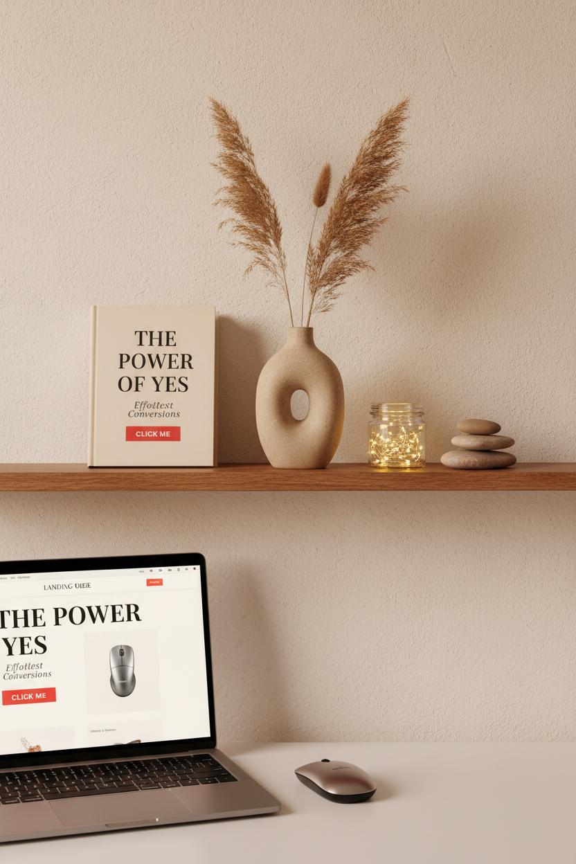
The secret behind visuals that actually convert is a blend of clarity, emotion, and consistency—the cozy trifecta of digital marketing design. Think of your image or layout like a well-styled shelf: one focal point, a few supporting details, and plenty of breathing room. Start with hierarchy that guides the eye: bold headline, compelling subhead, and a single, irresistible action. Contrast is your best friend—light against dark, soft texture beside crisp type—so your message pops even on a busy feed. And don’t underestimate authenticity; warm, real-life photography (a quick shoot with a simple ring light works wonders) paired with honest copy can feel like a friendly nudge instead of a hard sell.
Consistency is where conversions get compounding. When your brand identity is steady—colors, type, and tone aligned across landing page design, ad creative, and social media graphics—people recognize you at a glance and trust you faster. Keep brand color swatches within reach and use them intentionally: a neutral base, a signature hue for highlights, and a high-contrast button that sings “click me.” For landing pages, place your promise and proof above the fold, keep forms minimal, and use subtle directional cues (a product angle, a gaze line) pointing to your CTA. For ad creative, focus on one promise, one product, one path. And for social media graphics, think small-screen first: legible fonts, tight crops, and motion used like seasoning, not sauce. Tools help here—mock up variations in Adobe Creative Cloud, or flip through a favorite graphic design book for layout cues that just work.
Finally, treat every design like a friendly experiment. Test two headline treatments, swap a lifestyle image for a crisp product flat lay, nudge a CTA from muted to high-contrast. You’ll feel the difference in your click-throughs. Keep your workflow comfy and fast—a wireless mouse that glides, organized file names, reusable templates—and your creative energy stays high for the ideas that matter. Conversion-ready visuals aren’t loud; they’re clear, cohesive, and confidently simple, inviting your audience to say yes with as little friction—and as much delight—as possible.
Social Media Graphics That Stop the Scroll
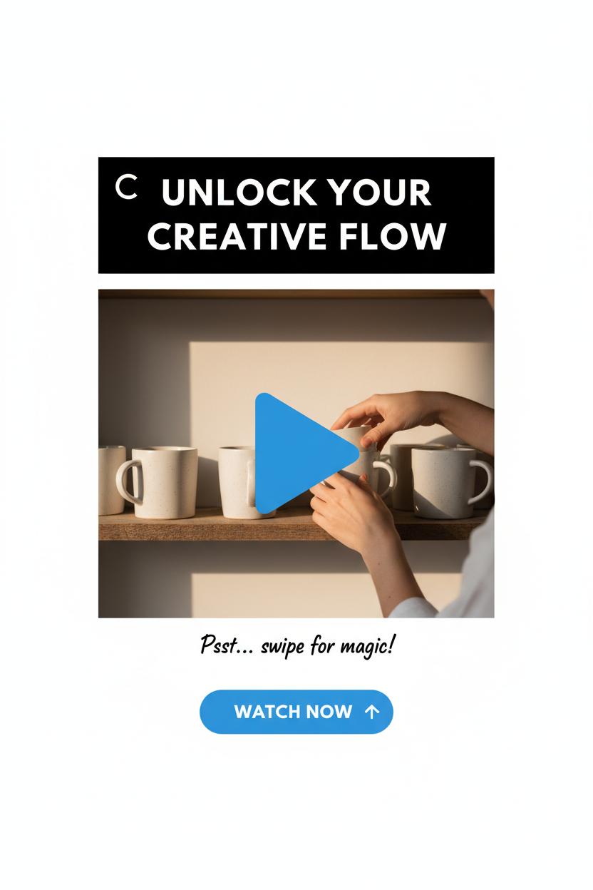
When I’m crafting social media graphics that truly stop the scroll, I treat each frame like a tiny billboard for my brand identity—clean, bold, and unmistakably me. Start with a single, magnetic focal point: a hero image, a punchy hook, or a striking color block pulled from your brand color swatches. Then build out the supporting cast with airy negative space, high-contrast type, and microcopy that winks at your audience. A smart blend of movement and stillness helps, too—think subtle animation, a looping product spin, or a quick before-and-after that whispers “save this.” The most effective ad creative borrows from good storytelling: show the problem, reveal the solution, and give the eye an easy path to the call-to-action. Bonus points if your CTA and visual style echo your landing page design, so the journey from tap to conversion feels seamless.
I like to keep my workflow as intuitive as the final look. I’ll open Adobe Creative Cloud, drop in pre-sized templates for each platform, and snap elements along generous margins so captions and buttons never get covered. A soft-lit photo makes all the difference—prop your phone on a stack of books, flip on a ring light, and capture textures, hands-in-frame moments, or gentle motion that feels human and lived-in. When I’m nudging pixels, a wireless mouse makes those tiny alignments feel effortless, and I’ll often flip through a favorite graphic design book to spark unexpected layout ideas. Keep a folder of evergreen assets—logo variations, background textures, icon sets—and name everything clearly so you can remix designs in minutes rather than hours.
Most importantly, let your social pieces braid into your bigger digital marketing design strategy. Reuse typography and palettes so people recognize you mid-scroll, and test a few headline variations across your social media graphics to see which earns the saves and clicks. Think in mini-series: a carousel that teaches, a short reel that demos, a static cover for consistency. Track what people engage with, then refine your ad creative and landing page design to mirror what the audience already loves. When the visuals feel warm, intentional, and unmistakably on-brand, the scroll slows—and that’s where connection (and conversion) begins.
Color That Converts: Using Brand Color Swatches Consistently
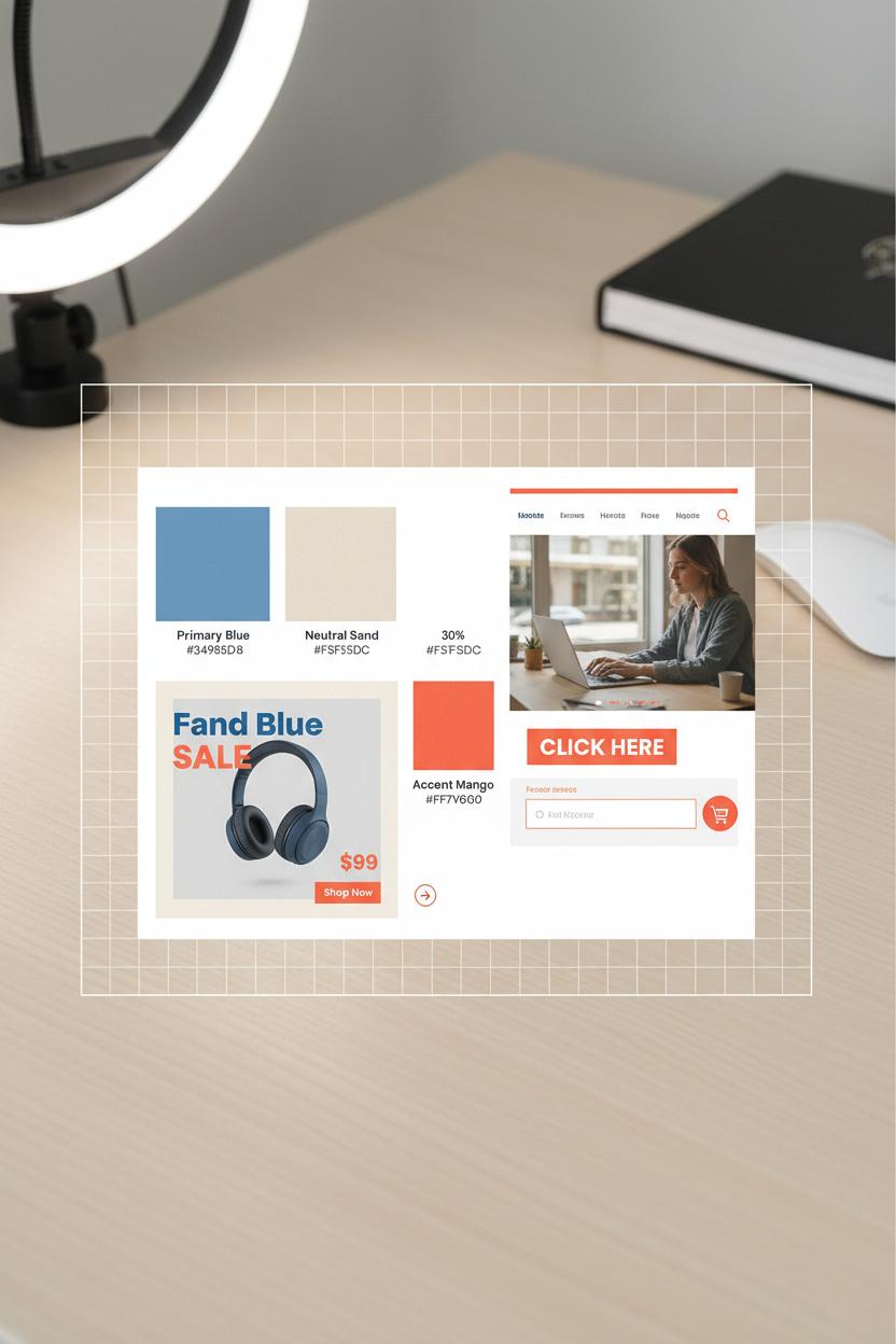
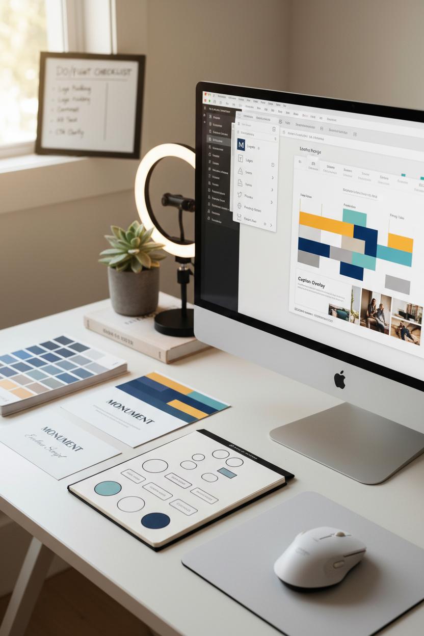
Color is the first handshake your brand offers online, and consistent brand color swatches make that greeting feel confident every single time. Think of your palette as a portable mood board: a dependable primary, a trustworthy neutral, and one lively accent that shouts “click me” without screaming. In digital marketing design, that 60-30-10 balance (dominant, secondary, accent) keeps everything cohesive—from a buttery neutral background that lets product photos shine, to a punchy coral or inky navy reserved only for calls to action. The magic isn’t just aesthetic; it’s behavioral. When your audience learns that your accent shade equals action, they’re primed to convert faster, because your brand identity is training them what to notice.
Carry those decisions through every touchpoint. In landing page design, keep the hero image calm and let the CTA pop in your accent; echo that color in form fields, badges, and sticky bars for a subtle rhythm. For ad creative, thread your palette through borders, headline highlights, and price tags so users instantly connect the ad to the page they land on—no color whiplash, no second-guessing. On social media graphics, lock in templates where the accent color marks buttons, arrows, and key stats; reserve your secondary for backgrounds or frames, and avoid letting it compete with the CTA. Always check contrast ratios so your text and buttons are legible; high contrast boosts both accessibility and conversions, especially on mobile.
Make consistency effortless with tools and tiny habits. Store hex values and naming conventions (Primary Blue, Accent Mango, Neutral Sand) in Adobe Creative Cloud Libraries so your team can pull the same hues across apps. Export a quick style tile and keep it with your campaign briefs; a one-page guide beats guesswork. If you’re brushing up on color psychology, a solid graphic design book can sharpen your instincts on complementary and analogous palettes. Shooting content? A ring light helps your colors look true in photos and videos, and a trusty wireless mouse makes pixel-perfect color picking less of a chore. Most important: protect the accent. Use it sparingly and consistently across ads, emails, and pages, and watch how recognition turns into clicks, and clicks turn into conversions—proof that color, used with intention, is your quietest, strongest closer.
Tools of the Trade: Adobe Creative Cloud and a Reliable Wireless Mouse
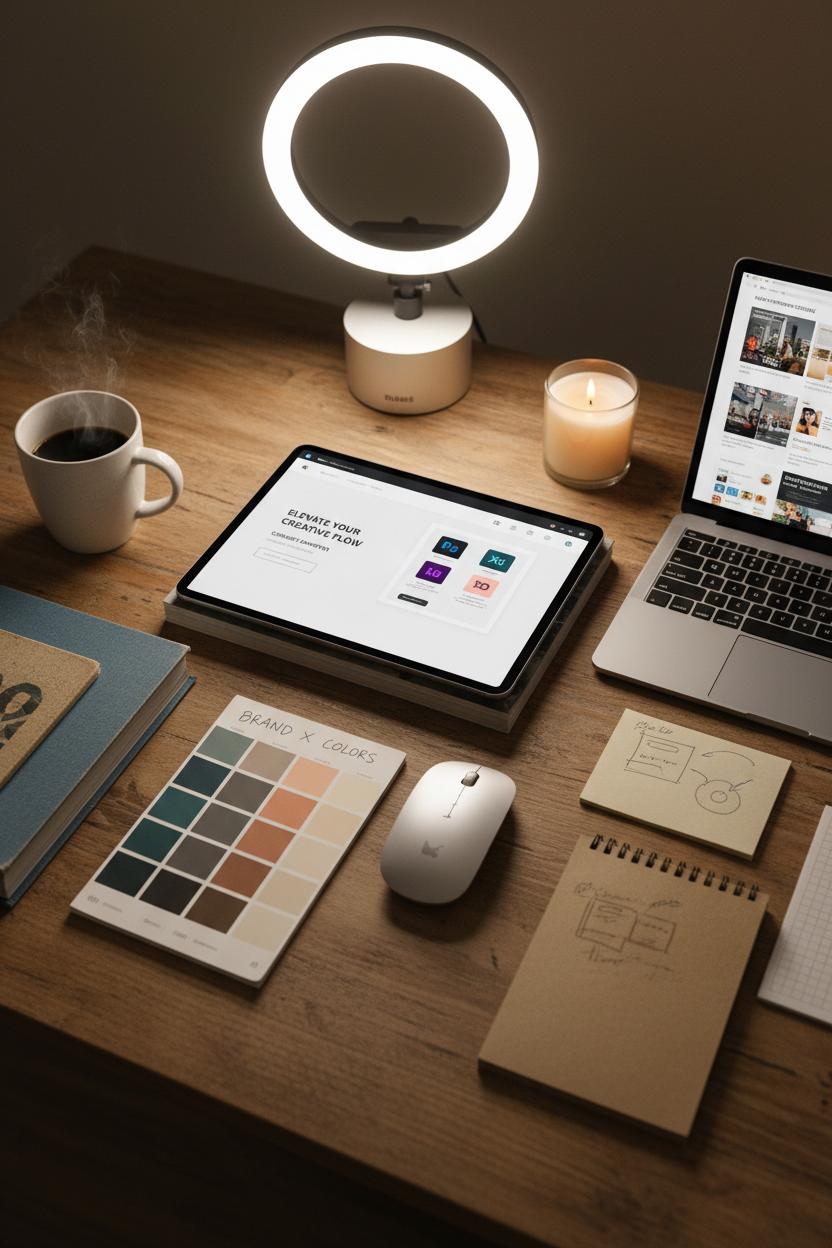
There’s a kind of calm that settles in when your toolkit is dialed in—like lighting a favorite candle before getting into digital marketing design. For me, it starts with Adobe Creative Cloud. Hopping between Photoshop for photo polish, Illustrator for crisp icons, and XD for wireframes keeps the flow seamless, especially when I’m sketching a landing page design that has to load fast and look gorgeous. I keep a living library of brand color swatches so the brand identity never drifts, no matter how many campaigns we spin up. On days when inspiration needs a nudge, I pull a well-loved graphic design book off the shelf for a quick page flip—just enough to spark a new take on a headline layout or a hero image crop. Then it’s back to Creative Cloud to build out ad creative and social media graphics that feel like siblings, not twins.
Beyond the screen, a reliable wireless mouse is the unsung hero of precision. It’s the difference between nudging a CTA button one pixel at a time and gliding it exactly where it needs to land. When you’re finessing kerning or carving a path with the pen tool, that tactile control saves minutes that add up to hours. Pair it with a simple ring light for crisp mockups and on-brand content captures—perfect for those last-minute Stories that need to look polished without a studio setup. I’ll often snap a quick flat lay of color chips, sketch notes, and a product sample, then drop it into a social template so the grid stays cohesive and human.
Build your own “go bag” of design comforts: Adobe Creative Cloud synced across devices, reusable templates labeled clearly, a palette of brand color swatches you actually love, and a wireless mouse that fits your hand like it was made for it. Keep a folder of high-performing ad creative and landing page design examples to reverse-engineer what worked. The magic isn’t in one big trick—it’s in a hundred small decisions, all aligned with your brand identity, all crafted with care. When your tools feel intuitive, your creative has room to breathe—and that’s when designs start to convert.
Typography Hierarchy for Clear Digital Marketing Design
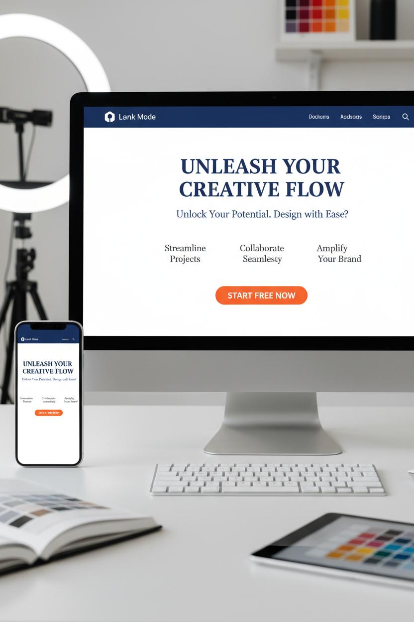
Typography is the quiet guide that leads a viewer’s eye exactly where you want it to go, and a clear hierarchy is what makes your digital marketing design feel effortless and clickable. Start by deciding the story your type has to tell: the bold headline that hooks, a supporting subhead that clarifies, and body copy that gently fills in the details. On a landing page design, I like a strong H1 that mirrors your brand identity voice, a thoughtful H2 that answers “what’s in it for me?”, and scannable body text that feels friendly, not fussy. Keep contrast obvious—size, weight, and color all play roles—and think mobile-first: if it isn’t legible on a thumb-scroll, it isn’t working. Limit yourself to two typefaces (a confident display paired with a clean sans or serif) so your message stays consistent across emails, ad creative, and social media graphics.
Build a simple type scale you can reuse everywhere; for example, a headline that’s noticeably larger, a subhead that supports, and body text with generous line-height so it breathes. CTA buttons should be short, high-contrast, and a touch heavier in weight than surrounding text so the eye lands there without shouting. In ad creative, fewer words win—one striking verb or benefit in a chunky, high-contrast font beats a paragraph every time. For social media graphics, design for three-second readability: big, centered type for the hook; small, secondary text only if it truly adds value. And always test your colors for contrast so accessibility is baked in, not bolted on later.
Tools make this smoother: I mock up typographic systems in Adobe Creative Cloud and keep brand color swatches nearby to check contrast on both light and dark backgrounds. A favorite graphic design book on my desk reminds me to mind rhythm—spacing, alignment, and consistent scales are the secret sauce. If you shoot product shots to pair with type, a simple ring light gives you clean images that won’t fight your words. And yes, a responsive wireless mouse actually helps with tiny nudges like kerning and baseline tweaks. Lock your hierarchy into a mini style guide, then A/B test variations of size and weight. When your fonts whisper “start here, go there, click now,” conversion starts to feel natural.
Conversion-First Imagery: Photos, Icons, and Illustrations That Persuade

The imagery that converts doesn’t just look pretty—it takes your visitor by the hand and walks them toward the click. When you’re planning photos for your landing page design, think story first: the hero image shows the outcome your audience craves, the supporting shots whisper “see how easy this is,” and every visual nudges attention toward the CTA. Faces looking toward the button, hands pointing to a form field, a cup of coffee steaming in the corner to keep the scene feeling lived-in—these small choices layer warmth and intention. Use generous negative space to give copy room to breathe, and choose product-in-context photos over sterile pack shots whenever you can. In digital marketing design, believable light, textures, and real environments build trust faster than a paragraph ever could.
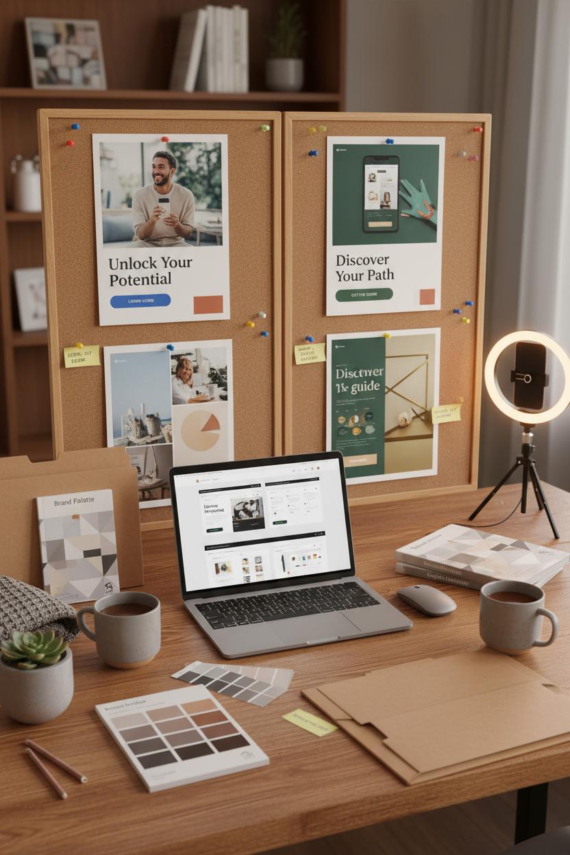
Icons and illustrations work like friendly tour guides. Keep a consistent line weight and style so they feel like one family, and let color do subtle wayfinding—your brand color swatches can assign a shade to each step or benefit, strengthening brand identity without shouting. Simple micro-illustrations that visualize outcomes (time saved, money kept, calm achieved) help skimmers get it at a glance. When these elements scale across ad creative and social media graphics, aim for a modular system: one expressive hero, a few utility icons, and a set of background shapes that flex from square to story to carousel. If you’re building in Adobe Creative Cloud, set up shared libraries for logos, type, and swatches so every export feels unmistakably you.
A practical workflow keeps the magic repeatable. Draft a shot list that pairs each message with a visual proof, gather props that mirror your audience’s world, and light it cleanly—a simple ring light can do wonders for skin tones and product details. Shoot tethered if possible, or at least with a wireless mouse nearby to breeze through selects and retouching. Keep a favorite graphic design book on your desk for composition prompts when you’re stuck. Before launch, check mobile crops, add descriptive alt text, and A/B test focal points: eye contact vs. hands-in-action, bright background vs. muted. The quiet rule beneath it all: if an image doesn’t clarify, it distracts. Curate ruthlessly, and let every pixel earn its place.
Test, Learn, Win: A/B Testing Ad Creative and Landing Page Design
Think of A/B testing as the cozy craft corner of your digital marketing design—where you pin two pretty options side by side and let the data pick the winner. Start with your ad creative: test one variable at a time so the results are crystal clear. Swap a soft lifestyle shot for a crisp product close-up, try a bold headline versus a whispery one, or nudge the call-to-action from “Learn more” to “Get the guide.” Keep your brand identity steady—same fonts, same voice, same heart—while you experiment with color contrast, textures, and layouts. I love spinning up quick variations in Adobe Creative Cloud, pulling from brand color swatches to try a richer accent or softer neutral without drifting off-brand. If your ads rely on video or UGC, a simple ring light can lift the entire mood and clarity. And don’t forget your social media graphics; that first-frame hook on Reels or a punchy carousel cover can nudge click-throughs way up. Watch CTR and CPC as your first read, and label each version neatly so you know what truly moved the needle.
Then carry the winner to your landing page design, where micro-tweaks make macro impact. Test your hero section first: headline clarity, benefit-driven subhead, and a CTA button that contrasts but still kisses your palette. Play with placement—above the fold versus just below—and try shorter forms, trust badges, or a quick FAQ to ease jitters. Mobile-first polish is everything: tighten line lengths, keep buttons thumb-friendly, and make images fast and clean. Track bounce rate, scroll depth, and conversion rate for at least a week (or until you have a confident sample), then let the champion roll into the next round of tests. Keep a swipe file of winners, a favorite graphic design book nearby for fresh layout ideas, and a wireless mouse to fly through revisions. This is the rhythm: test, learn, win—again and again—until your digital marketing design hums, your ad creative feels inevitable, and every scroll feels like a gentle yes.
Scale Smart: Templates and Systems to Protect Brand Identity
When you’re moving fast with digital marketing design, templates are your safety net and your superpower. Start with a simple brand kit that goes beyond a logo: lock in your brand color swatches, primary and secondary typefaces, button styles, image treatments, and a short tone-of-voice guide. Build these into reusable templates for social media graphics, email headers, and landing page design blocks so anyone on your team can plug in new content without freestyling. I love setting up Libraries in Adobe Creative Cloud so icons, logo versions, and approved photos live in one tidy place—no scavenger hunts. Keep a living “do/don’t” board and a quick preflight checklist (logo padding, contrast, alt text, CTA clarity) to protect brand identity when deadlines get wild.
Think in systems, not one-offs. Create modular files for ad creative—headline frames, offer badges, testimonial cards—so you can swap messaging without redrawing layouts. For landing page design, prep hero sections, feature rows, FAQs, and pricing tables that snap together like building blocks, each with baked-in spacing, button sizes, and mobile rules. Your social media graphics should have size-ready variants and a consistent hierarchy for caption overlays, so every post looks like part of the same story. A lightweight naming convention and folder map (Campaign > Platform > Date > Version) saves hours and stops accidental uploads of the wrong file. Little tools matter here too: a responsive wireless mouse for speedy precision edits, a ring light for quick content shoots that match your visual vibe, and a dog-eared graphic design book nearby for timeless layout inspo when you’re stuck.
Finally, systemize feedback. Use shared comment templates—“Hook clarity,” “Brand color check,” “CTA visibility,” “Thumbnail legibility”—so reviews are fast and consistent. Track winning variants in a simple swipe file with screenshots, performance notes, and links to master files; tag them by offer type and season so you can relaunch with confidence. When your templates carry the heavy lift, every new ad creative, email, or landing page design feels effortless and unmistakably you. That’s how you scale without diluting your brand identity—and keep your digital marketing design polished, purposeful, and primed to convert.
Prove It Works: Measuring the ROI of Digital Marketing Design
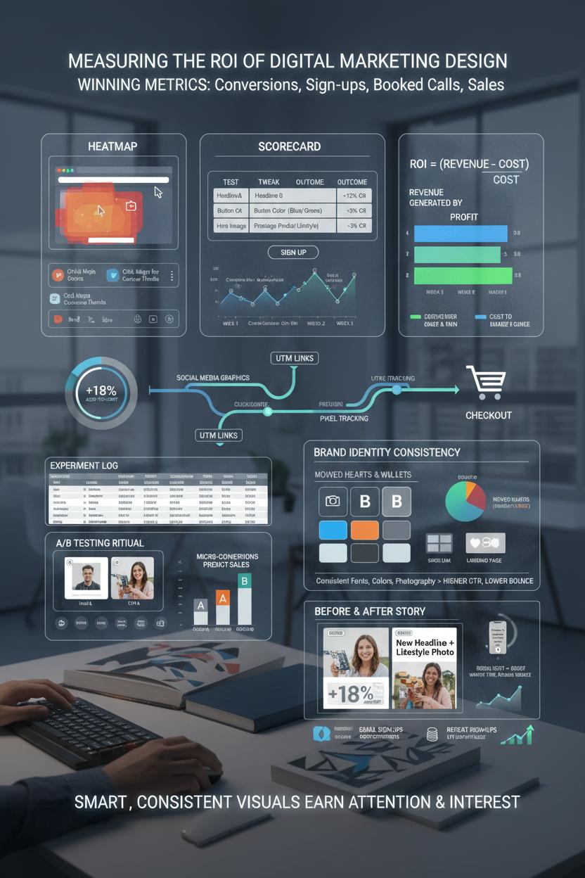
Let’s make the results as beautiful as the pixels. Measuring the ROI of your digital marketing design starts with naming what “wins” look like: conversions, sign‑ups, booked calls, or sales. Tag everything—use UTM links on your ad creative, set up your pixels, and watch the path from social media graphics to landing page design to checkout. Make it visual: heatmaps for scroll depth, click maps for curious thumbs, and a simple scorecard where you log the test, the tweak, and the outcome. When you change a headline, hero image, or button color, track conversion rate, cost per acquisition, and average order value over a week or two. ROI is just the revenue that design helped generate minus the cost to make and run it, divided by that cost; keep it simple, then go deeper as you learn.
A/B testing is your cozy, repeatable ritual. Duplicate a high-performing ad creative, swap one element (the thumbnail, the hook, or the call to action), and let the audience vote with clicks. On social media graphics, measure saves, shares, and profile taps—micro-conversions that predict sales. If your brand identity is consistent—fonts, brand color swatches, photography style—you’ll usually see click-through rates rise and CPAs fall because people recognize you faster. For creators and product demos, a ring light can lift watch time and reduce bounce on reels that push to your landing page design. Pair this with a weekly “story of the data” recap: which design moved hearts and wallets, and which needs a graceful sunset?
Make testing lightweight so you stick with it. Build templates in Adobe Creative Cloud, keep a wireless mouse and hotkeys ready for speed, and stash a graphic design book nearby for pattern-breaking ideas. Document every experiment in a living spreadsheet: date, hypothesis, asset link, spend, CTR, conversion rate, revenue, notes. Then tell a simple before-and-after story—“New headline + lifestyle photo increased add-to-cart by 18% at the same spend.” Fold in longer-term signals too: email sign-ups that buy later, repeat customers, and LTV trends. That’s the real ROI of digital marketing design—when smart, consistent visuals don’t just get attention, they earn it back with interest.
Conclusion
And that’s a wrap: keep your digital marketing design simple, on-brand, and guided by data. Lead with a clear value prop and irresistible CTAs on landing page design, build a consistent brand identity across every touchpoint, and craft scroll-stopping ad creative and social media graphics that feel made for your audience. Test, tidy whitespace, choose purposeful color, and stay mobile-first. Cozy takeaway: brew a coffee, pick one tiny improvement, and ship it today—then measure, iterate, and watch conversions glow. Save this for your next design brainstorm.