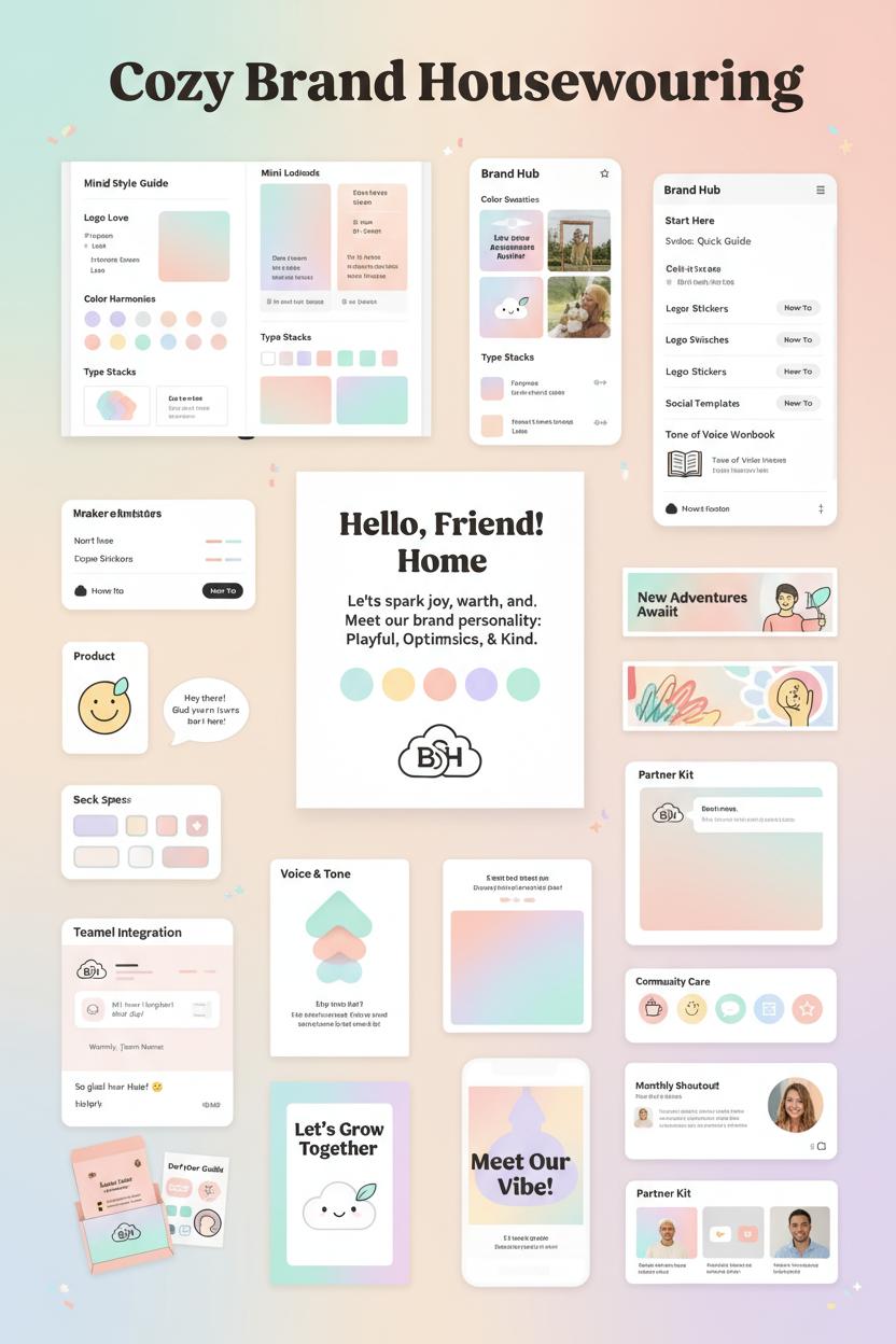
Ready to make your brand feel like a hug? This Friendly Branding Guide shows you how to build friendly branding with a clear brand personality, a soothing pastel palette, and a playful rounded logo, all wrapped in an approachable tone. Inside, grab a mini brand style guide, color palette swatches, and social media templates, plus ideas for logo sticker sheets and a tone of voice workbook. Perfect for creators and small shops who want visuals and words that smile back—pin now, polish later!
What Is Friendly Branding? Define Your Brand Personality and Promise
Think of friendly branding as the feeling of a warm smile translated into visuals and words. It’s the way your business greets someone at the door—without shouting, without pressure—just a gentle, confident welcome. At its heart, it’s about trust and ease: clear promises, easy choices, a sense that someone thoughtful is taking care of the details. Friendly branding doesn’t mean childish or overly cute; it means human. It’s consistency that comforts. When your photos, captions, packaging, and support emails all whisper “you’re welcome here,” people relax—and that’s when they listen. Start by naming your brand personality in a few grounded traits, like calm, kind, and helpful. From there, pair those traits with an approachable tone that uses simple words, second-person warmth, and kind guidance rather than hype.
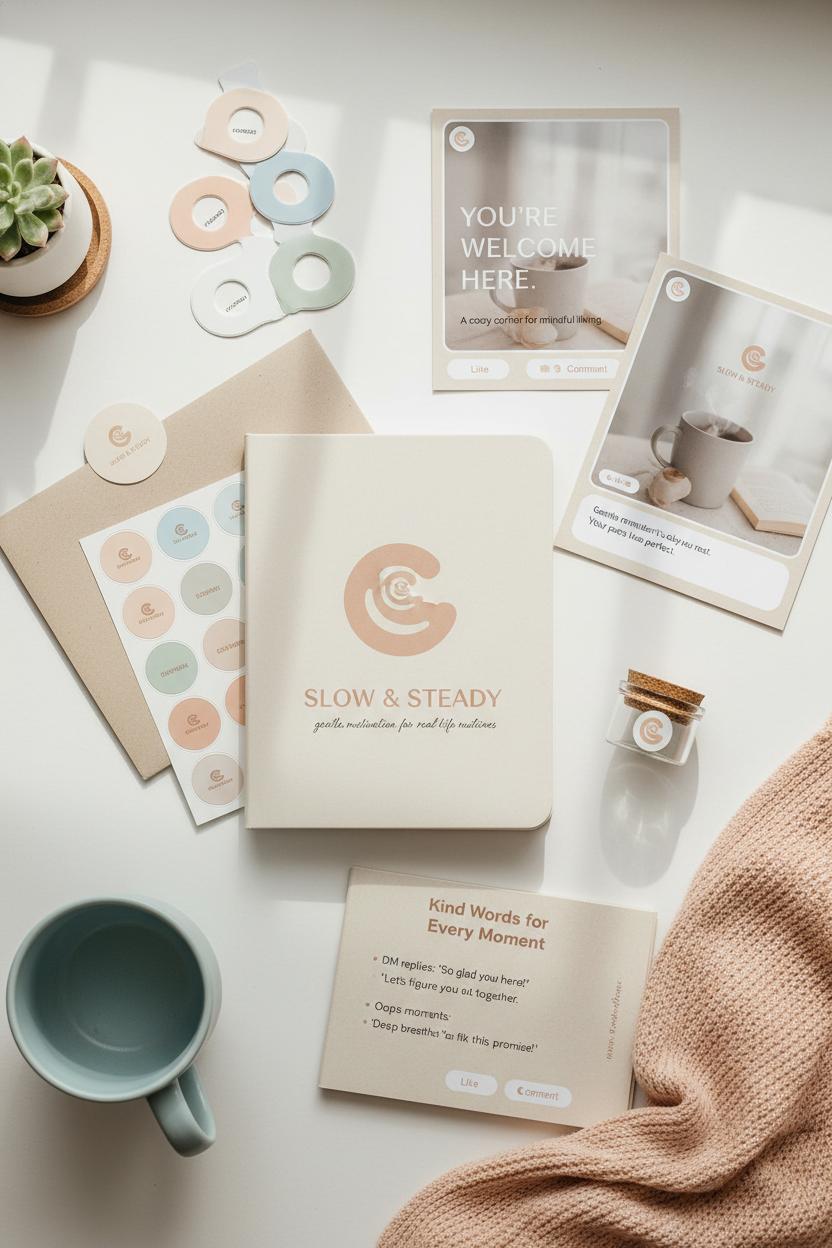
Now translate that personality into a promise—what you always deliver, no matter the product or platform. Maybe it’s “soft solutions for busy days” or “gentle motivation for real-life routines.” Let that promise steer your style choices. A pastel palette can soften the mood instantly: think misty peach, cloud blue, or sage milk. A rounded logo and curved iconography signal safety and approachability, while pill-shaped buttons, soft shadows, and generous white space keep everything breathable. Test combinations with color palette swatches to find hues that feel like your brand on its kindest day. Try printing a few logo sticker sheets to see how your mark behaves on packaging, notebooks, or envelopes—it’s a quick reality check for warmth and legibility. Then carry the feeling into your feed with social media templates that bake in spacing, headline sizes, and caption cues so every post feels coherent without trying too hard.
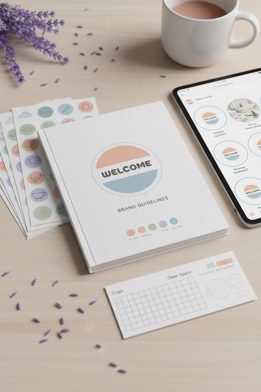
Finally, make it official. A simple brand style guide can capture your promise, brand personality traits, color codes, type choices, and image do’s and don’ts in one cozy home. Pair it with a tone of voice workbook to practice everyday phrases—DM replies, product announcements, even “oops” moments—until your approachable tone is second nature. Friendly branding is less about one perfect asset and more about a hundred small, consistent touches that say the same kind thing over and over. When you do that, your brand starts to feel like a friend people love to keep around.
Craft a Brand Style Guide for an Approachable Tone and Consistency
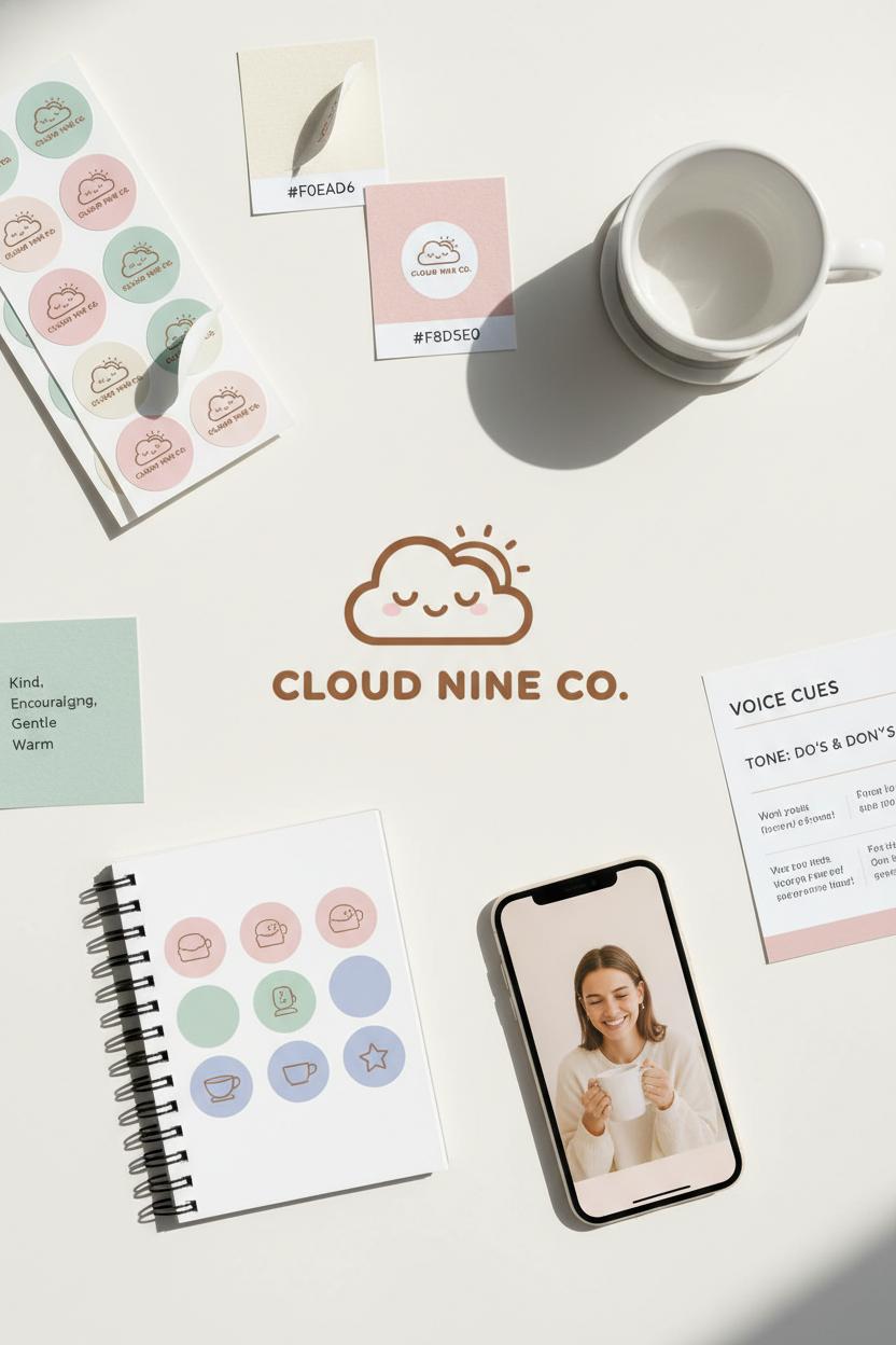
Think of your brand style guide as a cozy recipe card for friendly branding—the go-to place that shows anyone on your team exactly how to serve your brand personality warm, consistent, and just sweet enough. Start by naming your vibe: Are you the kind friend who brings sunshine to a gray inbox? Write it down. Define your approachable tone with a few sample phrases you’d actually say to customers, then add do’s and don’ts to keep everyone aligned. A tone of voice workbook can help you map out key words, phrases, and sentence rhythms so your captions, emails, and product pages all sound like they’re from the same thoughtful person.
Next, bottle your look. Choose a pastel palette that feels like soft morning light—think creamy neutrals with a whisper of blush, mint, or periwinkle—then lock it in with color palette swatches so your hex codes never drift. If your logo leans cuddly, a rounded logo or gentle wordmark reinforces that approachable vibe across packaging, site headers, and stickers. Consider collecting logo sticker sheets for quick mockups and on-the-go branding moments; they’re surprisingly useful for planning merch and flat-lay photos. Document your icon style (rounded corners and line weights), image treatments (warm, low-contrast edits), and typography (friendly sans serifs with generous spacing). Add notes on how much white space to leave around elements so everything breathes like a calm Sunday afternoon.
Finally, make it easy to show up consistently with ready-to-use building blocks. Save social media templates sized for posts, stories, and pins so your layouts feel familiar even when you switch up content. Include signature phrases, greeting lines, and sign-offs to keep your approachable tone intact in DMs and customer replies. Show three before-and-afters: a caption made warmer, a CTA softened without losing clarity, and a product description with sensory details that still gets to the point. Wrap it all into a shareable brand style guide PDF with quick-reference pages: color chips, logo rules, photo mood, and voice cues. When your visuals glow softly and your words smile first, your brand feels like a friend—steady, kind, and unmistakably you.
Select a Pastel Palette: Build Soothing Color Palette Swatches
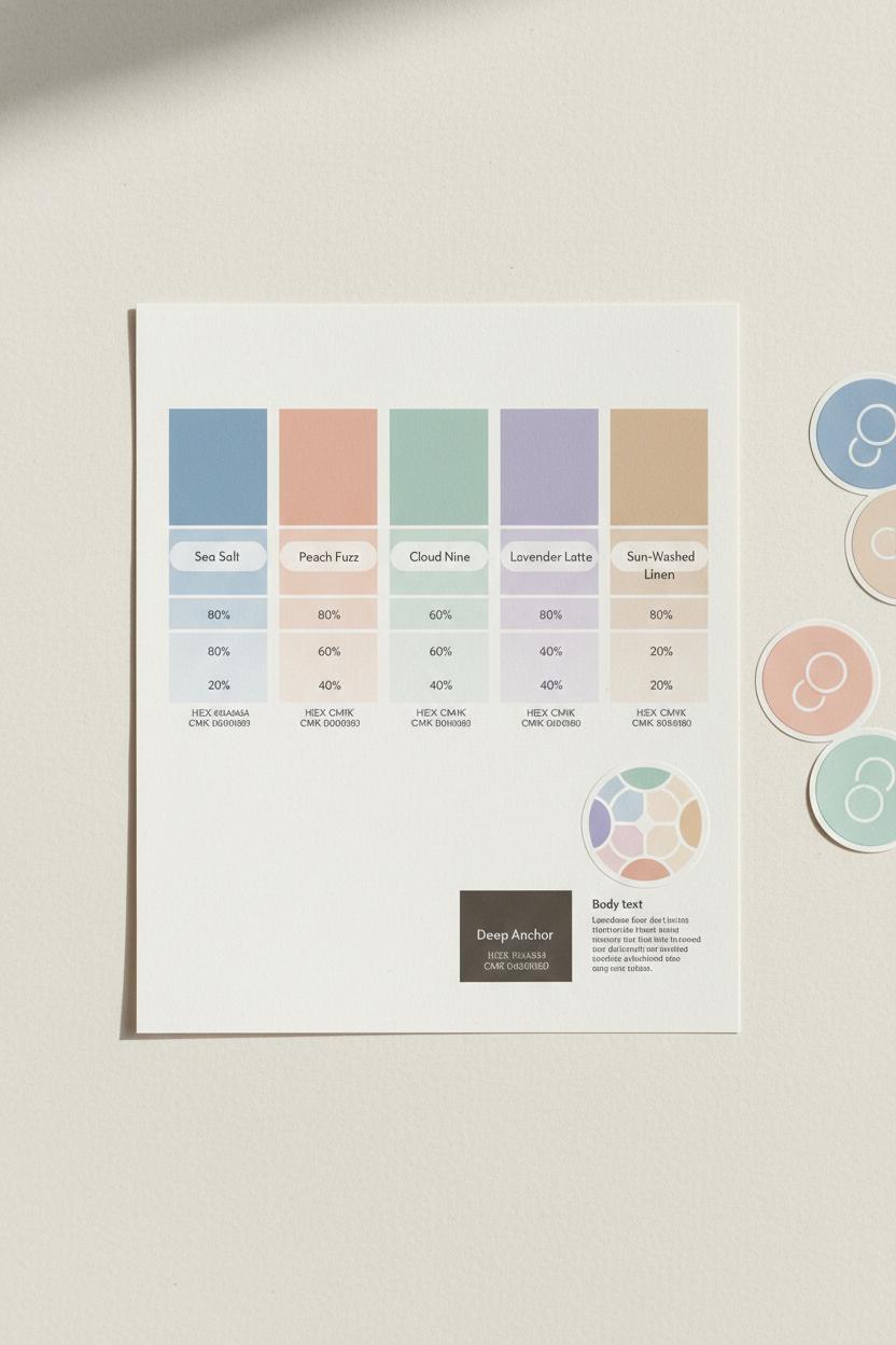
Pastels are where your soft, friendly branding truly starts to breathe. Think sun-washed sherbet, sea glass, cotton-misted mornings—colors that feel like a hug, not a shout. Begin by anchoring your pastel palette to your brand personality: are you more lavender-latte calm, or peach-sorbet playful? Choose one anchor hue that carries your vibe (say, a powdery blue for trust or a blush peach for warmth), then add two supporting shades that harmonize without competing. Balance with a gentle neutral—warm gray, oat, or a creamy off-white—to keep everything grounded, and include one deeper companion shade for contrast where you need legibility. Test your choices beside a rounded logo or circular iconography; curves and soft tones amplify each other, reinforcing an approachable tone that’s effortless and kind.
Now, build your soothing color palette swatches like a designer’s picnic. Make a tidy grid with your core hues across the top and a few tints beneath each: 100%, 80%, 60%, 40%, 20%. Pastels live in those airy tints, so let them float. Name each shade with something evocative—Sea Salt, Peach Fuzz, Cloud Nine—then note the HEX and CMYK so digital and print stay aligned. Print them out and hold the sheet in daylight; pastel colors can read cooler on screens and warmer on paper. Do a quick contrast check for body text and buttons, pairing your soft tones with that deeper companion so accessibility and calm can coexist. Drop the final picks into your brand style guide and keep a small set of color palette swatches handy for everyday decisions. If you’re tactile, try logo sticker sheets in your chosen hues to see how marks behave on packaging, envelopes, and planners. Then, pour the palette into your social media templates to keep posts dreamy and consistent, and give your words a matching softness by skimming a tone of voice workbook so captions and colors speak the same language. With a few thoughtful choices and a little testing, your pastels will feel cohesive, cozy, and instantly recognizable—like a gentle hello in color form.
Design a Rounded Logo and Round Icons for Soft, Welcoming Visuals
Soft curves instantly signal “you’re welcome here,” which is why a rounded logo is such a charming anchor for friendly branding. Think of it as a smile in symbol form: circular forms, softened corners, and gentle letterforms that mirror your approachable tone before anyone reads a word. Start by sketching within circles and rounded rectangles, then choose typography with open counters and curved terminals—rounded sans-serifs or relaxed monoline scripts work beautifully. If you already have a mark, try softening the edges, smoothing any sharp intersections, and balancing the negative space so it breathes. Keep your corner radii consistent across the lockup, and make sure the proportions feel calm and steady; this nurtures a brand personality that’s warm and quietly confident rather than loud.
Round icons extend that feeling across every touchpoint. Build an icon set on a simple grid with matching stroke weight and corner radius so each symbol feels like part of the same friendly family. Circles, rounded squares, and pill shapes are your best friends; avoid needles and angles that can read as severe. Then dress your shapes in a pastel palette—mists of peach, sage, lavender, or sky—using color palette swatches to test legibility on light and dark backgrounds. A whisper of soft shadow or a dainty outline can add dimension without breaking the calm. Try a “one main hue + two supporting pastels” formula for harmony, and keep contrast gentle with cocoa or charcoal instead of stark black to maintain that velvety, approachable look.
When it’s time to share your visuals, drop your rounded logo and icon set into social media templates so posts, Stories, and Reels feel cohesive and kind. Print logo sticker sheets for packaging, laptops, and event handouts—they turn your mark into tactile moments of delight. Capture decisions in a brand style guide that notes logo clear space, icon grid rules, corner radii, and hex codes for your pastel palette, then pair it with a tone of voice workbook to weave an equally approachable tone through captions, emails, and customer replies. The harmony of soft forms, gentle colors, and warm words makes your friendly branding unmistakable—and wonderfully easy to love.
Develop a Warm, Approachable Tone of Voice with a Tone of Voice Workbook
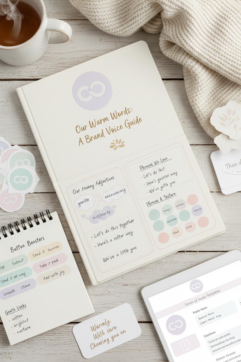
Think of your voice as the cozy throw blanket that ties the whole living room together—it makes your visuals feel lived-in and lovable. A tone of voice workbook is where that warmth gets mapped out, page by page. Start by naming your brand personality with a handful of homey adjectives—gentle, encouraging, neighborly—and jot down the phrases you naturally use when you talk to real people. Collect little snippets: “Let’s do this together,” “Here’s a softer way,” “We’ve got you.” Add a word bank of textures and moods that match your pastel palette—think misty lavender, buttercream, sea-glass calm—and you’ll feel your approachable tone take root. Friendly branding isn’t just how your posts look; it’s how your captions, emails, and DMs make someone breathe out and think, “Ah, they get me.”
Use your workbook to practice transforming stiff lines into warm ones. Swap “Submit form” for “Send it our way,” “Learn more” for “Take a peek,” and “Buy now” for “Add a little joy.” Keep sentences short, use “you” and “we,” and sprinkle in gentle verbs—soften, brighten, nurture—to mirror the curves of your rounded logo and the hush of your color palette swatches. Capture these choices in a simple brand style guide so anyone writing for you can echo the same smile-in-a-sentence feeling. Tuck in a few go-to sign-offs (“Warmly,” “With care,” “Cheering you on”) and create a mini library of welcome notes, thank-you cards, and package inserts that sound like a hug. If you love tangible tools, a tone of voice workbook pairs beautifully with logo sticker sheets for sweet packaging touches and social media templates for caption consistency.
Then, test and refine. Drop your top phrases into Instagram stories, pin descriptions, and product pages; see what earns saves and replies. Notice which words your community repeats back to you—that’s proof your tone is landing. Update the workbook regularly, just like you’d refresh a mood board, and keep your pastel palette nearby for inspiration. Over time, your approachable tone will stitch every touchpoint together, turning first-time scrollers into friends who stick around because it simply feels good to be here.
Extend Your Look with Logo Sticker Sheets, Badges, and Micro-Icons
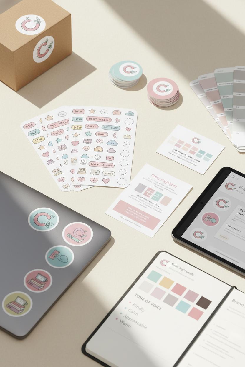
Think of sticker sheets, badges, and tiny micro-icons as the confetti that carries your story into every corner of your world. They’re the repeatable details that make friendly branding feel cohesive and delightful, even when your main logo steps offstage. Start by echoing the curves of your rounded logo in every element—soft corners, gentle outlines, and pill-shaped badges that feel touchable. Keep strokes light and airy, give icons a whisper of breathing room, and anchor everything in your pastel palette so nothing shouts, everything smiles. A little sparkle icon here, a tender heart there, a wavy underline or dotted halo—each micro-mark adds texture and warmth while reinforcing your brand personality. The goal is an approachable tone you can see: kindly, calm, and cute, never cluttered.
When you’re ready to put these pieces to work, let them mingle across print and digital. Order logo sticker sheets to seal packages, dress up laptop lids, or surprise customers with a freebie that gets shared. Use round-edged badges for “New,” “Bestseller,” or “Giftable,” then carry the same shapes into your site buttons and Story Highlights so everything feels connected. Sprinkle micro-icons in email sign-offs, Reels covers, and product care cards—tiny nudges that say “we thought of you.” Keep your color palette swatches nearby to test backgrounds and accents, and lean on a simple rule: one cozy neutral plus one pastel pop per element. To lock the look, document choices in a brand style guide and make space for words, too; a tone of voice workbook helps your captions and calls-to-action match the visuals with that same approachable tone. Finally, speed up your workflow with drag-and-drop social media templates that already include your badges and icon placements. With these small-but-mighty details, your brand doesn’t just look cute once—it feels like you, everywhere.
Social Media Templates That Carry Your Pastel Palette and Approachable Tone
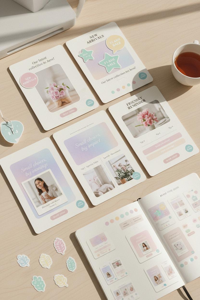
Think of your social posts as tiny rooms your audience can step into—each one arranged with the same soft light and familiar shapes—so your pastel palette and approachable tone feel unmistakable at a glance. Start with a handful of reusable social media templates for feed posts, Stories, Reels covers, and Pins that share the same margins, rounded corners, and creamy backgrounds. Tuck your rounded logo into a cozy corner like a friendly signature, and let sticker-like badges hold quick headlines or prices—digital “logo sticker sheets” work beautifully for this. Keep photo treatments consistent: slightly diffused shadows, warm highlights, and a hint of grain to soften edges. Use color palette swatches to anchor each layout—one hero pastel, one supporting shade, and a neutral—so your friendly branding stays calm, airy, and cohesive no matter the content.
Typography should echo your brand personality—think a round, humanist sans for body text with a delicate script or soft serif for accent words used sparingly. Give lines room to breathe and let buttons feel pillowy rather than sharp. The copy itself should carry an approachable tone: verbs that invite instead of command, captions that read like a warm nudge from a friend. A tone of voice workbook can help you bank ready-to-use phrases for captions, CTAs, and alt text so every post sounds consistently you. Design a few staple modules—a quote card with a pastel wash, a tip carousel with dotted dividers, a testimonial “polaroid” with a soft drop shadow—then swap photos and words while the structure stays steady.
To keep everything humming, build a lightweight brand style guide specifically for socials, noting your hex codes, type sizes, and image filters right beside thumbnail previews of your core templates. Save out a mix of seasonal overlays that still match your pastel palette, and test contrast so light-on-light remains readable. When you’re batch-creating, pull from your social media templates, drop in new imagery, and finish with your rounded logo mark for that final, friendly wink. Over time, these small, repeating choices become your visual rhythm—gentle, inviting, and instantly recognizable in a busy feed.
Accessibility First: Contrast and Legibility When Using a Pastel Palette
Pastels are dreamy, but the friendliest branding is the one everyone can read at a glance. When you play with a pastel palette, think of contrast as your quiet superpower: pair your ice-cream shades with anchors like charcoal, espresso, deep navy, or forest to keep copy crisp and icons clear. A butter-cream background with dark-ink text is safer than mint-on-blush, and if you must layer color on color, add a subtle shadow, outline, or translucent overlay to lift the letters forward. Aim for bold-enough type and generous spacing; a medium-to-heavy weight sans or humanist serif keeps that approachable tone without disappearing. If you love your rounded logo (we do), make sure its edges don’t fade on light hues—add a 1–2 px stroke or place it in a badge so it pops at small sizes.
Accessibility is also about how color is used, not just which colors you choose. Don’t rely on color alone to signal meaning—pair a pastel alert with an icon and a label, and use underlines for links instead of just switching to a softer blue. Test your friendly branding in the wild: view it on a phone in sunlight, print it at home, and screenshot your social posts to see if captions stay legible over photos. A quick pass with a contrast checker (shoot for strong contrast, especially for body text) plus a color-blind simulator can catch surprises early. Keep alt text thoughtful, buttons big, and focus states visible so your warm, welcoming vibe translates to real usability.
Build these habits into your brand style guide so consistency does the heavy lifting. Include color palette swatches with hex codes and approved pairings, minimum sizes for that rounded logo, and examples of text-over-image treatments for your social media templates. If you’re prototyping packaging or merch, print a few logo sticker sheets and test them on different surfaces to spot low-contrast combos. And while you’re refining visuals, let your tone of voice workbook reinforce clarity in copy—short, sunny sentences read better on soft backgrounds. The result is a cohesive brand personality that feels gentle yet confident: pastel, yes, but unmistakably readable and truly inclusive.
Rollout Playbook: Share the Brand Style Guide Across Teams and Channels
Think of your rollout like a cozy brand housewarming: invite every team in, hand them a little welcome basket, and show them where everything lives. Start with a simple kickoff note that puts your friendly branding front and center—what feelings you want to spark, the adjectives that shape your brand personality, and a quick peek at the pastel palette and rounded logo in action. Pair that with a shareable brand style guide that reads like a mini lookbook: logo rules, color pairings, type stacks, and a snapshot of your approachable tone so people can hear the voice as clearly as they see the colors.
Next, bundle the goods. Create a tidy folder or Notion hub with color palette swatches, logo sticker sheets, social media templates, and even a tone of voice workbook for the word-curious. Label everything with “start here” notes and short how-tos. Think about what each team actually needs day to day: marketing gets post templates and campaign headers; product gets UI button specs and illustration rules; sales gets deck covers and one-pagers; support gets greeting lines and sign-offs that model the same warm cadence. A lightweight approvals channel (a dedicated email or Slack thread) keeps sharing human and fast without turning into a design traffic jam.
Now ripple it across channels like a soft gradient. Update your email signatures and welcome series first so the experience feels consistent from hello; swap in pastel palette accents on landing pages; refresh Instagram highlight covers with the rounded logo; set story frames and Reels covers using the social media templates. For community and customer care, copy a few phrases from the tone of voice workbook into macros so the approachable tone shows up in DMs, tickets, and reviews. If you work with partners or creators, send a mini kit and a one-page “do/try” guide so they can plug in easily.
Finally, make it joyful to keep the momentum. Host a 20-minute “brand office hours,” share before-and-afters in an internal newsletter, and celebrate great uses in a monthly shout-out. Friendly branding sticks when everyone feels invited to play—clear guardrails, easy tools, and lots of visual snacks they can grab and go.
Resources & Checklist: Color Palette Swatches, Social Media Templates, and a Tone of Voice Workbook
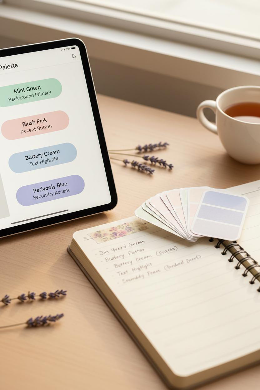
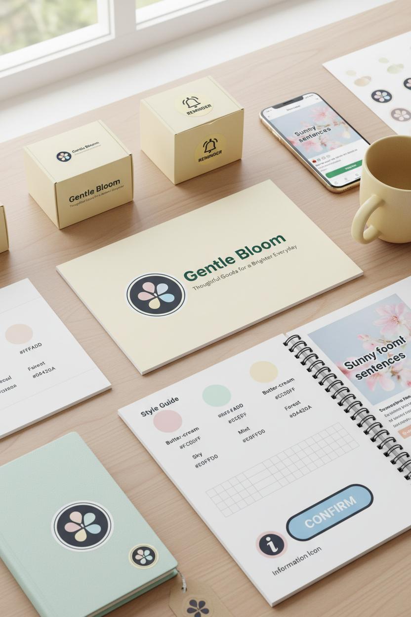
Think of this as your cozy toolkit for keeping everything consistent and delightful. Start with color: gather color palette swatches in a pastel palette that makes your shoulders drop and your smile soften—mints, blushes, buttery creams, and periwinkles that play well together. Save them digitally and print a tiny stack you can tape to your planner so every asset feels like it belongs to the same sunny morning. If you need a shortcut, pick up premade color palette swatches or a simple brand style guide template; both are easy to find, and they’ll spare you second-guessing. As you lock in your hues, jot a quick note for each shade’s job—primary for backgrounds, accent for buttons, whisper-soft for text highlights—so your friendly branding has guardrails as well as charm.
Next, give your shapes some love. A rounded logo instantly cues softness and approachability, but make sure it holds up at five sizes: favicon tiny, social avatar small, email header medium, website hero large, and print extra-large. Print a few versions as logo sticker sheets to test how the curves and negative space behave against different textures and colors; stick them on a notebook, a water bottle, and a kraft mailer to see your brand personality in the wild. While you’re at it, confirm you have light and dark lockups, plus a single-color option that still hums with warmth.
For your day-to-day posting rhythm, set up social media templates that echo your pastels and rounded edges—soft frames, generous padding, and image treatments that feel like morning light. Map a simple content pattern: quote, tip, story, product, repeat. Add a caption starter bank to keep your approachable tone steady, with phrases that sound like a helpful friend rather than a megaphone. If writing makes you stall, a tone of voice workbook can be a lifesaver; outline your do’s and don’ts, brand phrases you’ll use often, and a mini glossary of words that instantly feel like you. Tuck these tools—brand style guide, color palette swatches, logo sticker sheets, social media templates, and a tone of voice workbook—into one easy folder so every post, pin, and package feels unmistakably you: soft, rounded, and radiantly kind.
Conclusion
Wrap up: When you lean into a pastel palette, a rounded logo and icons, and an approachable tone, your friendly branding shines. Keep your brand personality consistent—soft edges, warm words, simple shapes. Curate 3–5 pastels, round off buttons and imagery, and write like you’d text a friend. Sprinkle kindness in microcopy, welcome white space, and let photos glow softly. Save this as your cozy checklist, brew some tea, and refresh your visuals. Your audience will feel at home—and your brand will feel unmistakably you.