Turn that fleeting “payment successful” moment into pure delight. In this guide to smooth checkout ux, we’ll unpack ecommerce design patterns that reduce friction, boost trust, and speed up conversions, from microcopy to motion on the confirmation screen. Whether you’re optimizing a fintech ui or a retail flow with a POS terminal, card reader, or mobile card swiper, we’ve got practical tips for NFC tap to pay, smart error states, and a receipt printer flow customers actually love. Pin now, polish later: create a checkout that feels fast, friendly, and unmistakably done.
Why payment successful messaging drives better checkout ux
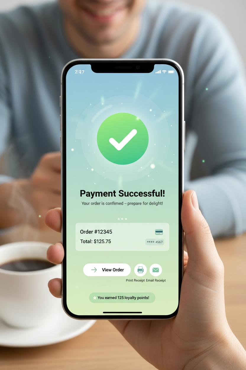
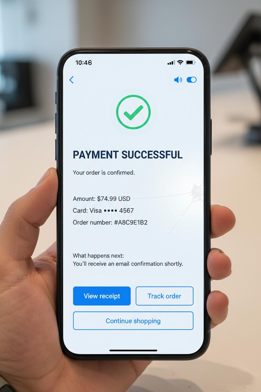
When the moment of truth finally lands—card authorized, order placed—the words payment successful do more than end a transaction; they smooth the emotional landing. Great checkout ux is as much about how shoppers feel after they pay as it is about the steps that got them there. A warm, unmissable confirmation screen with a clear checkmark, a friendly line of microcopy, and a tidy order summary creates closure, calms post-purchase jitters, and builds trust for next time. In ecommerce design and fintech ui, this is the peak-end rule at work: people remember the high point and the ending. Make the end delightful, and you elevate the entire journey. Reinforce success with sensory cues that fit your brand—subtle haptics, a soft chime, or a celebratory motion flourish—paired with concrete details like delivery ETA, last four digits charged, and how to reach support. It’s reassurance wrapped in clarity.
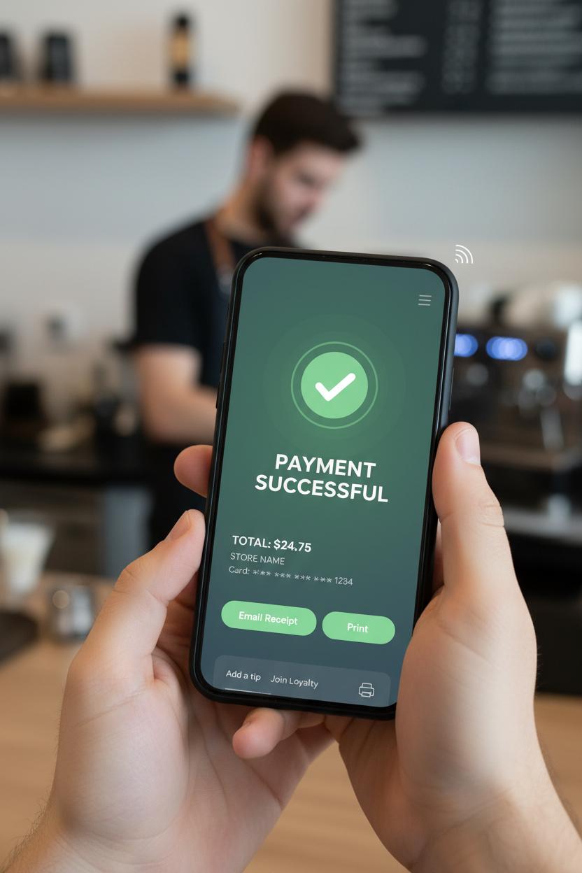
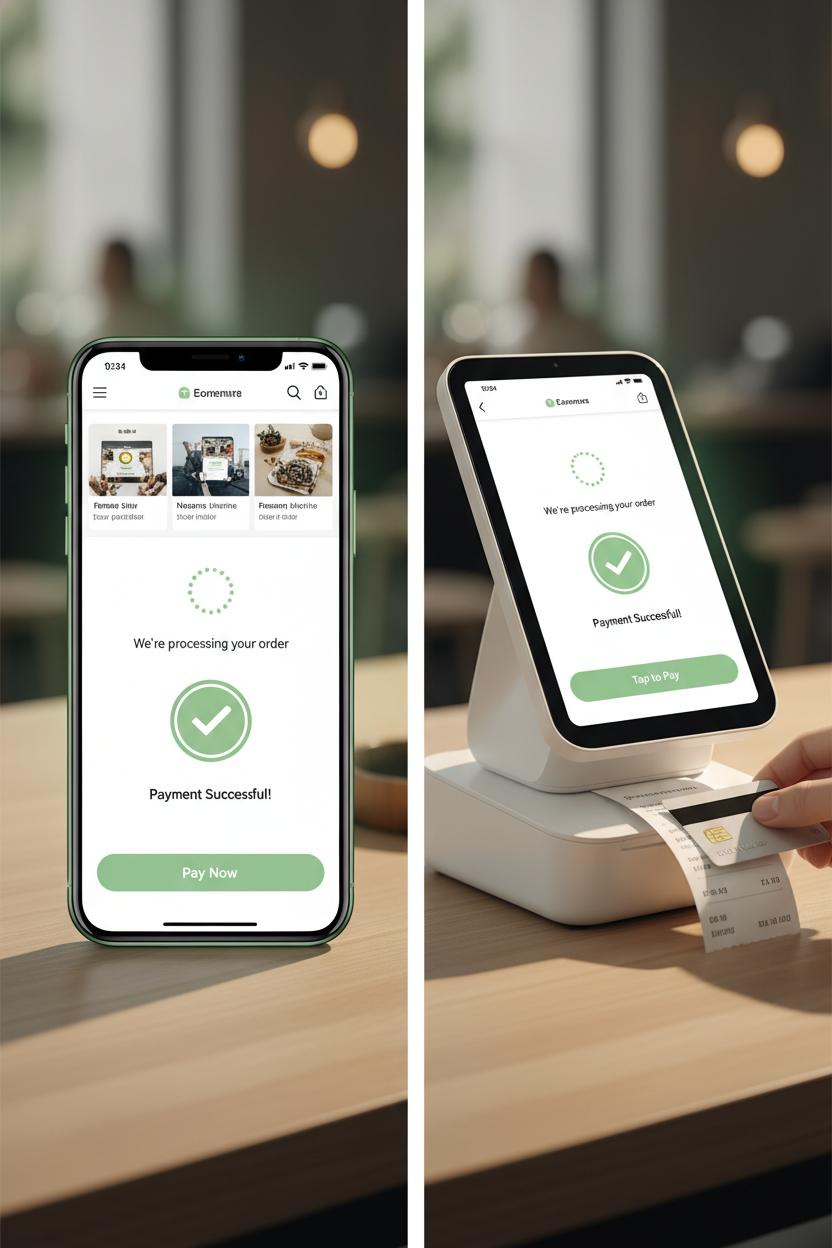
The same principle applies in person. On a POS terminal, the success state should be bold, legible, and instant; a simple “payment successful” tag, a bright check, and an optional prompt to print or email the receipt keeps the line moving without confusion. If a card reader blinks green after NFC tap to pay, or a mobile card swiper confirms with a gentle buzz, the hardware becomes part of the story. Offer a receipt printer option without forcing it, then echo the moment via SMS or email for continuity. Across channels, treat the confirmation screen as a launchpad, not a dead end: show next steps, provide tracking, highlight loyalty points earned, and add a single, safe action like “View order” or “Shop related.” In fintech ui, progressive disclosure works wonders—give the essentials up front, and let power users expand details like tax breakdowns or refund policy. Above all, be fast and fail-safe: prefetch the confirmation, cache the order ID, and display success instantly even if the network wobbles, with receipts syncing when you’re back online. When buyers feel seen, informed, and gently celebrated at the finish line, they remember—and they return.
Designing the perfect confirmation screen in fintech ui
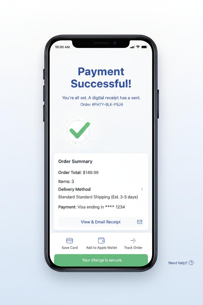
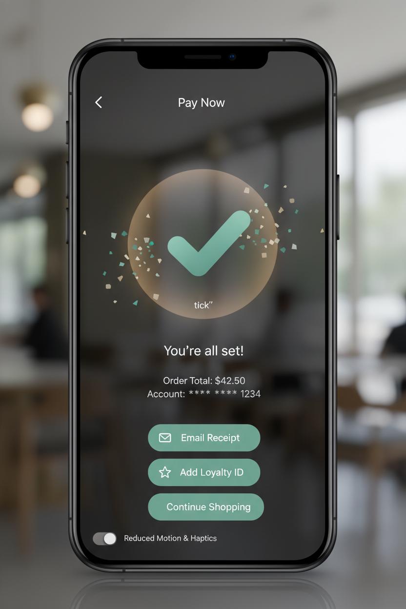
The most magical moment in checkout ux is the breath right after payment when the interface leans in and whispers, payment successful. Your confirmation screen should feel like a warm hug: a big, legible headline with a friendly checkmark, a soft micro-animation that sparkles for a second and then settles, and plenty of white space so the brain can exhale. Keep the essentials above the fold—order total, items, delivery method or pickup details, masked payment method, and a clear receipt action—so no one has to hunt. In fintech ui, trust blooms from clarity, so pair that celebratory vibe with specifics and reassurance: a human line of copy like “You’re all set,” a unique reference number, and gentle guidance on what happens next. This is also prime real estate for smart, low-friction choices that respect the moment—save the card, download or email the receipt, add to Apple Wallet, and track the order—without turning your confirmation into an ad board. Think delight, not detour; the best ecommerce design makes the win feel effortless and the path forward obvious.
Design for omnichannel life, too, because “success” looks a little different on a POS terminal than in a mobile app. If your flow involves a card reader, NFC tap to pay, or even a mobile card swiper, your confirmation state should sync across screens so the shopper sees the same status on their phone that the associate sees on the counter. A tiny buzz from the device, a soft chime, and a green success band on the terminal reduce second-guessing, while options like print, text, or email connect seamlessly to a receipt printer or digital delivery. Keep accessibility top of mind with color-plus-icon semantics and concise, screen-reader-friendly language. Offer contextual next steps that fit the purchase—schedule delivery, start a return window, share a gift message—and add a compassionate safety net: a persistent “Need help?” link and a reminder that their charge is secure even if they close the page. When your confirmation screen feels confident, kind, and consistent, it turns payment successful into a lasting, low-stress memory.
Ecommerce design essentials for a smooth path to payment successful
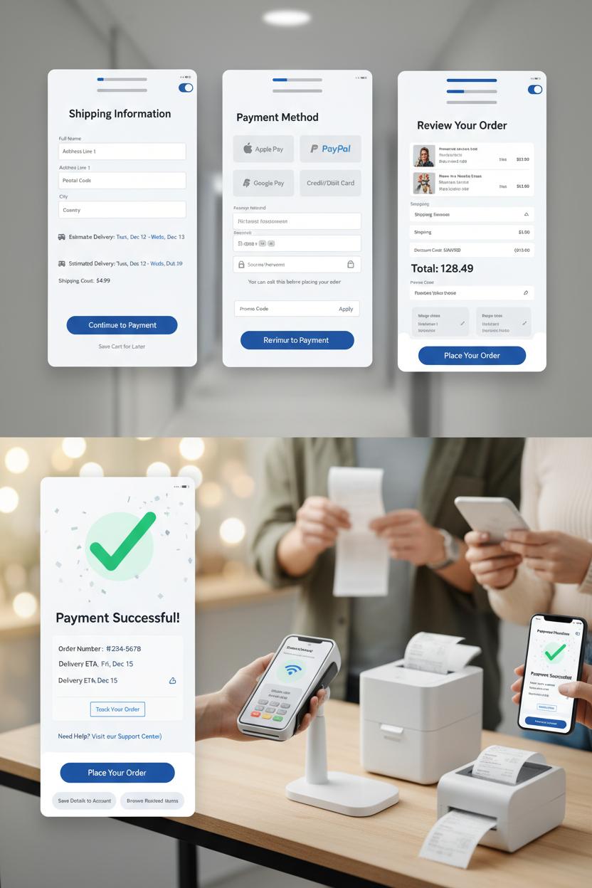
Think of your checkout ux as a calm, well-lit hallway that guides shoppers straight to the “payment successful” moment without a single squeaky floorboard. Great ecommerce design starts with trust: clear headings, generous white space, and a single, obvious primary button per screen. Hide the noise, surface what matters. Let shipping costs and delivery windows show up early, save carts automatically, and keep promo fields discreet. Use recognizable logos and subtle security cues that feel native to a modern fintech ui, not like a flashing warning sign. Above all, keep the page fast and predictable—fewer surprises, fewer abandons.
Forms should be breezy and forgiving. Ask only for what you truly need, enable auto-complete, and format inputs as people type so errors feel like gentle course corrections, not scoldings. Postal code can smart-fill city and state; card number spacing and expiry masks do quiet heavy lifting. Offer guest checkout, wallet options (Apple Pay, Google Pay, PayPal), and a clean progress indicator—Shipping, Payment, Review—ideally two or three steps, max. Transparent payment choices reduce doubt, and tiny bits of reassurance (“You can edit this before placing your order”) keep momentum. If you’re also selling IRL, let the experience feel unified: a sleek POS terminal and card reader that supports NFC tap to pay for pop-ups, a mobile card swiper for curbside moments, and a humble receipt printer for customers who still love paper. Omnichannel harmony matters; it builds confidence that your brand has its act together wherever the purchase happens.
And when the finish line appears, make the confirmation screen feel like a friendly wave from your brand’s front porch. Lead with a big, clear “payment successful” message, then stack the essentials: order summary, delivery ETA, tracking link, and how to get help. Sprinkle in a tiny celebration—a tasteful checkmark animation, a soft confetti drift—that still respects accessibility. Invite next steps without pressure: save details to an account, tweak a shipping address within a short window, or browse “pairs well with” items. Finally, send a quick, pretty receipt email that mirrors the page. That polished, end-to-end moment is where smart ecommerce design and quietly delightful fintech ui meet—and where customers decide they’ll happily buy from you again.
Microcopy and CTAs that reassure after payment successful
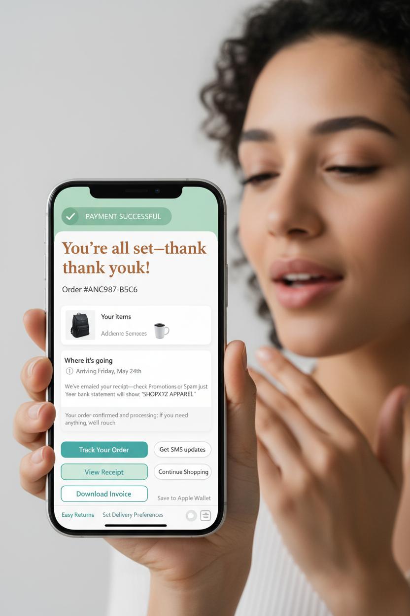
The moment the banner flips to payment successful is when your shopper finally exhales, so let your microcopy do the same—exhale with them. On the confirmation screen, keep the headline warm and human: “You’re all set—thank you!” followed by an order number that feels like an anchor rather than a code lost in space. In thoughtful ecommerce design, reassurance lives in the tiny lines beneath: a friendly recap of what they bought, where it’s going, and when to expect movement. Add clear timestamps and a plain-language note like “We’ve emailed your receipt—check Promotions or Spam just in case,” plus the exact descriptor that will appear on their bank statement to cut down on “What is this charge?” anxiety. If there’s a review or fraud-check window, say it softly: “Your order is confirmed and processing; if we need anything, we’ll reach out.” In checkout ux, these small sentences reduce support tickets and keep the glow of completion intact.
Your CTAs should feel like gentle next steps, not pressure. Lead with one primary action—“Track your order,” “View receipt,” or “Download invoice”—and offer one or two calm companions such as “Get SMS updates” or “Continue shopping.” In fintech ui, clarity beats cleverness: keep verbs concrete, avoid double negatives, and label destinations honestly. If you support wallets, a post-purchase “Save to Apple Wallet/Google Wallet” removes friction later. For in‑store or hybrid flows, mirror this reassurance on the POS terminal and mobile surfaces too: a crisp green check on the card reader after NFC tap to pay, a “Tap received—processing complete” line on the mobile card swiper, and a tidy choice between a printed slip from the receipt printer or an eco-friendly texted copy. Even a tiny “No duplicate charges—one receipt per purchase” note near a busy counter can melt worries, especially when lines are long and taps are fast.
Round it out with kindness: a link to easy returns, a nudge to set delivery preferences, and a clearly labeled support route that says “Need help? We’re here.” When microcopy feels like a person who’s thought of everything, the finish line stays as delightful as the cart—and that’s the quiet magic of a well-loved confirmation screen.
Visual feedback in fintech ui: animations, haptics, and timing on the confirmation screen
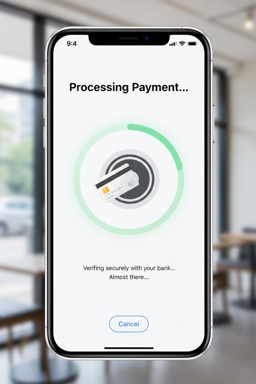
That tiny moment after a customer pays is where magic (and trust) is made, so treat it like the encore. On the confirmation screen, think in textures: a success checkmark that eases in with a soft pop, a warm glow that lingers for a heartbeat, and a micro-confetti or ripple that gently fades rather than shouts. In fintech ui, timing is everything—most “payment successful” animations feel best in the 300–600 ms window, fast enough to keep momentum, slow enough to read as intentional. Pair motion with sound and haptics sparingly: a single, crisp tick or a delicate vibration reads as confident; a chorus of effects feels chaotic. This layer-cake of cues—motion, color, microcopy—anchors your checkout ux and tells the brain, “Yes, this worked,” without asking for extra attention.
Design for the full spectrum of touchpoints, not just the phone in your hand. On a POS terminal with a card reader, the same visual language can appear as a pulsing edge light and a tidy “payment successful” label; with NFC tap to pay on a smartphone, a brief haptic nudge plus a success mark that scales up from the tap point reinforces the gesture. If you’re using a mobile card swiper at a market booth, the animation can originate from the connected device icon, then hand off to the screen. And for in‑person setups with a receipt printer, let a subtle “Printing…” micro-state bridge the gap between digital and physical proof. Whatever the surface, aim for consistency: one success color, one motion pattern, one short sound, so the brand’s victory lap feels familiar across channels.
Finally, pace what comes after. Keep the confirmation screen visible long enough to read order totals and next steps (about 2–3 seconds), then gracefully introduce options: save receipt, email or text, add loyalty ID, or continue shopping. In ecommerce design, resist cramming upsells during this glow—let reassurance breathe first. Soft, supportive microcopy like “You’re all set” followed by clear receipt choices reduces cognitive load, and accessibility toggles for reduced motion or haptics keep control in the user’s hands. When every cue lands with intention, the finish of checkout feels as polished as the start—and that’s the kind of calm, confident closure customers remember.
Contactless flows: optimizing NFC tap to pay for a fast confirmation screen
The fastest contactless moment feels like a wink—tap, tiny chime, and you’re already basking in that big “payment successful” glow. To make that happen, prep the interface before the tap ever happens. Preload the confirmation screen assets, cache brand fonts and the friendly checkmark animation, and keep a short, reassuring micro-state ready: “Hold near reader,” then “Processing…” for no more than a heartbeat. On NFC tap to pay, mirror the POS terminal’s LEDs with a gentle on-screen pulse so the shopper knows the handoff is happening; a crisp haptic plus a soft success tone can bridge any network jitter and keep the energy calm. In your checkout ux, aim for a sub-second transition where possible, but never fake it—only show the final state once authorization clears. The magic trick is reducing everything else: minimal copy, one clear total, store name, masked card, and a hero-sized confirmation screen that instantly reads as done.
Hardware and software should dance together. If you’re using a modern POS terminal or standalone card reader, align the UI timing with the device’s beeps and lights so the customer doesn’t second-guess the tap. For mobile setups, phone-as-terminal flows and even a mobile card swiper backup should keep the same rhythm: clear tap target guidance, immediate tactile feedback, and identical success visuals so muscle memory forms quickly. In ecommerce design for in-person checkout, keep actions after success lightweight: “Email receipt” as the primary secondary action, with “Print” tucked just beside it if a receipt printer is nearby—no modals that hijack the high note. Save tips, loyalty capture, and promos for after the confirmation, in a tidy sheet that doesn’t threaten the finish line.
Design for the edge cases with the same warmth. If a tap fails, fade into a friendly retry, then offer chip or swipe fallback without ejecting the cart state. Keep a short grace period so the total doesn’t expire while the shopper reattempts. Accessibility matters in fintech ui: large targets, strong contrast, voiceover labels that literally say “payment successful,” and motion that respects system settings. Performance does, too—prefetch, keep animations local, and trim any blocking calls so the confirmation screen feels inevitable. When all the little cues stack up just right, contactless turns into a tiny celebration the shopper can feel, not just see.
Mobile selling: checkout ux tips for a mobile card swiper
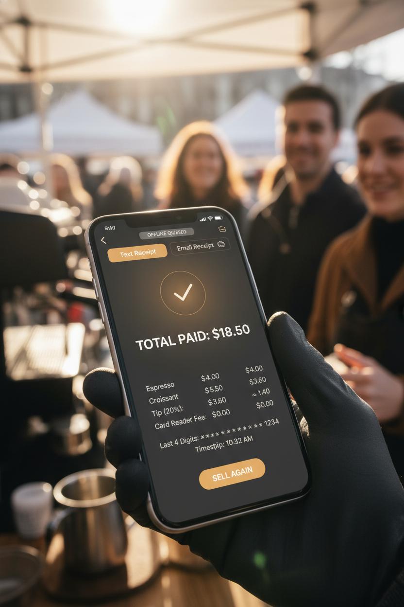
Selling on the move is a whole mood: coffee-laced mornings at the market, a sun-warmed pop-up, a line that blooms the minute you unclip your mobile card swiper. For moments like these, your checkout ux should feel as pocketable as your device—big, thumb-friendly buttons, high-contrast text for glare, and a flow that works one-handed without a second thought. Keep the path to pay short and sweet: item review, tip, pay. Anchor the Pay CTA within easy reach and make totals obvious with a gentle, trustworthy breakdown of items, tax, discounts, and shipping if needed. Whether you’re pairing a slim card reader, a full POS terminal, or going pure NFC tap to pay, reduce decision clutter with smart defaults and a single, confident action. If signal gets spotty, let buyers know the plan—queue securely offline, then sync—with calm microcopy and a visible status ribbon. This is where great ecommerce design meets street-smart finesse.
As the card meets the edge—dip, swipe, or tap—guide the moment like a host: “Hold near to pay,” then a clean, three-step progress cue—Connecting, Authorizing, Done. Subtle haptics and a soft chime make trust tangible. If something hiccups, give a friendly, specific reason and a one-tap retry. When the payment successful screen lands, make it delightful but swift: a gentle checkmark animation, brand color glow, and a confirmation screen that shows itemized details, total paid, last four digits, and time stamp. From there, offer receipts that match the pace of a pop-up: text and email up top, with a quick path to a paired receipt printer if your setup needs paper. Add a fast tip prompt that doesn’t hijack the flow, and a ready-to-sell-again state so you can keep the line moving.
A few little luxuries finish the fintech ui: skip signatures unless required, remember preferred receipt method, and surface battery and connectivity at a glance so you’re never surprised mid-sale. If you collect customer info, keep it optional and feather-light. And since real life is messy, design generous touch targets for gloved hands, offline clarity for remote fairs, and accessible contrast for sunny sidewalks. Small touches, big trust—every tap leading gracefully to payment successful.
Receipts done right: digital, SMS, and receipt printer workflows
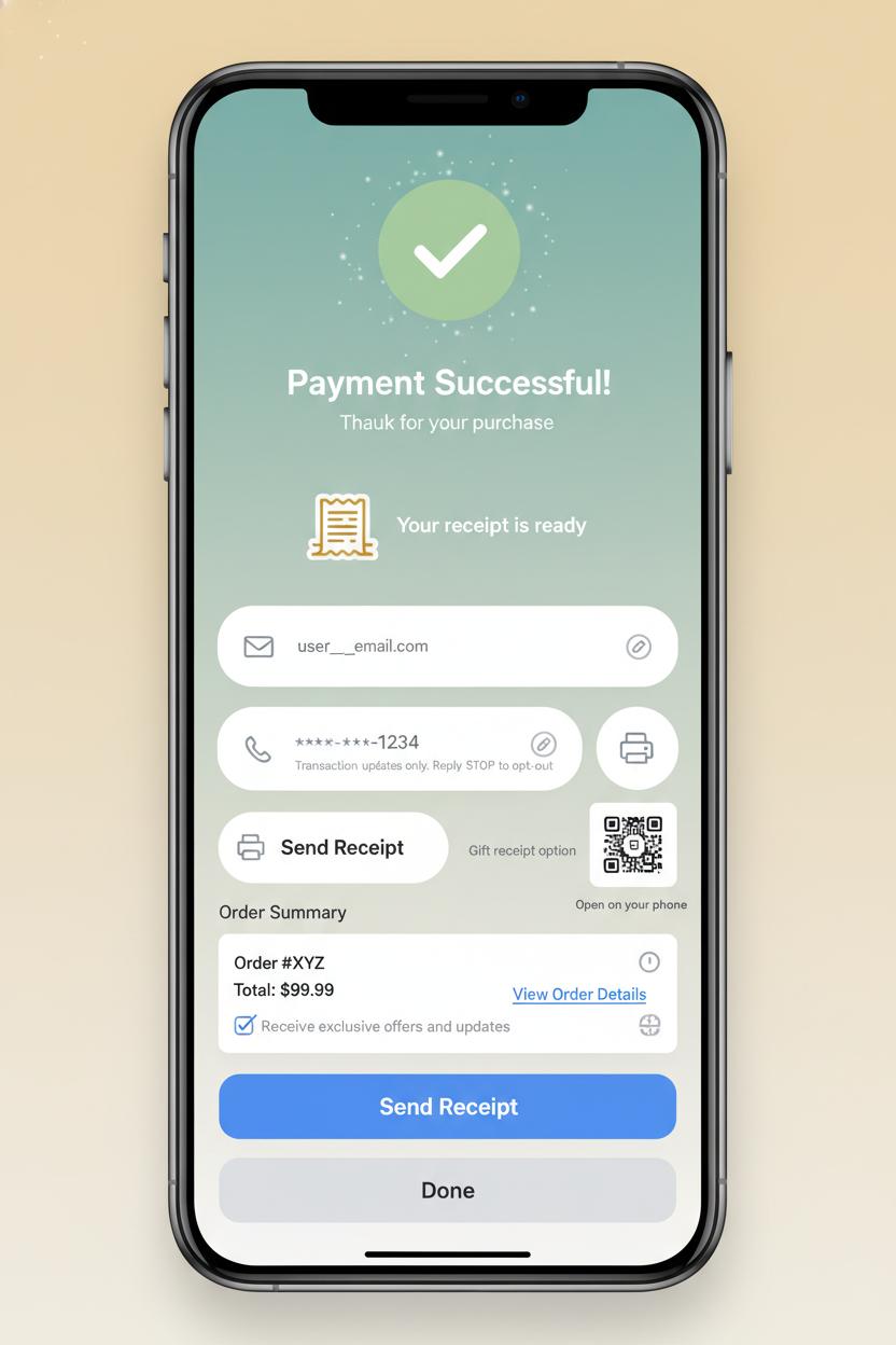
Right after that glow-up moment when the confirmation screen says “payment successful,” treat the receipt like the ribbon on a beautifully wrapped package—present, helpful, and never in the way. The sweetest checkout ux gives people a clear trio of choices without breaking the spell: Email, Text, or Print. If you recognize a saved email or phone, prefill it with a friendly hint and a tiny edit icon, and let them breeze on. Keep the action primary (“Send receipt”) and the exit effortless (“Done”), so shoppers aren’t trapped in a cul-de-sac of forms. In fintech ui terms, this is a soft landing: crisp microcopy, gentle defaults, and zero pressure—just that quiet confidence that everything’s taken care of.
For digital receipts, make email feel like a cozy home base. Prefill from their profile, validate in-line, and suggest their last-used channel for continuity. A good ecommerce design tucks in thoughtful extras: a “View order” button that leads to tracking, easy returns, and gift options; a summary that’s skimmable on mobile; and a little link to add the receipt to a wallet or download a PDF. If they’re using a shared device, offer a quick QR code that opens the receipt on their phone without typing. Keep consent clean: if you include a checkbox for promos, label it clearly and keep it off by default. All of this lives best on the “payment successful” screen so it’s memorable but optional, like a graceful last note.
Text receipts shine in motion—pop-ups, markets, or curbside—where a POS terminal, card reader, NFC tap to pay, or a mobile card swiper moves the line along. Use a masked number with a one-tap change flow, send a short link that opens a lightweight hosted receipt, and clarify that texts are transactional with easy opt-out info. If the signal’s spotty, queue the SMS and reassure with “Will send when online.” For paper lovers and expense reports, the receipt printer should feel like a single, satisfying click: auto-detect the printer when the POS is docked, print fast and quiet, trim blank space, offer a gift-receipt option, and add a tiny QR so the physical slip jumps neatly to digital. Seamless, warm, and considerate—proof that receipts can be both useful and delightful.
Cross-channel consistency: aligning ecommerce design with in-store POS terminal ux
When your brand’s online cart and in-store counter feel like twins separated at birth, the whole experience relaxes. The same friendly colors, the same rounded buttons, the same reassuring “payment successful” moment—all of it adds up to trust. Start by mapping your ecommerce design patterns to your physical checkout: if your app’s pay button is a soft green with a lock icon, echo that on the POS terminal screen so shoppers instantly recognize where to tap. If your site uses a big, cozy checkmark on the confirmation screen, bring that to the card reader display and pair it with a gentle chime and haptic nudge. Even the tiniest bits of microcopy should match; the line that says “We’re processing your order” online can be mirrored on the NFC tap to pay prompt, so there’s never that split second of doubt. This isn’t just cute continuity—it’s good checkout ux that reduces friction and support questions.
Think about the tangible touches too. If your web receipt is clean and photo-forward, train your receipt printer to echo the same hierarchy and tone, or default to digital receipts that mirror your fintech ui layout. Pop-up markets? Style the mobile card swiper overlay with your brand typography, so the quick-pay flow feels as polished as your site. Keep animations consistent: the progress spinner that tracks an online payment should time similarly on the POS terminal, and the language on decline or retry states should be identical, not “techy” in one place and friendly in another. For omnichannel perks—loyalty points, gift cards, subscriptions—use the same icons and placement so customers know exactly where to look whether they’re at a kiosk or checking out on their phone. The aim is familiar muscle memory: the same swipe, tap, and glance leading to the same confident finish. When every surface—screen, tap, and print—sings the same design chorus, customers breeze through checkout and leave with zero question marks, only that warm, unmistakable “payment successful” glow.
Accessibility basics for a clear confirmation screen and checkout ux
The most magical moment in checkout ux is when the interface gently shifts from uncertainty to relief: payment successful. An accessible confirmation screen makes that emotion unmistakable for everyone. Start with clear hierarchy and generous contrast so the success message can be read at a glance, even in bright store lighting or on a cracked phone screen. Pair a friendly success icon with real words—“Payment successful”—instead of relying on color alone. Keep the copy calm and specific: show the amount, masked card details, order number, and what happens next. Give people time; don’t auto-dismiss the screen. Offer redundant cues like a soft haptic bump and a subtle chime, but provide visible controls to mute or turn off sound. In your fintech ui, big tap targets (at least 44px), breathing room, and a single primary action—View receipt, Track order, or Continue shopping—prevent mis-taps and second-guessing.
Screen reader support is the quiet hero here. Move focus to the success heading and announce it with a polite live region so it doesn’t trample other narration. Label buttons in plain language (“Email receipt,” not “Send”). Respect prefers-reduced-motion by toning down confetti and animated checkmarks. Aim for 4.5:1 contrast on text, avoid all caps for long lines, and never encode meaning with color alone. Localize currency, dates, and decimal separators, and make error recovery easy—if something fails, offer a try-again path without starting over. Keep receipts easy to find and save: prominent options for email, SMS, print, or wallet, and a copyable order ID for customer support.
Accessibility touches every surface, especially when hardware enters the scene. On a POS terminal with a card reader or mobile card swiper, confirm success with haptics and a bold, high-contrast Done button that’s reachable at counter height. For NFC tap to pay flows, show a clear tap-complete state so no one re-taps in confusion. If a receipt printer is nearby, label Print Receipt and its alternatives equally so customers aren’t nudged into one format. Whether your ecommerce design lives in a kiosk, an app, or a handheld, testing in glare, low vision modes, and one-handed use keeps your confirmation screen—and your whole checkout ux—beautiful, calm, and truly inclusive.
Metrics that matter: measuring time to payment successful and confirmation screen completion
Two unsung heroes of checkout ux are time to “payment successful” and confirmation screen completion. Think of them as the heartbeat and the deep breath after—the moment your shopper commits, and the moment they relax. Instrument the journey from the instant the Pay CTA is tapped to the exact millisecond your system emits the payment successful event and renders it on-screen. Watch the median and p95 like a hawk, and segment by device, network, and method: card vs wallet vs BNPL; web vs app; even geography. In-store and on-the-go? Fold in hardware context too—how long between an NFC tap to pay on a POS terminal or mobile card swiper, the swipe on a card reader, the soft beep, and the visual confirmation? Does the receipt printer delay add a quiet five seconds that feel like forever? Every extra beat is an opening for doubt, so in your ecommerce design and fintech ui, reduce roundtrips, pre-authorize where safe, cache assets, and show honest, animated progress states that reassure without pretending.
Then, measure whether shoppers actually complete and comprehend the confirmation screen. Create a clean funnel: payment successful fired → confirmation screen viewed → key action taken (Continue shopping, Track order, Download receipt, Print). Track completion rate, time on screen, and visibility of essentials like order number and next steps. Micro-interactions are gold here: count clicks on “Copy order number,” taps to view receipt, prints triggered on a countertop setup, and save-to-wallet actions. If users bounce back to the cart or refresh in confusion, that’s a signal your confirmation design isn’t landing. Tie these behaviors to delivery method and hardware context—was there a second-long stall after the POS terminal cleared, or did the card reader prompt linger? For ecommerce design, prefetch confirmation assets before authorization finishes, keep your fintech ui calm and celebratory, and make the path forward obvious. When these two metrics move together—faster time to payment successful and higher confirmation completion—you can feel the whole flow exhale, and your revenue graph usually smiles right back.
QA checklist: testing checkout ux across devices, POS terminal, and card reader
Before you hit publish, give your checkout UX a cozy, all-devices dress rehearsal. On mobile Safari, Chrome for Android, and desktop, run through guest checkout and signed-in flows, single item and cart-full orders, shipping and pickup. Make sure numeric fields use the proper keypad, address and card inputs auto-advance smoothly, and the loading states feel calm, not jittery. Test slow networks, spotty Wi‑Fi, and airplane-mode recoveries—your “payment successful” moment should never feel accidental or rushed. The confirmation screen needs clear hierarchy: order number, items, totals, delivery or pickup details, and buttons for tracking, returns, and help. In your ecommerce design, listen for haptics and look for micro-animations that say “we’ve got you” without getting in the way. Keep the fintech UI consistent—fonts, buttons, and error styles should match across breakpoints and dark mode.
If you sell in person, take the same care with hardware. Run a full sweep on your POS terminal: tap a card, insert, and swipe, then repeat with an external card reader and a mobile card swiper to mirror pop-up or market setups. Confirm NFC tap to pay shows the same friendly states as your app, and that declines, timeouts, and partial approvals are gracious, not scary. Try a tip flow, then a refund, and be sure fallbacks work—when tap fails, chip picks up; when chip fails, magstripe still guides the user kindly. Print a receipt, then simulate the receipt printer running out of paper, and verify that digital receipts still send and the interface explains what happened. Check that the in-store “payment successful” tone matches your online voice so customers feel continuity wherever they buy.
Finally, sweep accessibility and edge cases. Turn on screen readers, bump up text size, and toggle high contrast; every label and hint should read naturally. Rotate the device mid-checkout, switch languages or currencies, apply discounts, and test expired or maxed cards. Validate that 3‑D Secure challenges return to a reassuring confirmation screen, and that analytics fire once—and only once—on the payment successful event. When this checklist feels boring because everything just works, you know your checkout UX is doing its quiet, beautiful job.
Conclusion
Here’s your gentle nudge to make every payment successful moment feel like a warm hug. When checkout ux is clear, trust grows; when ecommerce design is calm and consistent, carts convert; when a confirmation screen celebrates, loyalty blooms. Keep microcopy human, states predictable, errors kind, and loading honest. Sprinkle delight without slowing the path. In fintech ui, small signals – icons, receipts, reassurance – do the heavy lifting. Brew a cup, refine one touchpoint today, and let your checkout whisper: you’re done, you’re safe, you’re valued.