Craving a clean website design that looks stunning and converts like crazy? Discover the power of minimalist web design with modern UI, UX best practices, and a responsive layout that shines on every screen. Inside, you’ll find smart UX UI design tips, curated font pairings, and minimalist theme ideas, plus the best website templates to jumpstart your build. We’ll also share favorite web design books to sharpen your craft and boost conversions. Sleek, fast, intentional – this guide distills what matters so your brand feels polished, modern, and irresistibly clickable.
Principles of Minimalist Web Design That Drive Results
Minimalist web design works because it clears the path between your visitor and the action you want them to take. Start by prioritizing clarity over cleverness: one message, one primary CTA, and a layout that feels airy and intentional. Think of it like styling a shelf—remove what doesn’t serve, then arrange what remains so it shines. Generous whitespace, a calm color palette, and a modern UI with simple, intuitive patterns make your content feel instantly approachable. In a clean website design, hierarchy is your secret sauce: bold headline, supportive subhead, bite-size copy, and a button that looks easy to click. Every choice should answer, “Does this help the user move forward?”
Design details matter more when you have fewer of them. Choose typography that feels effortless to read, with thoughtful font pairings that set tone without stealing attention. Limit your palette to two or three hues and let contrast guide the eye. Use crisp, purposeful imagery and microcopy that’s warm and human. If you need a jumpstart, explore website templates or a minimalist theme to see how spacing, scale, and rhythm come together; then tailor them to your brand vibe. Skim a few web design books or resources on UX UI design to soak up UX best practices like scannable sections, predictable navigation, and obvious feedback on hover and tap. When everything aligns, the page feels quiet but confident—like a beautiful boutique where you immediately know where to go.
Finally, simplicity should extend to performance and accessibility. A responsive layout that’s mobile-first keeps buttons thumb-friendly, forms short, and text comfortable at every size. Optimize images, cut scripts you don’t need, and let pages load fast—speed is part of the experience. Use strong color contrast, clear labels, and error messages that actually help. Reduce cognitive load: fewer fields, fewer decisions, fewer detours. Minimal isn’t about stripping away personality; it’s about removing friction so your message lands and conversions follow. Do less, better—and let the essentials do the heavy lifting.
UX Best Practices to Reduce Friction and Build Trust
When you want visitors to feel instantly at ease, think of your interface like a beautifully curated entryway: everything has a place, nothing competes, and the path forward is obvious. That’s the heart of UX best practices for a clean website design. Start by removing decision fatigue. Keep navigation short and predictable, group related items, and make your primary call-to-action impossible to miss without shouting. Use generous white space so content can breathe, and lean on a modern UI with clear visual hierarchy—scannable headings, balanced spacing, and buttons that look like buttons. Write microcopy that anticipates questions and reduces anxiety, like shipping details near the cart or a short line under forms explaining why you’re asking for information. Little signals like progress indicators and friendly empty states smooth the journey and whisper, “You’re in the right place.”
Trust is also visual, and minimalist web design gives you an edge here. Choose legible font pairings and stick to a small palette so everything feels cohesive and honest. Subtle motion—think gentle hover states and smooth transitions—should guide, not distract. Transparency builds confidence fast: show prices early, surface reviews, and keep policies easy to find. If you’re starting from scratch, well-made website templates or a minimalist theme can help you stay consistent without overthinking every detail. And if you want to sharpen your instincts, dip into a couple of web design books or browse UX UI design resources to see how others create clarity with fewer elements. Authentic photography, crisp icons, and tidy forms with inline validation turn “maybe later” into “yes, now.”
Performance is part of politeness, so aim for a snappy, responsive layout that feels tailored to every screen. Design mobile-first, keep tap targets comfy, and avoid walls of text on small devices. Compress images, lazy-load where it makes sense, and use skeleton loaders so waiting feels less like waiting. Respect privacy with clear consent choices and explain what happens after a click; confirmation messages and easy undo options reduce regret. Consistency across pages—same button styles, heading sizes, and spacing rhythm—creates the kind of quiet confidence people trust. When your modern UI gets out of the way, visitors glide from curiosity to conversion, and your minimalist web design does what it’s meant to do: welcome, guide, and gently win them over.
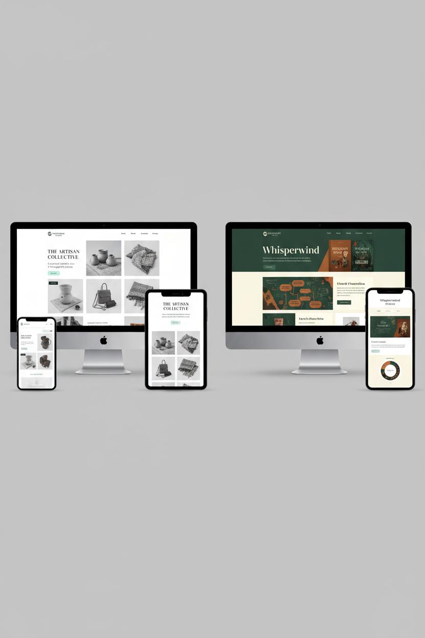
Choosing a Minimalist Theme: From Aesthetics to Performance
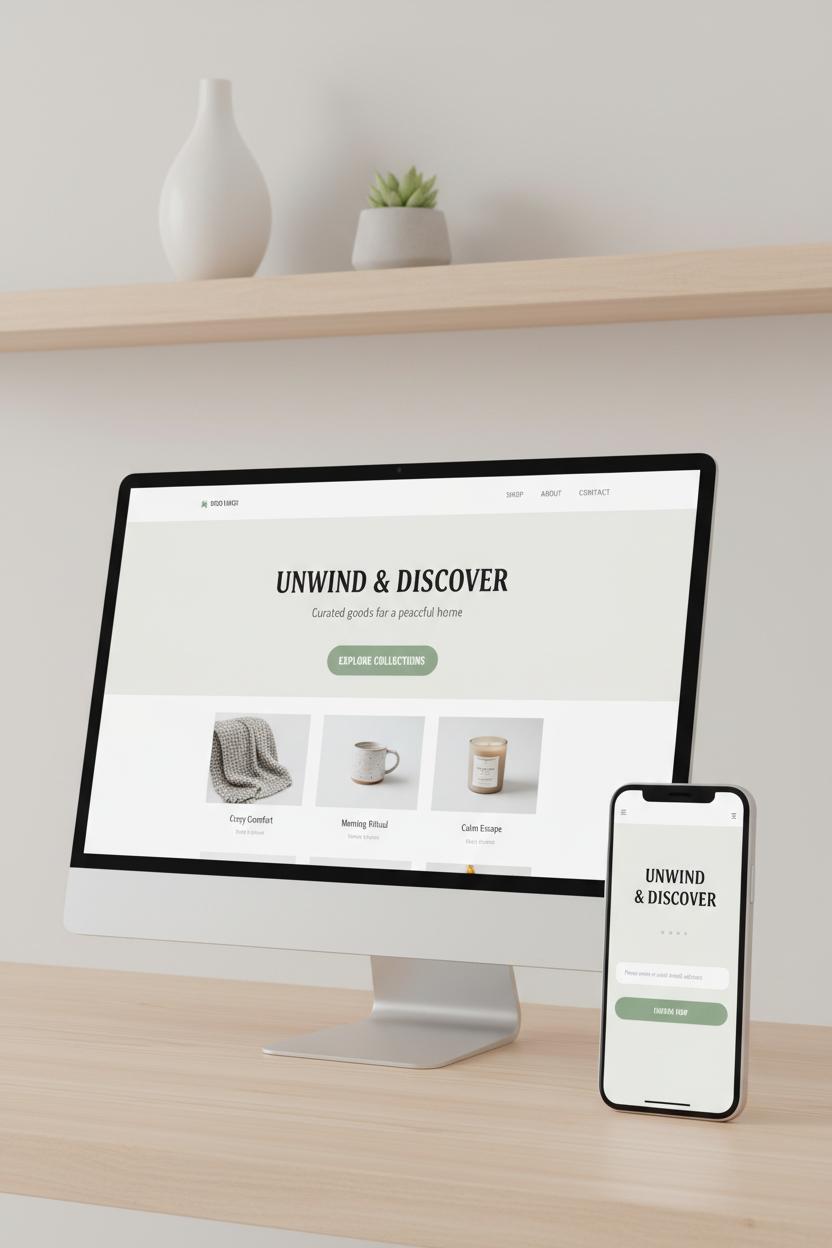
When you’re choosing a minimalist theme, start with the feeling you want to evoke. Clean website design is less about emptiness and more about intentional space: airy margins that make content breathe, a muted palette with one confident accent, and typography that whispers rather than shouts. Look for a minimalist theme whose demo already reflects your brand’s vibe—if the preview feels calm, clear, and modern, you’ll need fewer tweaks to get home. Pay attention to font pairings: a crisp sans for UI and a humanist serif for headlines can cue sophistication without clutter. Modern UI details like gentle microinteractions, soft shadows, and tidy iconography should guide the eye, not steal the show. If you’re browsing website templates, favor those that prioritize hierarchy and restraint; you can always layer personality through photography, copy, and color. For extra guidance, flip through web design books or UX UI design resources; chapters on typographic rhythm, grid systems, and content density will sharpen your eye for minimalist web design done right.
Under the surface, performance is the real luxury. A theme that looks light should load light, too. Seek out clean CSS, minimal JavaScript, and thoughtful image handling (built-in lazy loading, SVG icons, smart cropping). Check that the theme’s responsive layout feels tailored at each breakpoint—buttons with generous tap targets, readable line lengths, and navigation that never overwhelms on small screens. These choices aren’t just aesthetics; they’re UX best practices that quietly lift conversion. Test the demo on your phone over cellular, run a quick Lighthouse audit, and note any heavy sliders or bloated effects that dull that buttery scroll. Favor themes that support modern type options (variable fonts or system stacks) to balance beauty with speed, and choose components you’ll actually use so you’re not paying a performance tax on features you’ll hide. If you’re mixing and matching website templates or experimenting with font pairings, keep a simple rule: every element must earn its place. The result is a modern UI that feels effortless, a site that welcomes visitors with clarity, and a foundation you can grow without losing the quiet confidence of true minimalism.
Visual Hierarchy, White Space, and Grid Systems
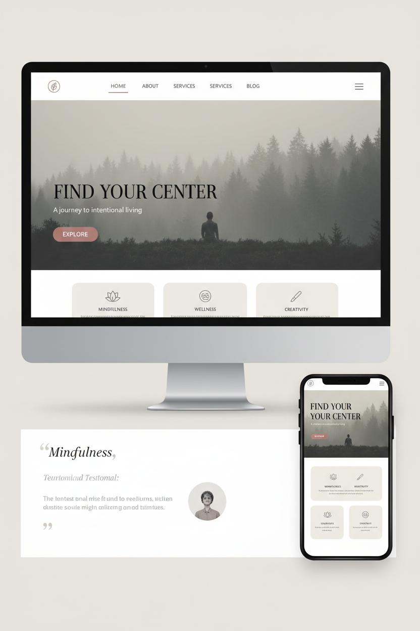
Think of visual hierarchy as your site’s gentle choreography—the sequence of glances, pauses, and clicks that leads someone from curious to confident. In a clean website design, hierarchy starts with clarity: a bold, benefit-led headline, a softer supporting subhead, and one unmistakable primary call-to-action. Size, color contrast, and spacing do the heavy lifting, but so do thoughtful font pairings that create a friendly rhythm. A modern UI thrives on restraint, letting a hero image breathe while secondary elements sit back and guide. Group related content, keep actions visually distinct, and remember that proximity is a language—elements that live together, belong together. If you’re brushing up on structure, flipping through web design books or a good UX UI design guide can spark new ways to stack information without ever feeling crowded.
White space is the oxygen of minimalist web design. It’s not empty; it’s intentional quiet that makes your copy legible and your visuals luxurious. Generous margins, roomy line-height, and consistent padding let the eye rest between moments of emphasis, which is one of the simplest UX best practices for reducing cognitive load. When you edit ruthlessly—fewer colors, fewer styles, fewer distractions—everything that remains feels more premium. Buttons pop. Product shots feel editorial. Testimonials read like a breath. Even the smallest details, like aligning labels or adding a touch more space above a section title, compound into a calm, trustworthy experience that nudges conversions without shouting.
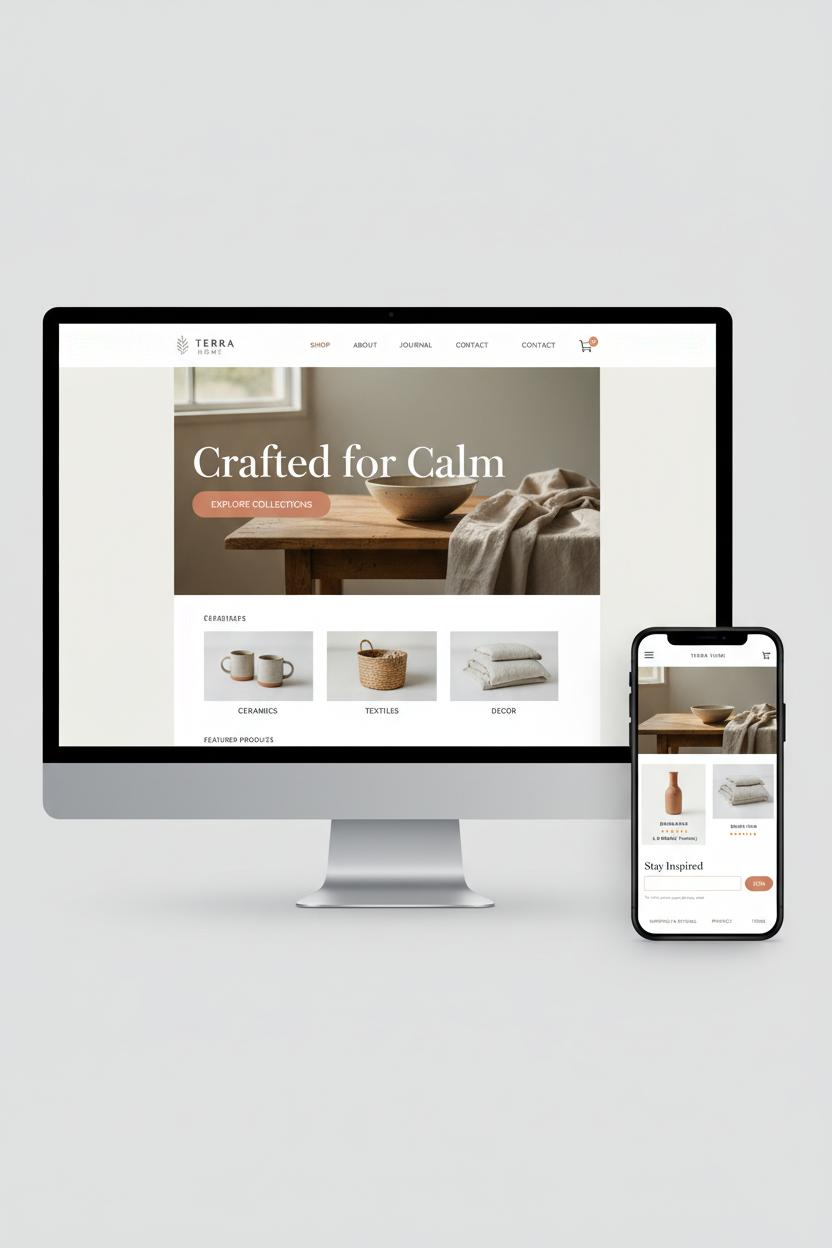
Underneath it all, a grid system keeps order. A 12-column grid with a steady spacing scale gives you a reliable rhythm, and when you translate that grid into a responsive layout, your pages adapt gracefully from mobile to widescreen. Lock your images and cards to the grid, align text baselines where possible, and keep consistent gutters so modules relate across breakpoints. If you’re starting from website templates or a minimalist theme, choose one with clear grid documentation and a sensible type scale—it will save hours. Want to experiment? Explore font pairings that hold up at small sizes, and skim a few web design books for grid and layout patterns used by pros. The result is a modern UI that feels serene, intentional, and effortlessly shoppable.
High-Converting CTAs: Placement, Contrast, and Copy

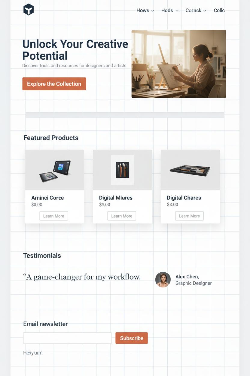
Think of your call-to-action as a tiny, well-dressed host guiding guests through a beautifully edited space. Placement comes first: tuck one primary CTA in the hero where the eye naturally lands, then echo it after your first scannable section and at the end of a key story block. On mobile, a gentle sticky bar at the bottom respects a responsive layout while keeping the next step within reach. In minimalist web design, breathing room is strategy, not excess—surround CTAs with generous whitespace so they never feel crowded by imagery or copy. Anchor secondary CTAs where intent spikes, like beneath pricing or testimonials, and keep their styling quieter so the primary button remains the star. These choices line up with UX best practices and feel right at home in a modern UI that’s crisp, calm, and easy to read.
Contrast is your secret sauce. In a clean website design, a single confident color against a palette of soft neutrals pulls focus without shouting. Choose accessible contrast ratios, then let size and weight seal the hierarchy. If you love airy aesthetics, a subtle shadow or filled button can outperform ghost styles that fade into the background. Thoughtful font pairings matter here: a friendly, high-legibility sans for buttons and a refined serif or geometric sans for headlines creates a chic tension that still reads in a blink. Many minimalist theme options and website templates include polished CTA systems—use them as a baseline, then refine spacing and states so hover, focus, and tap feel delightful and consistent.
Copy is the heart. Trade generic “Submit” for benefit-forward microcopy that whispers yes: “Get the lookbook,” “Start my free trial,” “Send my sample,” “Save my seat.” Keep verbs active and specific, reduce friction with clarifiers like “No card needed,” and align tone to your brand’s modern UI voice—warm, concise, and confident. Tiny helpers beneath the button—privacy notes, what happens next—build trust without clutter. If you’re exploring deeper, skim a few web design books or UX UI design resources for swipe-worthy phrasing and testing ideas. Then iterate: A/B test placements, hues, and verbs, watch where thumbs pause, and let the data polish the poetry until the path to click feels effortless.
Website Templates vs. Custom Builds: How to Decide
Deciding between website templates and a custom build is a lot like choosing between a capsule wardrobe and a tailored suit—both can be beautiful, but the right choice depends on your timeline, budget, and how specific your needs are. Templates shine when you want a clean website design that’s ready fast. Many come with a minimalist theme, tasteful font pairings, and a responsive layout already dialed in, so your pages look polished on phones and desktops without extra tinkering. If you’re launching a portfolio, a simple service site, or an early-stage shop, templated designs can deliver a modern UI with just enough personality to feel on-brand. Add your photography, refine your color story, and follow UX best practices—clear headings, generous spacing, and scannable sections—and you’ll have a minimalist web design that feels airy and intentional. For extra polish, browse a few web design books or UX UI design guides to fine-tune typography, hierarchy, and microcopy before you hit publish.
Go custom when your brand needs to say something only you can say—or when your site has complexity that templates struggle to handle gracefully. A bespoke build lets you craft a modern UI from the grid up, shaping navigation, motion, and content models around your exact goals. It’s ideal for unique product storytelling, intricate conversion flows, or performance-critical experiences where every millisecond and interaction counts. You’ll have more freedom to engineer a responsive layout that’s lightning-fast, accessible, and scalable, and to bake in UX best practices like semantic structure, meaningful micro-interactions, and thoughtful states for errors and success. Just remember: custom takes more time, budget, and decision-making. If you’re still testing your offer, a refined template can be the perfect stepping stone; later, you can graduate to custom once patterns are proven. A good rule of thumb: choose website templates when you need speed, predictability, and a tidy starting point; choose custom when your differentiation, complexity, or growth plans demand it. Either way, keep it minimal, let the content breathe, and treat type and color like your signature—small, confident choices in font pairings and spacing can elevate everything.
Must-Read Web Design Books for Minimal, Modern Creators

When you’re craving a clean website design that feels effortless yet intentional, a small stack of go-to web design books can be the secret sauce. Think of them as your creative compass for minimalist web design: they’ll help you edit bravely, design with clarity, and build a responsive layout that looks as refined on mobile as it does on a 5K display. Start with Adam Wathan and Steve Schoger’s Refactoring UI for a friendly, visual tour through color, spacing, shadows, and components that instantly elevate modern UI decisions. Pair it with Jon Yablonski’s Laws of UX to internalize the psychological patterns behind flow, hierarchy, and affordances—essential UX best practices that make every page feel intuitive, not just pretty.
Add Steve Krug’s Don’t Make Me Think, Revisited to your nightstand for its timeless reminder: if visitors have to work to understand your interface, you’ve already lost them. For system-level thinking, Brad Frost’s Atomic Design shows you how to build reusable parts that keep a minimalist theme cohesive as your site scales. Ethan Marcotte’s Responsive Web Design remains the classic for fluid grids and media queries, helping you craft a responsive layout that adapts gracefully without breaking your brand’s vibe. And because type carries so much of the mood in modern UI, Ellen Lupton’s Thinking with Type or Jason Santa Maria’s On Web Typography will sharpen your eye for font pairings, spacing, and rhythm so your headlines whisper “premium” instead of shouting.
Use these UX UI design reads alongside your favorite website templates: let a streamlined template give you structure, then refine with insights from your books to simplify navigation, tighten spacing, and dial in typography. As you design, keep a swipe file of components you love, note the micro-interactions that feel delightful, and test on real devices to ensure the calm of minimalist web design survives every breakpoint. With a handful of well-loved web design books, a few carefully chosen font pairings, and a thoughtfully edited minimalist theme, you’ll craft pages that are modern, breathable, and quietly high-converting—proof that less, done right, is so much more.
Case Studies: Clean Website Design Makeovers with Measurable Wins
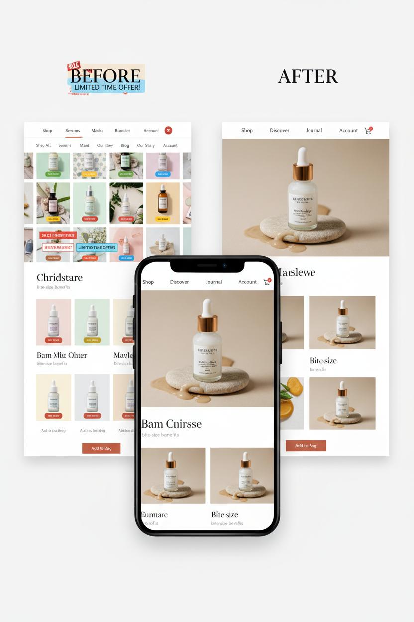
When a boutique skincare shop came to us, their site felt like an overstuffed vanity—too many colors, too many buttons, not enough calm. We gave the experience a deep breath: clean website design with generous white space, soft neutrals, and confident font pairings that let the product textures shine. Navigation dropped to four clear paths, product pages adopted a modern UI with large imagery and bite-size benefits, and we trimmed scripts for speed. Inspired by a couple of favorite web design books, we anchored every choice in UX best practices and tested a fully responsive layout. Four weeks later, average load time fell 41%, bounce rate dropped 27%, and conversion rate climbed 38%. Email signups jumped 60% after we simplified the form and tucked a gentle incentive into the cart.
An architecture studio needed a portfolio that felt like a gallery instead of a filing cabinet. We started with a minimalist theme and treated each project like a print—big photography, quiet copy, and a tidy grid that adapts elegantly on mobile. A sticky “Book a Consult” CTA replaced a busy footer, while case studies gained skim-friendly sections clients actually read. We refined their palette, leaned into minimalist web design patterns, and chose a measured set of type styles from our favorite website templates library for consistency across pages. The result: time on project pages rose 45%, contact inquiries increased 72%, and form completion time dropped by nearly a third. Most striking, 68% of those new leads came from phones, a direct payoff of the responsive layout and thumb-friendly patterns.
For a direct-to-consumer coffee roaster, we brewed clarity into every step. The old shop buried bestsellers and hid reviews; the refresh elevated social proof, simplified flavors into clear cards, and used modern UI details—micro-interactions, smart defaults, and a faster mini-cart. Guided by a seasoned UX UI design audit, we reduced checkout friction to two decisive screens and pared the header to a single line. A curated set of font pairings improved scannability, and we swapped a heavy homepage video for a crisp hero image to speed things up. Results tasted sweet: add-to-cart rate up 25%, checkout completion up 18%, and mobile revenue up 40% within six weeks.
Checklist: From Minimalist Web Design Concept to Live Site
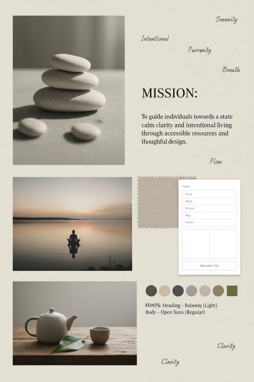
Start with a mood board and a mission. Gather a handful of images, textures, and words that feel like the brand you’re building, then write a one-sentence purpose for the site so every decision points back to it. Do a quick content audit—what truly deserves a place on your pages in a clean website design—and sketch low‑fi wireframes to map the flow. Peek into a couple of web design books or your favorite UX UI design references to anchor your choices in UX best practices: clear hierarchy, generous white space, and obvious next steps. Define your core pages, primary CTA, and simple navigation labels so visitors can glide from A to B without a bump.
Now shape the visual language. Choose calming font pairings that balance personality with legibility, and build a neutral-first palette with a single accent to punctuate calls to action. Curate imagery that breathes—think negative space, soft light, and consistent styling. Lay in a tight grid and rhythm for spacing; this is where minimalist web design really shines. Add only the modern UI touches that serve the story—subtle hover states, friendly microcopy, tiny micro‑interactions that feel thoughtful rather than loud. If you’re building fast, explore website templates or a minimalist theme as a starting point, editing ruthlessly so it feels custom. Keep components consistent—buttons, forms, cards—so your interface feels like one calm conversation.
Before you hit publish, road‑test the experience. Check the responsive layout across breakpoints, thumb and tap through on a real phone, and proof your copy out loud. Optimize images, defer nonessential scripts, and confirm color contrast and keyboard access; minimal doesn’t mean bare—it means considerate. Add SEO basics (titles, meta descriptions, alt text), set up analytics, and tuck in a favicon, 404 page, and XML sitemap. Do one last sweep: does every page earn its place, every section have a single job, every CTA read like a helpful nudge? Launch softly, watch how people use it, and iterate with small, steady improvements. Clean, modern UI plus UX best practices is a timeless formula—when your site feels calm, clear, and human, conversions follow without the hard sell.
Conclusion
Here’s your cozy nudge to keep it simple: clean website design turns quiet whitespace and clear hierarchy into calm clicks. Blend minimalist web design with a modern UI, follow UX best practices, and let a responsive layout make every page feel made-to-measure. Declutter, choose a restrained palette, streamline navigation, and spotlight one goal per screen. The result? Faster loads, easier paths, higher conversions—without losing warmth. Brew a tea, edit ruthlessly, then hit publish. Your most modern, inviting, high-converting home on the web is just a few thoughtful trims away.